

Fundamental analysis does not provide traders with an informational edge in a short timeframe, measured in hours, days or even weeks. To analyze the potential for mispricing on a shorter-term basis effectively, traders have turned to technical analysis.
There is a common misconception that technical analysis is a tool strictly for short-term trading, and therefore not useful for investment purposes. Has traders’ reliance on technicals caused investor antipathy?
LONG-TERM INVESTING HORIZON
Let’s say your investment horizon is 3 to 5 years. A 1-year chart of daily prices would not give you meaningful insight into potential price movements that far into the future. Would a 5-year chart of weekly data be more practical? How about a 20-year chart of monthly data?
Of the aforementioned charts, all three contain approximately 250 price bars. What differs is the compression, the amount of data within each price bar. Investors need to use a compression appropriate for their investment horizon. Due to the fractal nature of technical analysis, the compression affects the time horizon, not the analysis.
AN EXAMPLE
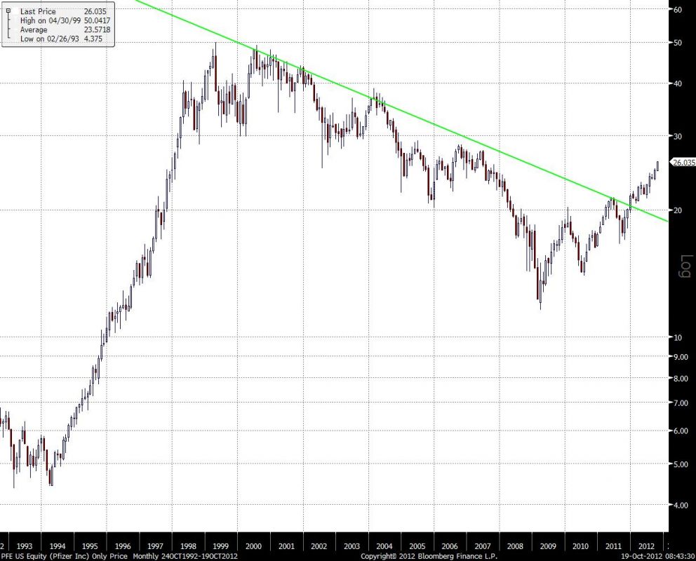
Figure 1 is a 20-year monthly chart of Pfizer, Inc (PFE). The downtrend line is anchored at the June 2000 (all-time high) and November 2001 closes. The line provided resistance in 2004 and then again in 2011. It wasn’t until the year end 2011 close that PFE was able to break above the downtrend. Note the strength of the rally since (+20%).
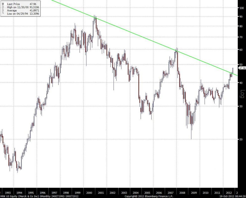
PFE took a relatively short time to move away from the trendline. From a technical perspective, this validates the line as resistance. How long will the rally last? The break of an 11 1/2 year downtrend will take some time to resolve. The expectation is for a multi-year move. This month, Merck & Co (MRK) is attempting to break above an 11 3/4 year downtrend line drawn from the December 2000 close (all-time high; Figure 2). An end of month close above $46 in MRK confirms the breakout. Further upside is required to validate the breakout. The chart will provide more information in early 2013.
LOOK BEFORE YOU LEAP
What is your outlook on the market you are investing in? Fundamental analysts rely on economists and/or macro analysts. What if you don’t have access to that information? Technical analysis provides you with the ability to analyze serial data, regardless of the underlying instrument. If you can chart it, you can analyze it.
Figure 3 is a 100+ year chart of the Dow Jones Industrial Average (DJIA), using quarterly price bars. The information provided by the patterns in this chart would be meaningful to an investor with a multi-year or multi-decade investment horizon. Here, a 17-year channel (Green Lines) developed in DJIA from the end of 1965 until the end of 1982. Minimally, you could measure the length of the rally as 4 3/4 years, until the end of September 1987. Another fair measurement would be 17 years, until the end of 1999. Again, the length of time you should expect a breakout to persist is commensurate with the length of time required for the formation to develop.
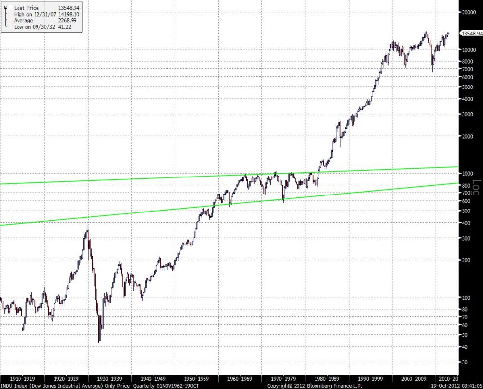
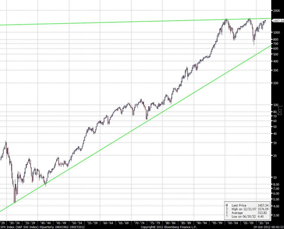
Figure 4 is an 85-year chart of the S&P500 (SPX), again using quarterly data. The bottom of the triangle formation (Green Lines) is anchored at the 1932 low. The top of the triangle is anchored at the 2000 and 2007 highest closes. Will the top of the triangle (? 1546.8 this quarter) act as resistance again? Or does the SPX have enough momentum to break out to the upside? Such a breakout would have multi-year implications.
CHECK YOUR EGO AT THE DOOR
Taking ego out of the equation – when are you wrong and does it matter?
DETACH FROM THE STORY
Technical analysis allows people to detach themselves from a “story” and strictly analyze the price structure. Some time ago, the following was relayed to me. A junior technician wanted the opinion of a well respected senior technician:
Jr: What do you think of this chart?
Sr: What’s the symbol?
Jr: walks away.
As technicians, we analyze the price structure. Neither the instrument, market nor price bar compression dictates the analysis. A chart is a chart. The analysis should be objective. The issue of being right or wrong is not important.
What is important is whether the potential reward is fair compensation for the risk you are willing to accept.
TRY THIS AT HOME
Try this exercise: Print out the charts of instruments you are performing fundamental work on. Remove the symbols and the price scale, so you are only looking at the patterns. Annotate the charts and see if this objective view results in a different interpretation of that instrument.
To gain another perspective, invert the chart (if your system allows, or turn the page over and upside down). Have your opinions reversed? If not, take another look at the original chart.
= = =
Visit our daily Markets section for specific trading ideas.<

