We might well be comparing apples to orangutans today but… then, again, we have presented stranger comparisons in the past.
The argument is that gold prices are in the process of peaking because silver prices have already reached a top as a result of a flattening out of the U.S. dollar.
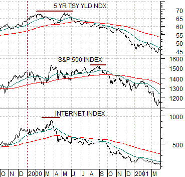
Below is a comparative view of 5-year U.S. Treasury yields, the S&P 500 Index (SPX), and the Internet Index (INX) from 1999- 2001.
The equity markets made a broad top in 2000 around the time that 5-year yields stopped rising and began to decline. The chart shows that the Internet Index (as well as the Nasdaq Comp.) reached a cycle high around the end of March while the S&P 500 Index held to a bullish trend into September of that year.
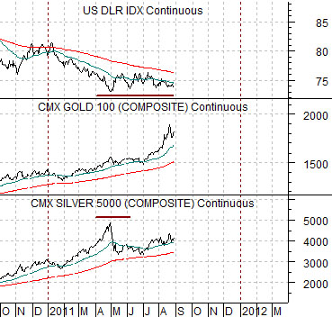
Below is a chart of the U.S. Dollar Index futures, gold futures, and silver futures.
In terms of our comparison gold futures are similar to the S&P 500 Index while silver futures are somewhat more like the high-flying internet stocks. Intermarket pressure in 2000 came from declining yields while in 2011 it seems to be a function of dollar strength.
Obviously the entire house of cards that represents our argument falls to the ground if the dollar were to resolve to new lows. If we assume that the dollar has actually bottomed and is going to drift back to the upside over the next few months then this may make some sense.
Through 1999 and into 2000 the stock market was strong while the internet sector was even stronger. There was, however, a period of months between the final top for the internet stocks and the start of serious weakness for equities in general.
Our sense is that if the bottom for the dollar went with the highs for silver then we might be working through a similar sort of lag with respect to gold prices. If the first pivot point was reached at the end of April when the dollar stopped falling then the next pivot point should occur when the dollar stops tracking sideways and start to rise in earnest.
Equity/Bond Markets
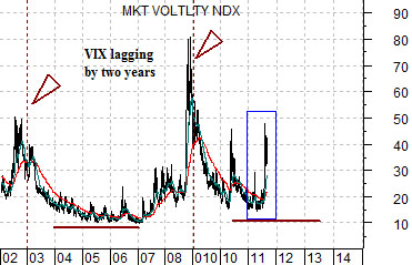
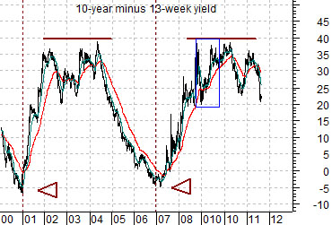
Too much to cover and not enough time or space to do it properly so this will be quick. At right are charts of the VIX and the yield spread between 10-year and 3-month yields.
The long standing argument has been that changes in the trend for interest rate and the yield spread impact the cyclical trend with a lag of two years. We have lined up the charts so that the VIX from, say, 2002 is above the yield curve in 2000 to account for the lag.
The point is that yield spread’s position from 2009 into 2011 argues for a relatively low VIX into 2013. The recent state of crisis may simply be a reflection of the quick decline in the yield spread through the first half of 2009.
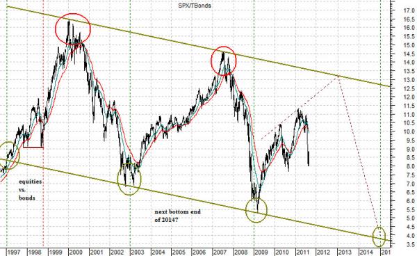
Next is a rather large chart of the ratio between equities and bonds (S&P 500 Index divided by the TBond futures).
The SPX/TBond ratio is trending within a downward sloping channel with tests of the channel bottom every six years.
The argument has been that the ‘crisis corrections’ of 2010 and, we believe, 2011 are similar to 1998. The SPX/TBond ratio is going to resolve higher but periodic routs are required to keep from rising too quickly. If the trend persists the next test of the channel bottom could take place some time around the final quarter of 2013. We are shoe-horning this one in so that we can compare this particular message with the one taken from the charts on the next page.
Bottom line- choppy markets with bullish resolutions with a more negative trend developing some time in 2013 or 2014.