We are going to start off today with a bit of a ‘what if?’.
The Decade Theme argument is based on the idea that one or more major asset classes rises to a peak in the first year of a new decade. We had commodity prices in 1980, Japan in 1990, and the Nasdaq in 2000.
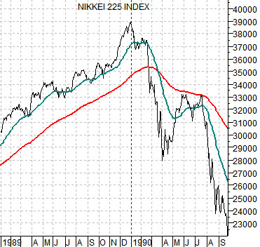
With the strength in commodity prices through the previous decade our thought has been that something related to commodities will be set to make a bubble peak this year. Taking the argument a step further this would imply that Japan’s equity market is working through a significant bottom in the same way that crude oil and copper prices pivoted up from a low following close to 20 years of downward pressure back in 1999.
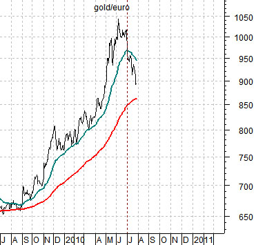
In any event… in yesterday’s issue we showed a number of charts of gold prices in terms of the euro. The gold/euro combination bottomed in 1999 and pushed upwards into June of this year.
Below we show gold in euro terms while below right is a chart of the Nikkei 225 Index as it made its bubble peak between 1989 and 1990.
The ‘what if’ part of this ramble is based on the proposition that gold/euro has just reached some kind of cycle top. In other words gold/euro is in a somewhat similar position today to the Nikkei 225 Index early in the second quarter of 1990.
We attempted to point out in yesterday’s issue that gold/euro worked through a number of corrections over the past four years with periodic declines below the 200-day e.m.a. line. What did not happen and, at least so far, has not happened is a ‘cross’ through the 200-day e.m.a. by the 50-day.
We are showing the comparison to highlight the significance of a moving average line ‘cross’. The Nikkei 225 Index reached a multi-decade price peak at the start of 1990 and the collapsed with the moving average lines ‘crossing’ in March. If gold prices represent the ‘bubble’ associated with this current cycle’s bubble then gold/euro will have to decline far enough below 850 to pull the shorter-term moving average line back below the rising 200-day e.m.a.
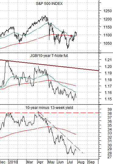
Below is a comparison between the S&P 500 Index (SPX), the ratio between Japanese and U.S. 10-year bond futures, and the spread between 10-year Treasury yields and 3-month TBill yields.
The argument is that the time to worry about an equity markets top is when the JGB/TNote ratio rises to the resistance line and the yield spread moves up to 3.8%. After a few weeks of stronger stock markets the idea here is that the markets are nowhere close to any kind of meaningful top.
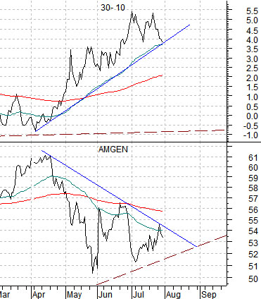
Below is a comparison between the stock price of biotech giant Amgen (AMGN) and the price difference between the 30-year T-Bond futures and the 10-year T-Note futures.
The 30- 10 spread goes ‘with’ the bond market. In a sense the chart suggests that while we may be nowhere close to a stock market top it is also true that the bond market has yet to confirm the new rising trend. We would like to see the 30- 10 spread decline below 3.5 with the 30-year minus 3-month yield spread rising through 3.0%.
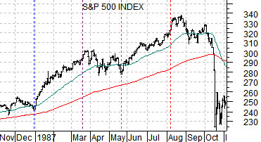
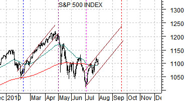
Below is a comparison between the S&P 500 Index from 1987 and the same index for the current time period.
This is based on chart comparisons between the SPX and the TBond futures from 1987 and the SPX and 30-year yields from 2010 that we have been running daily in the back pages for the past few weeks.
The argument is that in terms of ‘time’ the cycles are almost identical. If the pattern persists the next potential top for the SPX would be seen some time around the second half of September based on the way this index rose to a peak in August of 1987. Obviously this does not mean that the SPX will rise each and every day although the presumption is that it will continue to resolve upwards for another six or seven weeks.