We were asked years ago whether it would be possible to put the intermarket relationships that we work with into a computer model or ‘black box’ trading system. Our answer- especially after LTCM and its Nobel Prize-winning principals had blown a billion or five betting on what should instead of what did happen- was that this is far more of an art than a science. Goodness… the commodity markets proved that month after month after swinging higher in late 2006 and holding a gravity-defying rising trend for well over a year and a half. That commodity prices ‘should’ have been falling was not the issue even though in the fullness of time we were somewhat vindicated by the end result.
The point is that from an intermarket perspective commodity prices were in a declining trend even as prices made new highs month after month after month. Unless the rules that govern the markets had changed- and at times we wondered if that had happened- we had no choice but to argue that commodity prices were going to fall even as they moved upwards.
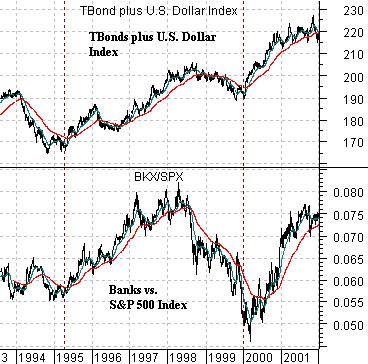
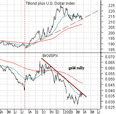
We mention all of this because it is our intention today to focus on another markets divergence. At top right we show the sum of the U.S. 30-year T-Bond futures and the U.S. Dollar Index (DXY) along with the ratio between the Bank Index (BKX) and the S&P 500 Index (SPX) from 1993 into 2001.
The premise is that when the U.S. dollar and long-term Treasuries are rising in price on a combined basis the major financials (BKX) will tend to outperform the broad stock market. In other words when the dollar is stronger it tends to put downward pressure on commodity prices which funnels money towards non-commodity sectors and when the TBond futures are rising it tends to indicate that there is enough economic ‘slack’ to keep raw materials prices from rising.
So… dollar and TBonds strong- banks are better. Dollar and TBonds weak- banks are worse.
Belowwe show the current situation. The sum of the U.S. 30-year T-Bond futures and DXY turned nicely higher last summer and for a few months it appeared that we were right on target as the BKX/SPX ratio began to rise. From October into March, however, the markets appeared to have decided that the only ‘financial’ worth owning was gold so even as the base trend for the BKX/SPX ratio pushed upwards the banks slumped to new relative lows.
Equity/Bond Markets
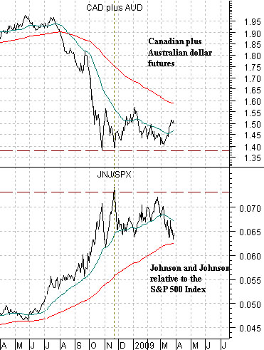
Below we show the sum of the Canadian and Australian (CAD plus AUD) dollar futures and the ratio between Johnson and Johnson (JNJ) and the S&P 500 Index (SPX).
The reality of the moment is that the perception of Chinese economic growth has spread through the markets leading to a rising trend for copper prices while the U.S. dollar and Japanese yen have either declined or flattened out. In response to the perception- or, perhaps, reality- of better Asian growth the markets have shifted focus back away from the consumer defensives (i.e. JNJ) towards the more economically sensitive cyclical sectors. In other words the reason the JNJ/SPX ratio is not making new highs is the same reason that the CAD plus AUD is not making new lows.
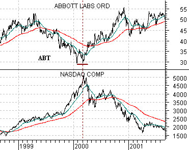
Below we show the comparison between Abbott Labs (ABT) and the Nasdaq Composite Index from 1998 into 2001.
There have been long periods of time in the past when consumer growth stocks such as ABT have defined the markets’ trend. In other words they were, more often than not, rising in price. From the end of the 1990’s, however, the trend has favored the more cyclical sectors which means that ABT had tended to do better during those periods of time when the ‘hot’ sectors have been under pressure.
The point is that ABT declined from around 50 down to 30 as the Nasdaq rose from 1500 to 5000 from late 1998 into 2000 and then rallied back from 30 to around 55 as the Nasdaq began to journey from 5000 back to 1500. One explanation would be that during 1999 ABT lost 40% of its fundamental value and then during 2000- almost miraculously- gained it back. Another explanation would be that the decline in the share price of ABT was simply a function of money chasing price momentum.
Our point, we suppose, is that while the Nasdaq was rising the markets were simply not interested in steady growth names such as ABT but once the Nasdaq finally reached a peak the flow of money out of ABT reversed as its share price returned to its original trading range.
The argument that we are making actually has nothing to do with the Nasdaq today and everything to do with both momentum and the perception of ‘hot’. We will argue that when one sector receives a disproportionate amount of capital inflows there will be a negative offset in a number of other sectors. When the Nasdaq pushed upwards the stock price of ABT moved downwards but when the Nasdaq finally began to decline the share price of ABT began to rise. Fair enough.
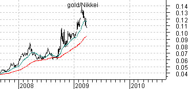
So… the question today would be whether were are in the midst of something similar to the Nasdaq from 1998 into 2000. The chart below right shows the ratio between the price of gold and Japan’s Nikkei 225 Index. Similar to the Nasdaq this ratio bottomed in 2007, pushed higher from October into March, flattened out from March into October, and then drove higher into the following March. In other words we are attempting to make the case that the rising trend for gold prices is part of the offset that has gone with the falling trend for other asset prices in the same manner that the Nasdaq’s trend served a the mirror-image for the price trend for ABT close to a decade ago. If this is correct then the weaker gold prices eventually become the quicker the broad recovery in financial asset prices will progress.