In yesterday’s issue we touched on the idea that the share price of Amgen (AMGN) rises in advance of the cyclical trend. In other words Amgen tends to push higher until economic growth has found sufficient traction to push long-term U.S. Treasury yields higher.
The argument is that the markets view Amgen as an attractive alternative when cyclical growth is negative enough to push interest rates to the down side. While Amgen will tend to rise and fall with the broad market it also has a tendency to diverge at certain key points in time. A quick review of this pattern may be of some help in identifying the current state of the markets trend.
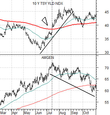
First is a chart of Amgen and 10-year Treasury yields from 2003. This is the same perspective that we showed yesterday but over a somewhat shorter time frame.
From the middle of 2002 into the start of the third quarter of 2003 the share price of AMGN pushed higher. This included the final few months of the 2001- 2002 equity bear market that made a low in October of 2002 as well as the next nine months that marked the final push to the lows for long-term yields.
10-year Treasury yields made a number of rallies to the upside but perhaps the most interesting chart point has to do with when AMGN’s share price made it peak in July of 2003. The chart makes the case that the highs for AMGN were reached on the day when 10-year yields moved above the 200-day e.m.a. line.
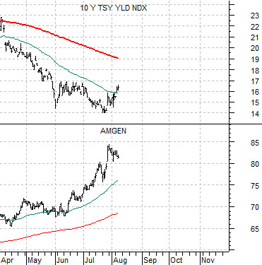
If we compare this to the current situation using the second chart below the one thing that stands out is that 10-year yields are still well below the moving average line.
Our thought is that we could be quite late in the rally phase for the major biotech stocks but… it also might make sense to give this theme a bit more rope. For good or for bad the exit point for this particular argument- one that we have been positive on for quite some time- should be an upward push by 10-year yields through 1.9%. Of course the longer this takes the lower the moving average will decline to but for the time being the gap between yields and the trailing moving average appears large enough to keep us positive on the biotechs.
Equity/Bond Markets
The Decade Theme argues that the cyclical trend follows the same general pattern from decade to decade. Price and/or bubble peaks are made in the ‘0’ year (i.e. 1980, 1990, 2000), the leading edge of the recovery begins late in the ‘1’ year, cyclical bottoms are made in the final quarter of the ‘2’ year, corrections and consolidations show up in the ‘4’ year, with crashes and crises marking the ‘7’ and ‘8’ years.
Another spin on the ‘Decade Theme’ suggests that each decade is different than the one previous. The 1970’s included rising interest rates and commodity prices, the 1980’s focused on consumer themes and falling interest rates, the 1990’s were all about large cap developed markets, while the 2000’s were driven by small cap, emerging, commodity, and lower interest rates.
There are a number of details that we find rather fascinating. The trend went commodities (1970s), consumer (1980s), tech (1990s), and then back to commodities (2000s). If the sequence persists the current decade will feature strength in the consumer spending themes.
The difference, however between rising commodity prices in the 1970s compared to the 2000’s was the direction of interest rates. Those involved in the markets through the 1970s would have found it difficult to imagine that gold prices could rise in a parabolic fashion in the face of collapsing interest rates and inflationary pressures.
The point? Our thesis is that the markets are shifting towards two themes. First, a return to consumer spending with much of the growth coming from the emerging markets. Second, a generational peak for long-term bond prices.
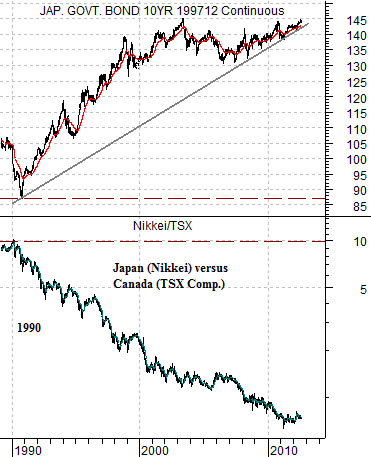
While only time will tell whether our views are correct they do form the back bone for one of our central biases. We are looking for price growth from a consumer theme that has shown a tendency to do better when bond prices are declining. There may be any number of qualified candidates but the one that works best is… Japan.
First below is a chart of the Japanese 10-year (JGB) bond futures and the ratio between Japanese and Canadian equities (Nikkei 225 Index divided by the S&P/TSX Composite Index.
The argument is that when Japanese bond prices peak and turn lower the ratio between Japanese and Canadian stocks prices will rise. The problem is that we are still dealing with the same rising bond price trend that as dominated the markets for the past 22 or so years.
So… think of it this way. Chart-wise the argument that the Nikkei/TSX ratio will rise when Japanese bond prices turn lower is quite compelling. On the other hand… since Japanese bond prices have been trending upwards since 1990 our thesis has never been thoroughly tested.
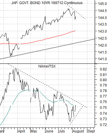
Next is the same comparison over a much shorter period of time.
We can see the relationship and we can imagine how this might play out but the reality is that if bond prices have finally peaked and turned lower then the ‘new trend’ is less than a couple of weeks old. So new, in fact, that it is impossible to see unless we use a fairly tight time frame.