In yesterday’s issue we touched on the topic (again) of Wal Mart’s relative strength. While we acknowledge that this time might be different we have noted on many occasions in the past that when the share price of Wal Mart (WMT) starts to seriously outperform the broad market there is some kind of ‘growth issue’ brewing.
The basic argument is that money flows towards Wal Mart when cyclical growth begins to wane. In other words when you start to notice that the ratio between WMT and the S&P 500 Index is on the rise it suggests that the markets are trading as if growth is in the process of slowing.
The second part to our presentation today has to do with a lag of around 9 months between when WMT begins to outperform and the realization by the markets that there is an actual problem. So… without further ado let’s push on to the two chart comparisons at right.
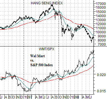
The top chart compares the WMT/SPX ratio from 1996- 98 with the Hang Seng Index from Hong Kong. The Hang Seng Index represents both Asian growth and the trend for basic materials and copper futures.
Our view is that trends tend to run quarter to quarter so we are marking the start of the rising trend for the WMT/SPX ratio as the beginning of the first quarter in 1997. Notice that the Hang Seng Index continued to rise into the summer of that year only to ‘crash’ in October. Between the start of strength for WMT/SPX to the collapse of a cyclical or growth-oriented market (Hang Seng Index) took very close to 9 months.
Below right is a view of the WMT/SPX ratio and CRB Index from 2007- 09.
Using calendar quarters to set trend change points we can see that WMT started to outperform the broad U.S. large cap equity market in the autumn of 2007. Yet… similar to the Hang Seng Index in 1997 commodity prices- especially energy, base metals, and grain- continued to push upwards for an additional 9 months. Three quarters after the WMT/SPX ratio began to trend upwards the commodity markets absolutely collapsed. Were the similarities to 1997 mere coincidence or is this the sort of thing that one should seriously pay attention to?
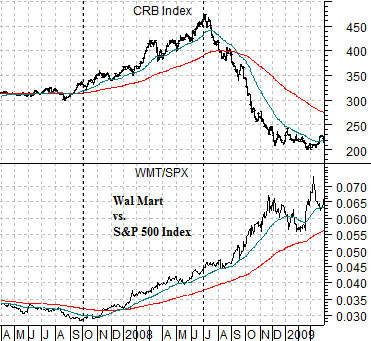
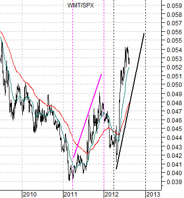
At top right is a chart of the ratio between Wal Mart and the S&P 500 Index.
The most obvious detail is that the ratio is and has been rising rather briskly. Another observation is that it did something similar over the final nine months of 2011.
Once again we are using the start of a quarter to mark the trend change point. The WMT/SPX ratio turned higher at the beginning of the second quarters of both 2011 and 2012.
So… given that the WMT/SPX ratio pushed higher for 9 months through 2011 and we don’t recall a cyclical market or markets ‘crashing’ early in 2012 does this mean that our page 1 argument isn’t working? Perhaps. On the other hand it might also mean that we have to use a more imaginative interpretation.
In a sense the ratio ‘worked’ but in a somewhat unexpected manner. Instead of cyclical weakness through the first quarter of 2012 we had the opposite- cyclical strength. Instead of the ratio continuing to push higher as money abandoned cyclical asset prices we had bond price weakness and a falling ratio. If we were to show something like Japan’s Mitsubishi UFJ (a laggard bank that we use as an indicator of cyclical strength) it began to power higher at the end of last December.
The point is that when the WMT/SPX ratio has been moving higher for 9 months one of two things seems likely to happen. Either extreme cyclical weakness or rather marked cyclical strength. The first might show up through falling Asian share prices or tumbling commodity prices while the latter would hammer the bond market.
Now… we are going to take a rather large leap of logic. We are, in fact, going to attempt to shoe-horn in a chart comparison even though we are aware that it doesn’t fit the time frames previously discussed.
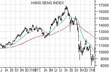
At right is a chart of the Hang Seng Index from 1996 through into January of 1998. We are attempting to capture the Hang Seng’s 1997 ‘crash’ that ultimately led into 1998’s Asian crisis which, of course, preceded the cycle lows for copper and crude oil in early 1999.
The argument is that the upturn in the WMT/SPX ratio at the start of 1997 initiated a sequence that led to the Hang Seng Index rising and then collapsing as money moved relentlessly away from Asia, Brazil, and Russia with commodity prices under pressure.
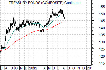
We could argue that the WMT/SPX ratio’s strength is a precursor to a similar kind of sequence and, in fact, that may turn out to be true. Yet we find the visual similarity between the chart of the U.S. 30-year T-Bond futures today to the Hang Seng Index from 1997 to be rather intriguing. So intriguing, in fact, that we wonder whether the markets are going to resolve the rising WMT/SPX ratio during the final quarter of this year by shifting back into a trend driven by rather extreme cyclical strength.
Chart-wise this would argue for the TBond futures to decline to the 200-day e.m.a. line into the end of this month and then bounce ‘up and out’ through quarter end with the bulk of price weakness showing up through the final few months of this year and, quite possibly, through the first quarter of 2013.