We have a number of biases in terms of the markets. By ‘bias’ we mean that there a few things that we expect to happen with enough conviction that it probably colors much of our work. If, for example, one believes that stock prices should rise then there is a reasonable chance that arguments supporting this view will be presented.
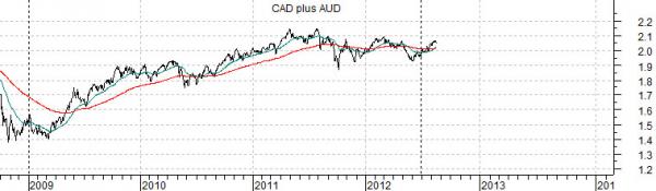
Below is a chart of the U.S. Dollar Index (DXY) futures from 1998 into early 2004. Below this is a chart of the sum of the Canadian and Australian (CAD plus AUD) dollar futures from 2008 to the present day. The charts have been set up quite carefully to reflect time periods precisely one decade apart.
Our premise is premise is that the prior decade’s ‘strong commodity price’ trend was an extension of U.S. dollar weakness and the dollar’s weakness started to show up in 2002 as money that had previously focused on the ‘large cap, large market’ trend that dominated the 1990’s moved off in search of higher returns.
The weaker dollar reflected money moving into smaller and commodity-based markets and sectors with the end result being a fairly lengthy period of relative strength ‘catch up’ by the commodity cyclicals. This was, by the way, exactly the argument that we were making day after day after day ten years ago.
Our bias today can be seen on the chart comparison. For good or for bad the expectation is that the trend for the commodity currencies in 2012 is similar to the U.S. Dollar Index in 2002. If this plays out then instead of a tail wind from a falling dollar the commodities markets will face a fairly steady head wind. This doesn’t mean that commodity prices won’t rise in the same way that the techs and telecoms enjoyed periods of price strength over the previous decade. It does mean, however, that our focus is going to be on those sectors that we hope will show better ongoing relative price strength.

Long-term yields are on the rise. Or, perhaps, they are on the bounce. There is a difference.
The big question is ‘why’.
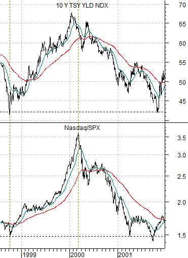
Below is a chart comparison between 10-year Treasury yields and the ratio between the Nasdaq Composite Index and S&P 500 Index from 1998- 2001.
Strength in the techs and telecoms from late 1998 into 2000 drove interest rates higher. The Nasdaq/SPX ratio moved relentlessly higher along with yields. The argument would be that if the Nasdaq was driving yields higher… then once yields began to weaken it suggested that it something to say about the state of tech-related strength.
So… if yields have stopped going down then, by extension, we could argue that those sectors that have been underperforming the broad market may be set to show a bit of relative strength. Two candidates leap to mind- the laggard banks and the energy-using cyclicals.
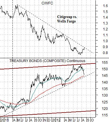
Below is a comparison between the U.S. 30-year T-Bond futures and the ratio between Citigroup (C) and Wells Fargo (WFC). C is supposed to represent the ‘laggard bank’ theme while WFC represents ‘leading bank’.
The C/WFC ratio has turned higher but has yet to break the downward trending resistance line.
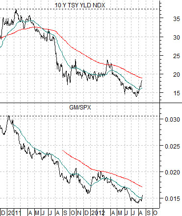
Below we show 10-year U.S. Treasury yields and the ratio between General Motors (GM) and the S&P 500 Index (SPX).
If yields continue to rise then the expectation would be that GM will start to outperform the broad market. The key- in our view- to a sustained trend change rests with the position of the TBonds relative to the 200-day e.m.a. line. Below the line is cyclically positive while above the line favors a more defensive investment posture.