The S&P 500 Index took a nice run at breaking to new recovery highs yesterday before making the case that it was still a bit early for this to happen. We still need to see 30-year Treasury yields move above 3% with the 30-year T-Bond futures nicely below 144. Close but not quite.
We are going to take another pass at an argument that we made on Monday on the fifth page.
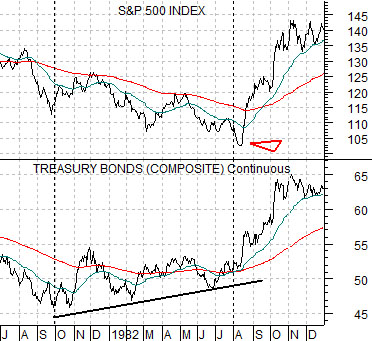
Below is a comparison between the S&P 500 Index and the U.S. 30-year T-Bond futures from 1981- 82.
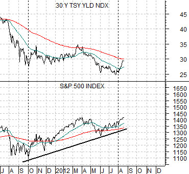
Next we show the S&P 500 Index and 30-year Treasury YIELDS from 2011- 12.
The premise is that in years past the bond market would tend to lead the stock market at both tops and bottoms. Bonds would turn higher ahead of the stock market and then turn lower before equity prices peaked. This was definitely the case in 1981- 82 as the bond market made its cycle lows around the end of the third quarter of 1981 while the S&P 500 Index did not make its bear market bottom until August of the following year.
The intermarkets seemed to have changed somewhat over the past decade with one of the key differences being an apparent shift in the relationship between bonds and stocks at markets bottoms. Instead of the bond market leading the stock market we have shown at in 2002- 03 the stock market actually led yields by close to nine months.
So… instead of arguing that a rising bond market leads to an improving stock market we are suggesting that a rising stock market is a leading indicator of an impending upward shift for yields.
The S&P 500 Index pivoted higher close to the end of the third quarter in 2011. The point of our comparison is to show that the rapid increase in yields in August of this year bears a certain resemblance to the way the S&P 500 Index swung higher in August of 1982.
The key may very well lie with the position of 30-year yields relative to the 200-day e.m.a. line (i.e. around 3.0%). Through 1981- 82 the SPX struggled each time it approached the moving average line until it finally busted to the upside. 30-year yields have also had difficulty holding above this line so the transition from cyclically weak to cyclically strong may be marked by a solid push above 3% by the 30-year Treasury yields.
Equity/Bond Markets
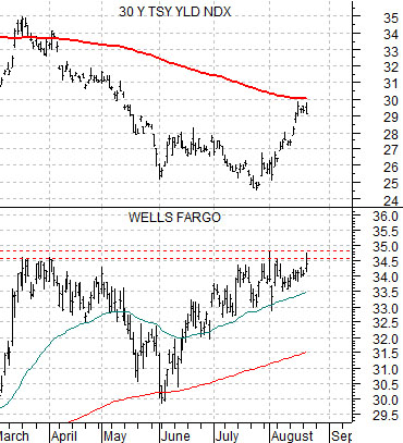
Below we show 30-year yields and the share price of Wells Fargo (WFC). To extend the recovery we would expect to see WFC above the 34- 35 level with 30-year yields moving up through 3.0% and then holding that level (as opposed to the brief foray through the moving average line in March of this year).
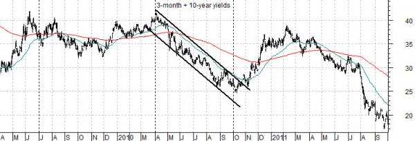
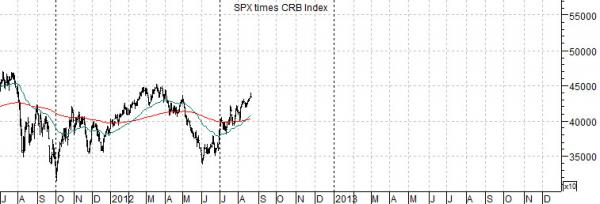
Next is a chart of the sum of 3-month and 10-year Treasury yields along with a chart of the S&P 500 Index multiplied by the CRB Index. The latter combination represents ‘asset prices’ and is used here to represent the cyclical trend.
The argument is and has been that ‘cyclical asset prices’ lag changes in yields by roughly two years. We have fudged the comparison somewhat by lining up the charts with an offset of 2 years and 3 months so that, for example, yields in June of 2009 are being compared to the combination of equity and commodity prices in September of 2011.
The 2-year lag suggests that declining yields lead to cyclical strength… about two years later. Rising yields lead to cyclical weakness with a similar time lag.
The point is that the second half of this year represents a fairly nice window for an improving cyclical trend with the potential for a return to weakness in the first half of 2013 and then another positive time frame in the second half of next year.