We are going to attempt to explain why we are currently suffering from a rather severe case of the ‘twitchies’. To do so we need to set the premise.
Our view is that the markets keep repeating similar trends from decade with the cyclical bottom showing up around the autumn of the ‘2’ year. The problem is that ‘around the autumn’ is less than precise.
At right are three ‘cyclical’ markets that focus on each of the last three ‘2’ years.
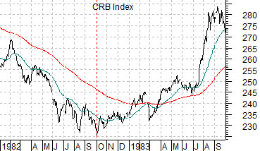
Below is a chart of the CRB Index from 1982- 83. Commodity prices bottomed at the end of September in 1982. The equity markets, of course, turned higher a month or so earlier in August.
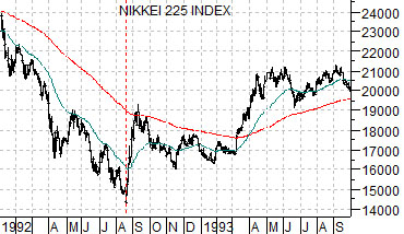
The chart at middle shows Japan’s Nikkei 225 Index from 1992 into 1993. The Nikkei collapsed in 1990 and made its first meaningful bottom in August of 1992.
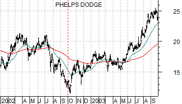
Next is a view of copper producer Phelps Dodge (PD). PD was bought out by FreePort McMoRan (FCX) years later but back in 2002- 03 it was the stock that we used most often to represent the commodity cyclical equity markets theme.
In the midst of a weaker dollar and rising commodity prices the share price of PD still managed to slump to new lows into early October of 2002.
The point? Three cyclical markets making major bottoms ‘around the autumn’ of 1982, 1992, and 2002. The window that describes ‘around the autumn’ runs from August into October.
We started the page off by mentioning that we are somewhat ‘twitchy’. The expectation is that we are in the general time frame for a cyclical bottom- the kind that will mark the start of a rising trend for long-term Treasury yields along with an assortment of cyclical asset prices. The problem that we are facing is that it is entirely possible that the positive trend has already begun which means holding a bullish posture. Yet it is also possible that the nascent cyclical recovery will collapse into quarter end before building back to the upside through the final quarter of this year. The time frame under consideration is quite small but the two paths or outcomes are rather markedly different; which makes us twitchy.
Equity/Bond Markets
We are going to toss out a new thought today. The markets tend to set and then follow a fairly well defined trend through each decade. These trends can usually be described through some combination of dollar and bond market price weakness. The question is… does the trend reflect money moving towards a new theme or simply moving away from the last theme?
We are actually going to make an attempt to explain what this is supposed to mean. Really.
From an intermarket point of view there are four possible trends based on the U.S. dollar and bond market. Each trend favors a different theme.
Strong dollar (i.e. money moving towards large cap and developed markets) and rising bond prices (falling interest rates)- goes with strength in large cap U.S. stocks with an emphasis on ‘growth’ and ‘defensive’. Best trend for the drug stocks, consumer stocks, anything related to consumer growth (like Starbucks years ago), and, to a certain extent ‘tech’ (Microsoft in the 1990’s).
Strong dollar and falling bond prices- still good for large cap and developed markets but better for ‘tech’ as the cyclicals rise in the face of falling bond prices.
Weak dollar (money moving away from large cap and developed) and falling bond prices- money is moving away from large cap and developed towards smaller markets (Latin, Asian, emerging, etc.) while weaker bond prices reflect robust growth. This is the perfect trend for cyclical commodities like the base metals.
Weak dollar and rising bond prices- This is the opposite of offset of the ‘tech’ trend. The weaker dollar supports commodity prices while rising bond prices reflect tepid or negative growth. This is a trend that involves money moving away from large cap markets as growth slows. This is the best trend for gold prices.
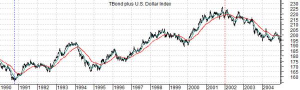
Below are two charts. The top chart describes the dominant trend or theme through the 1990’s. It includes a rising trend for bond prices as well as the U.S. dollar. This was a trend that favored large cap consumer and defensive-type stocks with periodic bursts of intense upward pressure on ‘tech’ each time the bond market began to decline in price.
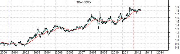
The bottom chart shows the ratio between the U.S. 30-year T-Bond futures divided by the U.S. Dollar Index (DXY) futures.
The ratio rises when bond prices move upwards. Rising bond prices reflect slower growth and/or economic weakness. The ratio also benefits from a weaker dollar. The dollar weakens when money moves towards smaller cap themes (Asia, emerging, Latin, etc.)
The dominant theme through the last decade involved a rising bond market and weaker dollar. The money that poured into the dollar through the 1990’s that helped lift the S&P 500 Index up to its all time highs started to head out the door in 2002. The ensuing trend was all about gold price strength (chart on page 3).
So… the question is… now what? We are at the point in time when a new trend should begin. Will it favor dollar strength or, perhaps, bond price weakness. Our thesis has been that at least for the next few years the trend will be neutral to negative for gold prices.