
One of the key components of technical analysis is taking a look at volume and applying analysis to statistics derived from volume. Most recently the S&P 500 (SPDR S&P 500 ETF Trust) is down nearly 4% from its recent high set in September. Today I want to take a look at one of the ways I look at volume and the buying and selling pressured applied to equities and using it to get a potential warning for possible equity strength or more recently, weakness.
Below is a chart with the S&P 500 in the bottom panel and two indicators to monitor buying (green line) and selling (red line) pressure in the top panel. I’ve shown this chart a few times on my blog, but most recently the divergence that has been taking place has been larger than what we’ve experienced in the last several years.
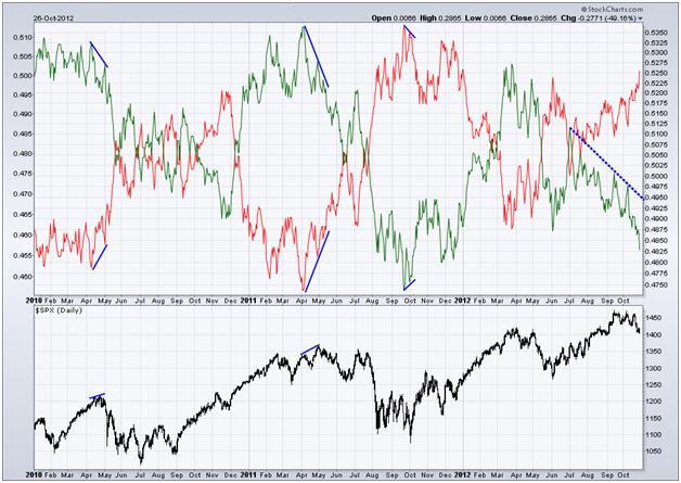
As you can see, the two lines are mirror images of each other, which should make sense because for every buy order filled there needs to be an equivalent sell order. Martin Pring, author of Introduction to Technical Analysis, once said/wrote “volume leads price.” This is evident in the chart above, as buying pressure (green line) starts to fall and diverge from price, sending a warning flare for equities.
Most recently we’ve seen a fairly large divergence in buying volume, lasting almost the entire rally since July. Buying pressure has nearly fallen off a cliff during this recent bout of weakness in the S&P 500, a sign that equity bulls either had weak hands to begin with as they pull the trigger to exit their longs or there just hasn’t been very many bulls coming to the party the last few months, which if true, will create more heartache for those still holding long and strong.
Disclaimer: The information contained in this article should not be construed as investment advice, research, or an offer to buy or sell securities. Everything written here is meant for educational and entertainment purposes only. I or my affiliates may hold positions in securities mentioned.
= = =

