With the markets essentially closed yesterday we found the time to do some work on a new thesis. Given the sheer scope of the argument we have extended the analysis over the fourth page with the wrap up on page five.
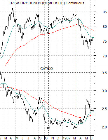
To set the stage we start off with a chart comparison at top right of the U.S. 30-year T-Bond futures and the combination of the share prices of IBM and Merck (MRK).
The first point is that the trend for the bond market remains higher. Regardless of what has transpired over the past 30 or so years one can argue that the trend for financial asset prices is still positive.
The second point is that the TBonds are currently pushed up into the top edge of the rising channel. While this does not mean that bond prices can not go higher… within the context of the multi-decade trend it would likely be fair to suggest that bond prices are ‘high’.
The third point is that within the context of the TBond’s trading channel there has only been one other instance when bond pries were as ‘high’ as they are at present for an extended period of time. There have been a few price spikes along the way but only during the period from 1986 into 1987 did bond prices grind away close to the top of the channel.
Our thesis begins with the assertion that there are similarities- and differences- between the current trend and the one that impacted the markets through the mid-1980’s.
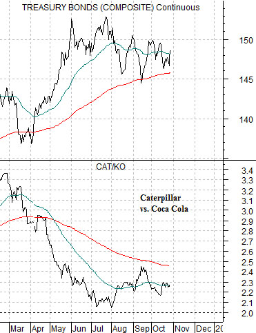
Below are two charts of the U.S. 30-year T-Bond futures. The top chart runs from 1985 through 1987 while the lower chart begins in 2011.
Our ongoing argument has been that as long as the TBonds remain below the peak set at the end of May (around 153) but above the 200-day e.m.a. line (just over 145) the equity markets should remain in a ‘set trend’. This trend has included a positive bias as defensive stocks and those with stable earnings and dividends have lifted in price. In a sense the longer Treasury yields remain near current levels the greater the interest by investors in high-quality companies with secure dividend yields in excess of the return on long-term bonds.
The point is that the TBonds have pushed higher with corrections holding at the moving average line from 2011 into 2012 in a manner similar to 1985- 86.
The thesis that we are attempting to develop revolves around both the similarity and difference between the current situation and that of the 1985- 86 time frame.
In both instances the bond market was driven up towards the top of the trading channel. The argument is that while the outcome might be roughly the same the ‘driver’ appears to be different.
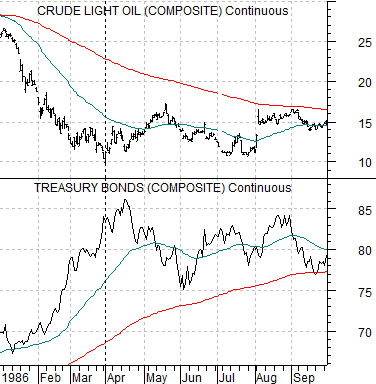
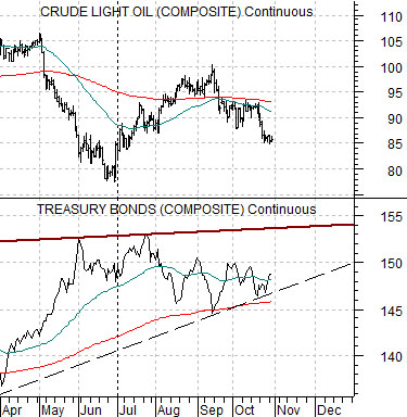
Below is a chart comparison between crude oil futures and the U.S. 30-year T-Bond futures from 1985 through 1987.
The offset for bond price strength from 1985 into 1986 was a collapse in crude oil futures prices. Yet to understand ‘why’ oil prices declined from over 30 down to 10 in a matter of months one has to view the trend for commodity prices during this time frame. The chart below shows the Reuters CRB Index from 1983 through 1986.
Commodity prices were under considerable pressure during this time frame while crude oil fought the trend by holding near the highs for close to two years. Eventually the weight of the down trend swept through the energy complex causing crude oil prices to buckle as bond prices soared.
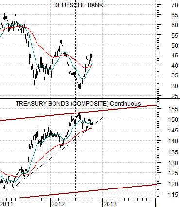
Below is a chart of the TBond futures and the share price of Deutsche Bank (DB) from 2011 to the present day.
The similarity to the 1980’s rests with the steep rise for long-term Treasury prices. The difference- we will argue- lies with the reason bond prices have moved higher. While there is a certain amount of pressure on the commodities markets and even a slight down trend for crude oil prices this is likely not ‘the’ reason why bond prices have moved to the channel top.
The most obvious ‘driver’ would be the series of crises roiling through the Eurozone. From Greece to Spain and from bail out to bail out the markets have been mired in a cyclically negative trend since the end of the first quarter of 2011. The chart of DB suggests that a potential bottom is forming in a similar manner to crude oil futures during the latter half of 1986.