

Geometric charting approaches the financial markets from a very different perspective than the familiar and effective world of oscillators and moving averages. Instead of mathematical formulas using specific price data, price movement itself is treated as an expression of human awareness conforming to geometric principles, which are only revealed when price and time are seen as two inter-dependent aspects.
PRICE AND TIME
Like two sides of the same coin, financial markets display certain properties only revealed through combining ‘both sides’ of price and time into one coin.
Perhaps you have seen some geometric analysis, and like me at first, felt a little overwhelmed by so much going on in one chart. The key to avoiding confusion is to go one step at a time, as geometric charting is very progressive. It requires patience, diligence, and some effort, but it is worth it.
FOUNDATION: UNITING PRICE AND TIME
According to W.D. Gann (the father of geometric charting), uniting price and time is based on $1 per time period, i.e. 1 dollar per week ($1/W) or month ($1/M), with the exception of using 50 cents per trading day (50c/TD). Naturally, much larger price levels call for larger ratios such as $10/M (gold and S&P 500 over 1,000) or 100/M (i.e. the Dow at 13,000). 1
This one-by-one (‘1×1’) relationship also can unite price and time visually, by adjusting the chart’s vertical scale so that this 1×1 line is exactly 45o, perfectly splitting time (horizontal x-axis) and price (vertical y-axis) in half.2
The basic analysis offered by this 1×1 line is that price is considered strong (bullish) if above, and considered weak (bearish) if below.
If 1×1 is such a big deal, then wouldn’t multiplying or dividing the price amount also work? YES! 2×1, 3×1 4×1, 8×1, or smaller amounts like 1/2 x1, 1/4 x 1 (usually expressed as 1×2 and 1×4 respectively) etc. are commonly used for analysis, referred to as ‘Gann Angles’. Therefore, in a $1/TD environment, a 2×1 angle = $2/TD, 8×1 = $8/TD, 1×2 angle = 50 cents/TD ($1 per 2 TD’s), etc.3
APPLICATION
Now let’s apply some of these angles on an S&P 500 daily, using $1/TD (actually 1 point/TD) as our scaling ratio (instead of 50 cents/TD, due to the larger prices), and aligning the vertical scale so that this 1×1 relationship is exactly 45 degrees.4 This line is placed going up from the major low of 1074.77 on Oct 4, 2012, particularly to assess the strength of the recent up trend, as well as 2×1 and 8×1 angles. In addition, descending 1×1 angles are placed from highs at A, B & C.5
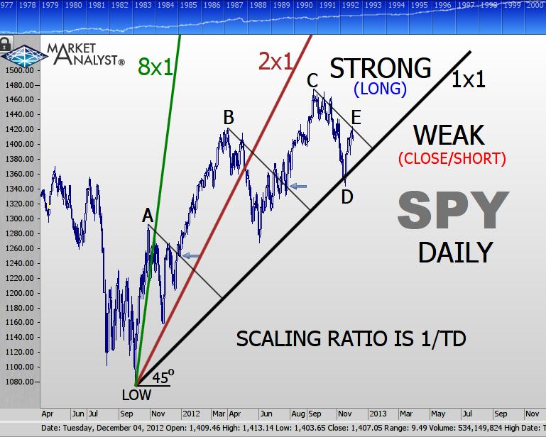
Since the market is still above the ascending 1×1 line, it is considered strong from a longer-term perspective. At D, the bounce showed continued strength, and offered an ideal entry. However, at E the current market is experiencing resistance from a descending 1×1 line from the high at C. From a short-term perspective, price is weak, unless broken to the upside.
In retrospect, the first and second short-term up trends were properly supported by the 8×1 and 2×1 angles respectively, each effectively indicating strength above and weakness below these lines.
Successful breakouts (blue arrows) of descending 1×1 lines from highs at A & B confirm the continuation of the overall up trend, and offer useful entry locations. The second example unfortunately encountered a whipsaw.
In conclusion, the S&P is still strong, but currently trapped in a small area of 1×1’s from important points. A break to the upside implies a continued up trend, and a downside break implies either a bear or sideways market. In this case, the descending 1×1 line from C would be extended downward, with weakness maintained while underneath. In addition, smaller angles below 1×1 from the major low would be drawn for potential support, including 1×2, 1×4 etc.
Now, let’s take a broader monthly look, using 10 points per month, and focusing on the major low of 768.63 on Oct 2002. 1×1’s are drawn from this low and also directly below from zero (a VERY useful concept!). In addition, a 30o angle (green) is drawn from the low.6
IMPORTANT TIP
The price of any low or high can be ‘translated’ into time (and vice-versa!?) by using the scaling ratio. Therefore, the major low’s price of 768.63 divided by 10/M = 76.863 months, which rounds up to 77 months, and which added to Oct ’02 becomes Mar ’09, the next major low at C! Fascinating…
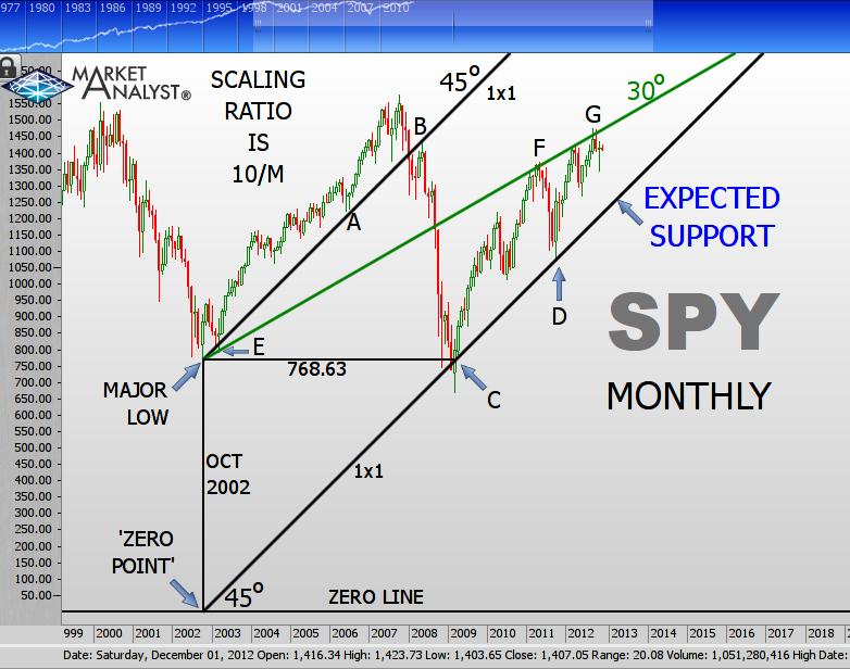
An ascending wedge shape is outlined by resistance at F & G and support at C & D.
The top at G, which is on the 30o angle (30o is 1/3 of 90o), is just 1 month off of 120 months from the major low, which is exactly 1/3 of 360! A great place for a major top, unfortunately for longs.
Similarly, the low at A (great long entry) is exactly 45months from the major low on the 45o angle, which clearly identifies strength and weakness for price, with a great rally top to short at B.
The market is ripe for a correction back to support, which would be first supported by a violation of the 1×1 on the daily chart. Geometric charting is even more effective with this type of multiple time frame analysis. A weekly analysis in 10/M would clarify matters even further.
CLOSING THOUGHTS
Uniting time and price is certainly a powerful ally for any trader or analyst. Geometric charting offers many possibilities, way beyond what is discussed here, including shapes like circles, squares, trig ratios, radians, etc. But you now have enough understanding and tools to get started on your geometric journey. Good luck!
[Editor’s note: Do you have questions for Scott? Please post them below.]
SUGGESTED READING:
- Anything by W.D. Gann
- Gann Made Easy (McClaren)
- Breakthroughs in Technical Analysis (Keller) – specifically the two Gann Chapters.
- Technical Analysis for the Trading Professional (Brown) – Great Gann chapter.
- Anything by Michael Jenkins – for advanced study.
- Numerous Articles by the author in Technically Speaking (MTA newsletter: Feb, Mar, Apr, Sep & Oct ’12 issues), and traderplanet.com (Oct ’12), and numerous blogs at mta.org.
FOOTNOTES:
- Feel free to experiment with any value that has some meaning, such as 9/M (32/M) on gold. Also, my own ‘Relative Charting’ method uses actual price movement for the scaling ratio, but I will only discuss the conventional approach of W.D. Gann in this article.
- Since most geometric techniques can be done mathematically, this step is not absolutely necessary, but it tremendously helps visually!
- For a greater understanding of Gann angles, please refer to Gann Made Easy (McClaren).
- If your charting software does not have this feature, then hold a 45o triangle drawing tool to the screen over the 1×1 line, and adjust the vertical scale.
- If you do not have Gann tools at your disposal, then draw a line from the low with 1174.77 (100 points above) on Feb 28, 2012 (100 TD’s forward), then extend the line. Repeat this procedure with the appropriate multiple for additional Gann angles: i.e. a 2×1 angle with 200 points above and 100 TD’s forward, etc.
- To draw any geometric angle manually using its respective price/time ratio, multiply the tangent ratio of the desired angle by the scaling ratio:
Tan 30o x 10/M = .57735 x 10/M = 5.7735/M

