

If there is one adage beginning traders are likely to hear often from experienced traders, it’s “Identify the trend,” followed by “Trade the trend.”
Sounds simple enough. In fact, almost anyone can look at a chart and see trends as prices make a series of higher highs and higher lows in an uptrend or lower highs and lower lows in a downtrend or meander back and forth in a sideways trend.
Trading a trend may not be quite so simple.
For example, the trend seems to be pretty clear on the E-mini futures chart below. But when and where do you go short?
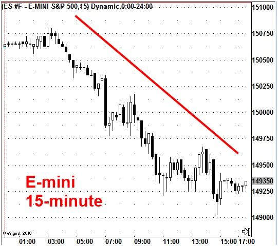
And what happens when you put that chart into the perspective of a longer-term time horizon?
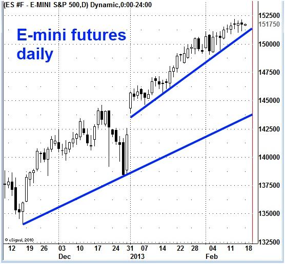
Except for the downside blip in late December, the E-mini trend on a daily basis is clearly moving up, not down like the 15-minute chart. The chart certainly looks bullish in 2013.
Analysts have been spending a lot of energy and effort arguing about the direction for stocks. On one side, they contend stocks will continue in a bull market due to the “Bernanke bubble” with its seemingly never-ending supply of paper dollars stirring up the inflation rate. On the other hand, they warn that all bubbles end badly and the market is headed for a major collapse.
Step back another couple of steps to get more clarification.
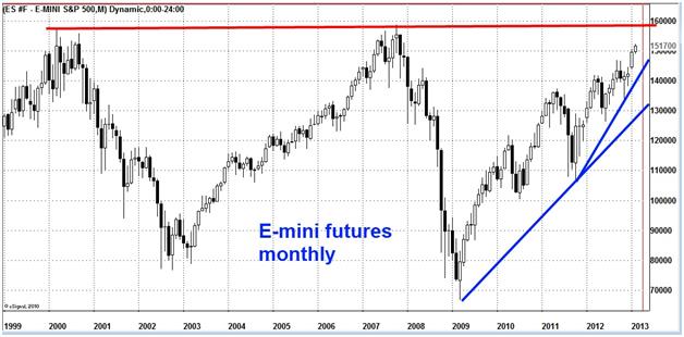
The recent uptrend is intact despite several “corrections,” but lying dead ahead is a potential long-term uptrend barrier at the highs from 2000 and 2007.
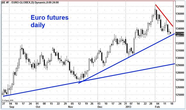
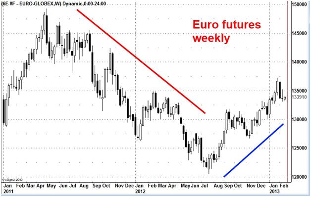
The euro offers another example. In a world where central banks are trying to outdo each other in printing money to weaken the value of their currencies and stimulate their economies (while playing nice and not calling any country out for their policies because they are all doing it), you can think of plenty of reasons why the value of the euro should be sinking, as it has this month.
But a weekly chart probably provides a better overview of trends for financial markets like currencies influenced by government and bank policies.
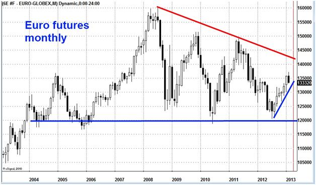
And a monthly chart illustrates an even longer-term picture of the direction of the euro.
Our purpose in this article is not to predict the trend and whether it will continue or reverse in the E-mini or the euro but to emphasize the value of looking at charts for multiple time frames for a given market, depending on the time horizon you are trading. If you trade intraday, look at daily charts; if you trade daily, look at weekly charts; if you are a long-term investor, look at monthly charts. For many traders, a weekly chart may offer the most tradable information.
Among the insights you can gain from analyzing multiple time charts:
- Pressure applied by trends from a greater degree chart or a shorter-term chart.
- Significance of a short-term price pattern – is it just part of a correction/congestion area on a larger degree chart or the start of a potential new trend opportunity?
- Longer-term trend support and resistance areas.
- Key points that may be battlegrounds for continuing or reversing price direction.

