

What does a crash look like?
If you haven’t seen one before, the precious metals showed us one between Monday, April 12 and Friday, April 15 of this year. Gold lost over $260 at its worst point, with a 16% drop in just over two days.
Silver fared worse, cracking 19% in the same period. Those were the most devastating drops we have seen in precious metals three decades. Other metals followed, with large declines in the price of platinum, palladium and copper. We’ll come back to the discussion of copper later in this article.
[Watch Steve Miller, Host of Ask SLM: Daily 12:00 CT at tastytrade.com]
BEAR TRIGGERS
There are many reasons we can give to the decline in metals. The impetus to the break came a few days earlier when European central bank President, Mario Draghi, indicated Cyprus would need to sell gold to raise enough money qualify to receive previously agreed to bail-out funds. That was a shock. What if Euro-zone central bankers wanted other weak peripheral countries to do the same and sell their gold? And why not, since their actions were already a departure from the norm in the way they handled the Cyprus banking crisis.
Other reasons that metals fell might be: India’s gold purchases have dropped off. They’re the biggest user of gold. Goldman Sachs reiterated their bearish call on the metal. The dollar has turned strong, which is often acts inverse to commodities. And many traders thought the short yen – long gold play was a layup. So they got caught in that one big time, which had to add to the margin calls that hit as the metals plunged. Then, of course, there’s the domino effect of gold ETFs selling of holdings as the metal fell.
GLOBAL GDP OUTLOOK
So this article is about oil, right? What does the recent crack in metals have to do with that? A lot! The biggest reason for the break in metals could be that world growth just doesn’t support the prices we have seen. And that’s where copper comes in. The price action in copper, an industrial metal (Often called “Dr. Copper) is historically a good measure of world-wide growth and demand. And the price of copper tends to track the stock market very closely; that is, until February of this year, when copper turned very weak relative to equities (this could be negative for stocks; another whole article).
SOME PERSPECTIVE
Really, metals and other commodities have been weak for a very long time, with the huge early-April break just being the crescendo. Since the highs in most commodities in 2011, Gold is down 31%, copper down 34% and Silver a whopping 55% from peak to trough. We also saw big breaks in the grains, foods and softs. Cotton actually lost over two-thirds of its value since 2011. My take is that the ongoing crisis in Europe, a big slowdown in China, Japan desperate in its deflation fight and U.S growth rate consistently below 2% finally took its toll. And prospects of future growth remain dim.
SUPPLY SIDE SHIFT
While commodities had these massive declines, energies have fared the best. From peak levels, oil is down about 22%, as is unleaded gasoline, with heating oil down just 15%. You certainly can’t make a fundamental case for stronger energies, with shale-oil and fracking technologies sharply tipping the supply-demand ratio to the bearish side in the U.S., and giant new initiatives and discoveries worldwide. This could mean a structural change has taken place in the energy complex, which brings lower prices long-term.
THE TECHNICAL VIEW
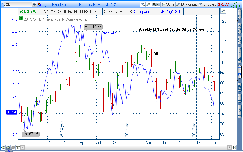
So now that I said all this background fundamental stuff, I prefer to make my case in the charts. Let’s look at the chart below which shows the relationship between copper and oil. The “bar chart” is oil and the “line chart,” in blue, is copper. You can see the amazing correlation between the two commodities, with copper often leading the way in both directions. Copper is now threatening its 2010 low, while oil is still $13 above that level (around $75). If copper is leading the way again, oil is in for a big downside break.
Next, I’m going to show you a chart you of the likes you have probably never seen. Below is a 3-year weekly chart of crude oil that includes cyclical analysis. A cycle is a repeating pattern that is measured from low to low. I keep charts on 400 stocks, ETFs and commodities, of which about 77% have very readable cyclical patterns. In this case, you can see that the cycle length is very apparent, with major lows 32 to 36 weeks apart. The rising phases of these cycles are shaded in green and the declining phases in red.
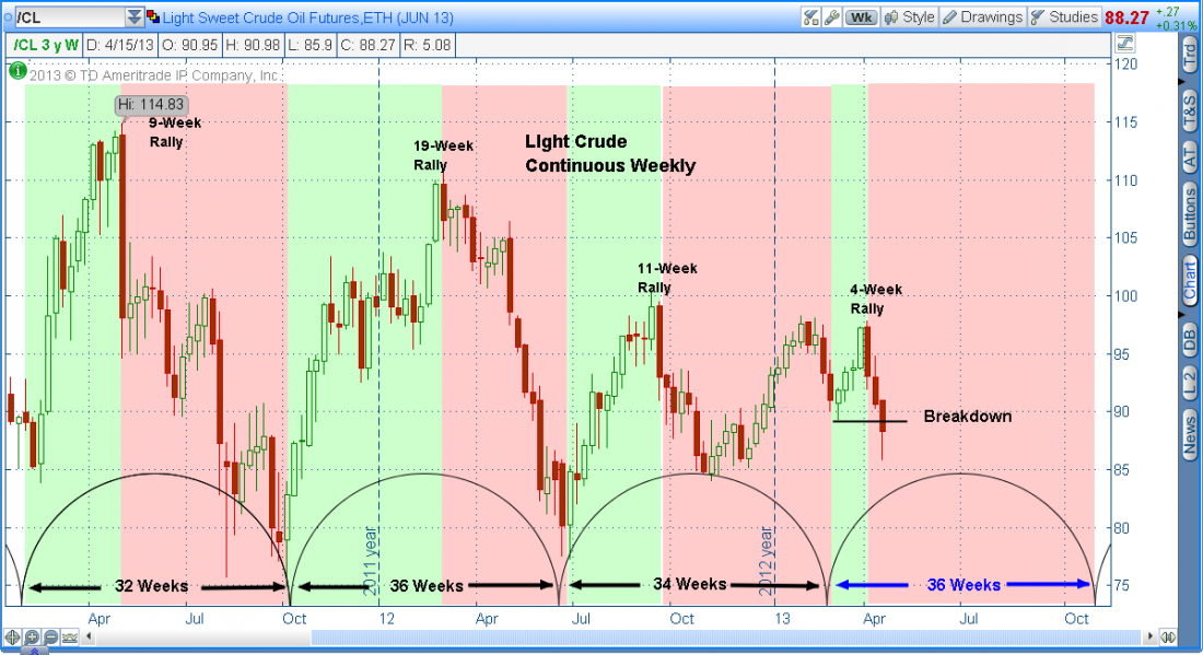
There are several important things to see. First, notice the declining peaks. That’s an indication of a long-term bearish trend. Next, you can see that the lengths of the rally phases are diminishing, with the last rally in the first quarter of 2013 only being 4-weeks long. The most important thing to see is that the breakdown in price, in April of this year, ends the rising phase and sets oil in a negative phase that lasts into October of this year. So between the negative messages copper is sending on growth and demand and the cyclical analysis seen here, oil looks to be in some big trouble.
How low can oil go? Support we already discussed around the $75 is quite obvious. That level is also the 50% retracement level of the rally off the 2009 low to the 2011 high. If selling really becomes panicky, however, which is what we have already seen in many commodities, the price of oil could retreat to the 61.8% retracement level at around $64 a barrel.
THE TRADES
How do we play it (if you believe it)? Well the obvious is to short oil or its products, gasoline or heating oil. For those who do not trade futures or are more risk averse, there are other choices. There are a few very tradable oil ETFs. The most active is USO, the United States Oil Fund, which correlates with oil nearly perfectly. Option trading in there is huge; and “call credit spreads” or long puts offer a great way to have defined risk. A decent inversely-correlated ETF is SCO. This security is Proshares Ultrashort ETF, which moves 2x the opposite direction of crude oil. So if oil is down 1%, this ETF will rise about 2%.
Another way for those much more investment minded is to buy stocks in airlines. These companies tend to benefit from falling oil, jet fuel, being about 35% of their operating cost. My two favorites based on chart patterns are UAL and DAL.
Of course, I could be wrong about oil. However, since my bias comes from 39 years study in chart patterns and cyclical analysis, and since I’m an active trader, I can guarantee you that over the coming weeks I will have trades on that will benefit from a decline in oil in many of the aforementioned symbols. That’s my disclosure.

