

The stock market has had a massive run since the bottom of the financial crisis.
As measured by the Dow Jones Industrial Average, the stock market has rallied from the 2009 low of 6469 to the August ’13 high of 15,658. That’s a gain of a massive 142% in 54 months. In comparison, the average cyclical bull market rises for about 26-months, with an average gain of under 90%. This bull is about double in length and one-and-a-half times the magnitude of the average bull market in the past century.
= = =
Watch Steve Miller every day on Tastytrade.
= = =
It’s easy to get in the argument of whether the stock market is overvalued or not. I’ve done that already in a past article in the TraderPlanet Summer Journal: “The Myth of the Undervalued Stock Market.
THE TECHNICALS
In this article, I want to focus on the technical aspects of the stock market, and how we’ll know when this old bull has sounded its last snort.
TOP PICK
One of my favorite tools in my arsenal of technical studies, also used by the vast majority of market technicians, is moving averages. A moving average is mathematical computation created by adding a specific number of data points and dividing it by the number data points used. So a 10-day simple moving average (SMA) of the closing prices of a security is derived adding the past 10 closes and dividing that sum by 10. What you get is a smooth line on the chart, as each new day is added and the 10th day back is dropped.
GOLDEN CROSS
Chartists tend to use combinations of MAs for buy and sell signals, as they cross over each other, for support-resistance or for trend analysis. There are infinite variations of moving averages, with the most commonly used set of MAs being 10-day, 50-day and 200-day. The famous “Golden Cross” comes when the 50-day moving average crosses above the 200-day MA. And the dreaded “Death Cross” comes when the 50-day moving average drops below the 200-day moving average. Also, it is said a security is bullish when the prices is above the 200-day average and bearish when it’s below. Thus, the 200-day is often considered support or resistance.
DEATH CROSS
I don’t like to use the common studies, so I do a lot of testing of other combinations of tools and their input values. I want to take a look at the “Death Cross” and compare that to one of my variations to see which signal really works, and look at the present condition of the stock market.
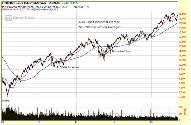
The chart below is a daily bar chart of the Dow Jones Industrial Average for the present bull market (since 2009). The 50 and 200-day moving averages are plotted on the graph. Note that in 2010 and 2011 the index fell below the 200-day MA and the 50-day MA gave the “Death Cross” signal, saying the stock market was in trouble. Both of these were false breakdowns and would have taken the investor out of the market. Even in 2012, the Dow fell below the 200-day MA, which was a false signal. So does the Death Cross mean death to the market or death to the investor who follows it?
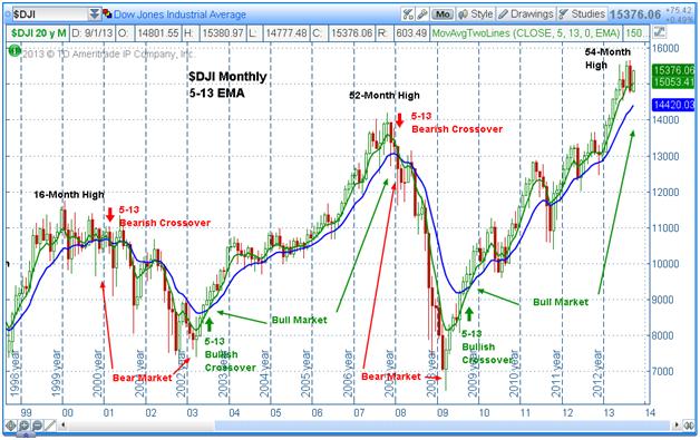
Now look at the next chart. I love this one! This is a monthly chart of the DJI for the past 15 years. It shows the past two full bull-bear cycles and the current bull market. The moving averages I use here is a different set than used on the weekly chart above. Here I used the 5 and 13-month exponential moving average (EMA). An exponential MA gives more weight to the more recent data. I think you will see this is a very valuable tool. This set of MAs is made up of two “Fibonacci” prime numbers; a set I find very reliable.
DIGGING DEEPER
Look at the bottom of the bear market in 2009, which begins the same period I looked at in the previous chart. Note that the 5-13 MAs gave a bullish crossover in late 2009 and has not given a negative signal since. That includes the two major corrections in ’10 and ’11. So, this study set has defined the major (bullish) trend very well. If you look back at the bear-market bottom in 2002, when the bullish cross came, it set up the major bull market and a gain, from that point, of 5000 points. There was not a threat of a bearish signal, until the real signal in early ’08. That bearish signal came with the DJI at around 12,250, on the way down to 6,500. There is a similar bear signal at the top in 2001, setting up that 32% drop (just your average bear).
Just for added delectably, I have added in the monthly counts for the cyclical bull markets. The bull market in 2000 peaked in the 16th month from the last major low in ’98 and moved in a wide range before succumbing to sellers after the bear cross. The bull that ended in ’08 stretched to an amazingly long 52 months, one of the longest in history. And now, this bull is 54 months old, a point where it’s stretched, historically, from which a huge downside snapback is very likely.
A TOP IS AT HAND
There are two other technical tools that are giving warnings also. The candlestick pattern in August is a “bearish engulfing” pattern, opening higher than the previous body and closing lower (outside bar). That signals a top is at hand. And the distance between the 5 and 13-month MAs is quite far. That is a “Moving Average Convergence-Divergence” (MACD) bearish warning that worked very well at the peak in 2008.
Still, those moving averages tell the tale of the major trend. The 5-month IS well above the 13-month MA. With bearish warnings abound and a significant correction likely in the next few months, when it does come, these moving averages will tell us the condition of this very old bull.
= = =
He’s back!
The AskSlim column is now a regular item in the TraderPlanet quarterly Journal. Stay tuned for the Fall edition to be released shortly. But, you can always post a question for Slim below too. Subscribe for free to this educational trading publication here.
= = =
Market Moving News: What Does The Fed’s Decision Really Mean?

