

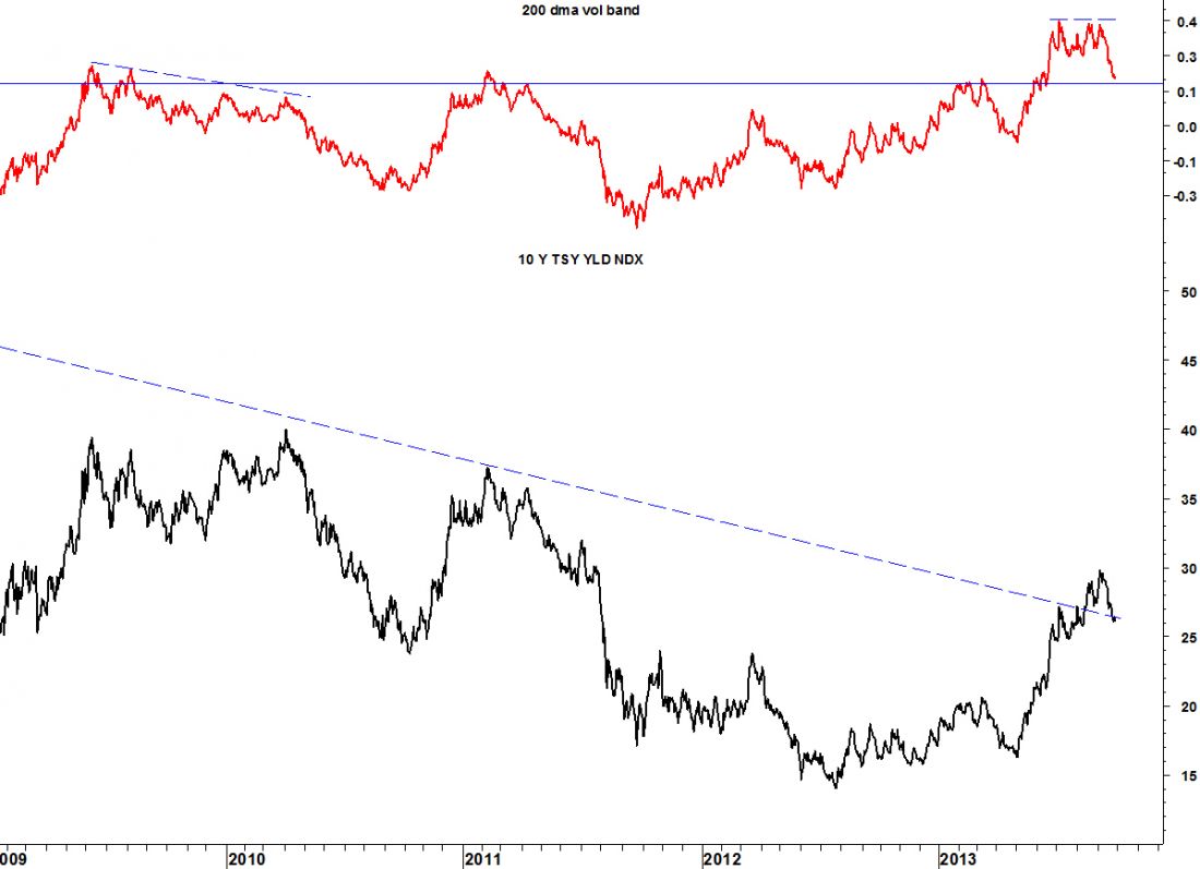
TNX is the symbol for the interest rate on the ten-year, U.S. Treasury note. One observation which has kept me from getting bullish about TNX (despite the break out above the long-term trendline) is the level of the red line in the chart below.
CHART ANALYSIS
The red line represents the distance between TNX and its 200- day moving average. Since last July it has far exceeded its highs at past tops in TNX (which is probably long-term bullish) but, not only did that level appear stretched, but it failed to confirm the higher highs in TNX seen in August and September.
TREND CHANGE
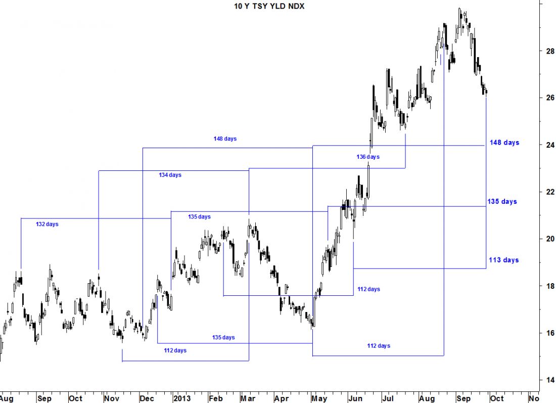
Now that TNX has dropped back below the trendline and its 200-dma volatility band has dropped back to the old level of resistance, I expect a bottom and I think Friday was it. TNX exhibits a number of – not cycles – but closer to what George Lindsay called “intervals of equidistance.” These intervals appear to be pointing to a change in trend last Friday.
= = =
Request your free copy of the Special Report: Gold, Now It Gets Interesting at Seattle Technical Advisors.

