

Philly Semiconductor Index (SOX)
Much has been said and written about sector analysis and the use of ratio charts to assess the strength of a particular market sector versus another, or relative to a benchmark index such as the S&P 500. Money managers often incorporate sector and ratio chart analysis into their investment models in order to proactively manage risk. For example, in their recent Charles H. Dow Award winning paper titled “An Intermarket Approach to Beta Rotation,” Charles V. Bilello and Michael A. Gayed exploit the Utilities sector and its unique characteristics to devise a simple buy-and-rotate strategy that can significantly outperform the traditional buy-and-hold strategy posited by proponents of the Efficient Market Hypothesis.
While no particular single-variable approach to risk management is infallible, the Philly Semiconductor Index (SOX) has undoubtedly earned a prominent place among the most reliable forward-looking indicators, consistently shining a bright light on the stock market’s future trend since the latter emanated from the 2007-2009 rubble. For instance, chart 1 below depicts the SOX/SPX relative-strength ratio and the multi-month bullish base (i.e., the blue Head and Shoulders bottom) it traced out from mid-2012 through early 2013. Unsurprisingly, the subsequent breakout foreshadowed 2013’s exceptionally strong performance, the consequences of which continue to permeate the pores of the stock market.
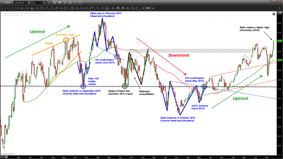
Chart 1. The SOX/SPX relative-strength ratio predicted every major turn since the 2009 bottom.
Coincidence? Hardly. Perhaps chart 2 below will further bolster the SOX’s precursory characteristics. For instance, back in February 2011, only three weeks ahead of the Japanese earthquake and tsunami, the SOX unexpectedly ran out of steam, reversing course upon running into the 2004-2007 triangle’s b-d line. However, as the SOX retreated, the major indices surprisingly kept advancing for several months before the “string finally snapped.” It is precisely this multi-month bearish non-confirmation (i.e., divergence) that precipitated the summer 2011 swoon!
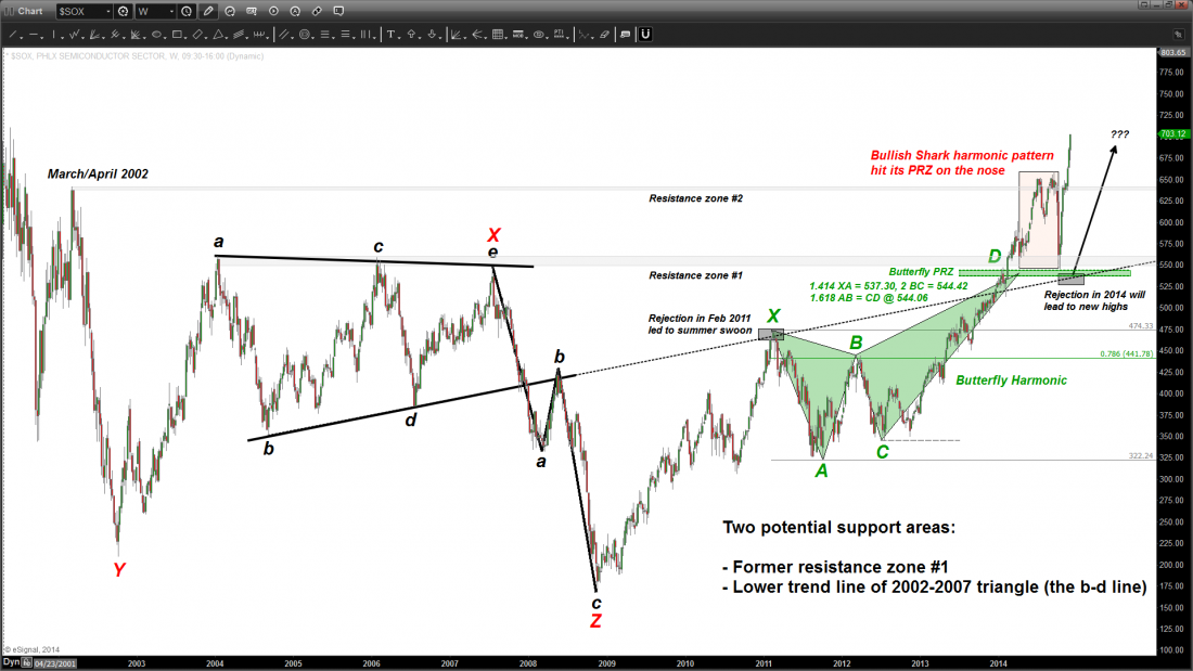
Chart 2. In October 2014, the SOX back-tested the triangle’s d-d line and was subsequently rejected… Exactly NOT like 2011.
Enter 2014. The year got off to a chaotic start with the SOX hardly budging. Having cleared the entire price zone occupied by the 2004-2007 triangle, the SOX briefly exhaled to the tune of 7% in April on the heels of a whopping 12% gain during the first three months of the year. The SOX would then bottom on April 15th while still up 4.2 percent for the year. In contrast, this tepid two-week pullback, which tested a prior resistance zone (i.e., top of triangle), was dwarfed by 8.7% and 10% pullbacks in the Nasdaq 100 and the Russell 2000, respectively.
In short, the March-July 2011 stock market advance leading up to the summer swoon was largely unconfirmed by the SOX, and so was the corrective action during the first few months of 2014. It is precisely this bullish non-confirmation on the part of the SOX that imminently set the stage for the subsequent rallies to new all-time highs during the second half of 2014.
Nasdaq Composite (COMPQ)
While stock market pundits have been flocking in droves to pitch their predictions for yet another bullish year, the ongoing sideways market, which began in late November / early December 2014, appears to have set the tone for at least the first one or two quarters of 2015. The monthly chart of the Nasdaq Composite (COMPQ) below sports a recognizable pattern, namely, a harmonic Crab having a calculable upside objective of 7000-7600 (the potential end of the 5-wave run that began back in October 2002). However, as shown in the chart, green wave 3 has either ended or will do so upon reaching the all-time high set back on March 1st, 2000. While the chart of the Nasdaq 100 (NDX) is not featured in this article, it is worth noting that its wave 3 would achieve a size of 2.618 x wave 1 upon reaching its corresponding all-time high recorded back on that same date fifteen years ago. From a conventional chart pattern perspective, the multi-year price action is clearly painting a bullish picture, i.e., that of a massive “Cup and Handle.” Within this pattern, the “Handle” section is none else but green wave 4, which is expected to unfold over the course of several weeks, if not several months. As the saying goes, “the bigger the base, the higher in space”. And this isn’t only true of the index itself, but also of myriad individual stocks, the likes of AAPL, INTC and YHOO, to name just a few.
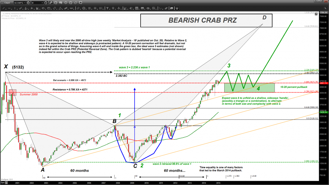
Chart 3. The bigger the base, the higher in space… The Nasdaq Composite is challenging the all-time high set back fifteen years ago. The overall pattern is a massive “Cup and Handle”, with green wave 4 the prospective “Handle” section.
#####
Related Reading
Read another story by this author…

