
Is talk of another GFC a reality, or just ridiculous speculation with no foundation whatsoever?
Recently I wrote a very well received piece on the recent Greek Debt Crisis where I looked at the cold hard facts when the media went all crazy about a potential oncoming European Crisis, “Will A Greek Exit Trigger Another European Crisis?” It seems like we need to revisit this crisis topic all over again.
Last time, the markets were in a panic over a potential break-up of the Eurozone due to a possible Grexit in June, this time we are in another panic over various other reasons ranging from a slowing Chinese economy, to plummeting oil prices, and the likelihood of the Fed finally increasing rates this September.
In general, I don’t like to predict, especially about economic matters. Why? Because my history of getting predictions right is sketchy at best.
Warren Buffett famously quotes ‘It is better to be approximately right than precisely wrong.’ What words of wisdom…
However, I do like to research what is really happening around the world markets based on hard facts and then form the best educated opinion I can based on my findings.
This allows for an unbiased decision making process simply because I have already established my thoughts beforehand.
Everyone has opinions, me included. So rather than tell you what I think, I’m now going to show you two powerful fundamental risk charts that pretty much tells the story of the whole market as it stands and will give you a sense of whether we are in for another GFC style recession or not.
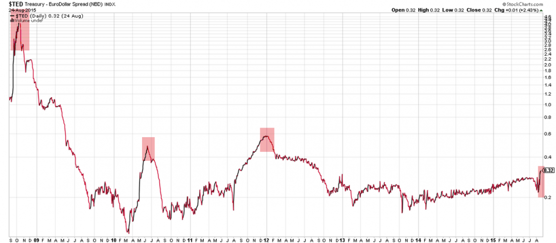
TED Spread
I’ve been using the TED spread for a while now and it is simply the difference between 3 month US Treasury futures against that of 3 month Eurodollar futures.
In layman terms, it basically measures the likelihood of corporate borrowing default as the spread gets larger. Simply by seeing how bad it got during the recent GFC (measuring above 4.6 compared to the current 0.32), tells us the market as a whole does not believe we will have similar corporate borrowing defaults as compared to the recent GFC.
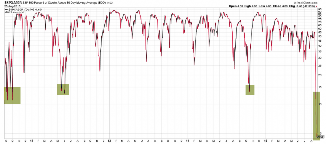
50 Day Moving Average % Stocks S&P500
With only 4.6% of stocks within the entire S&P500 index above their 50 Day moving average, the chart portrays how oversold our market is. If history is anything to go by, when the markets gets as oversold as this, there is a high probability there will be a snap back recovery over the coming week and months. Just like we had in the past.
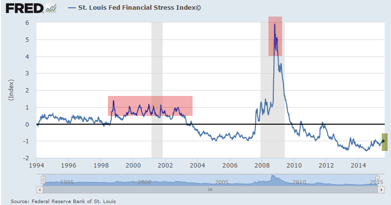
FRED Financial Stress Index
This very important index amalgamates a series of 18 weekly data sets consisting of seven interest rate data measurements, six yield spreads and five other indicators. The current measurement of -0.968 is extremely low by historical standards. You only need to see how high it got during the Global Financial Crisis period as highlighted in grey.
It is this type of data which allow me to measure the true back-end state of the market and confidently take advantage of new opportunities when others are in panic mode.
I always remember the famous Buffett saying; ‘Be fearful when others are greedy and greedy when others are fearful’.
Now is the time to be in the latter camp and take advantage of an abundance of recent market bargains over the coming days and weeks.
To see how you can double your returns ‘safely’ in 10 simple steps, click here.

