

You may find it hard to believe, but the bulls have been steadily leaving this market for the last 13 years!
The AAII ( American Association for Individual Investors ) has been tracking the weekly sentiment of its members since 1987. It is an intriguing look into the collective minds of the individual investor, letting the reader track the swings from bullishness to bearishness and back again and also allowing the reader to see what the market has done in the wake of these mood shifts.
The data can be found here
While the results are not scientific, and cannot be used as a timing tool, they are definitely a window into the investment stance of the mom and pop investor. we can see whether they are stuffing their hard-earned money into stocks or stuffing it under the mattress!
 .
.
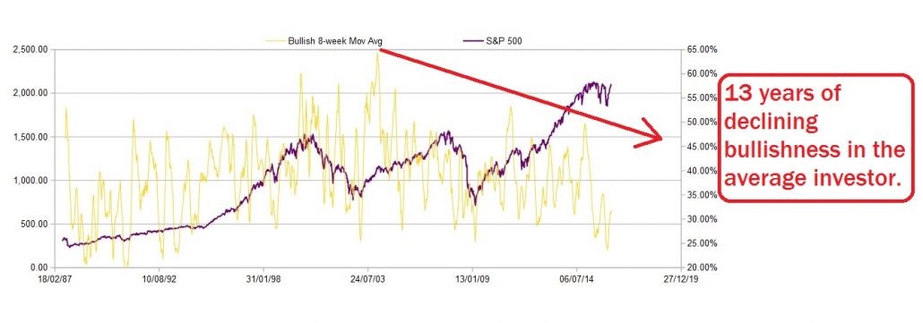
In the chart above I have plotted the 8 week MA of Bullish investors with the S&P 500, and it reveals some striking points. Bullishness topped out way back in 2003 on a rebound off the internet crash low. It was an all time high for the survey of almost 65%, and bullishness has been on a long slow march downwards ever since then.
The only market top that individuals were increasingly bullish into, was the .COM top. The 2007 top in stocks did not coincide with a bullish % top, in fact the bullish % had been decreasing since 2003.
And the current top? Well Individual investors are downright depressed! Even though the S&P is a full 30% higher now than 2007 top!
It does beg the question, ” who then, is buying this market?”.
Is it simply a FED engineered, institutional buying frenzy?
The Shorter term data is shown below.
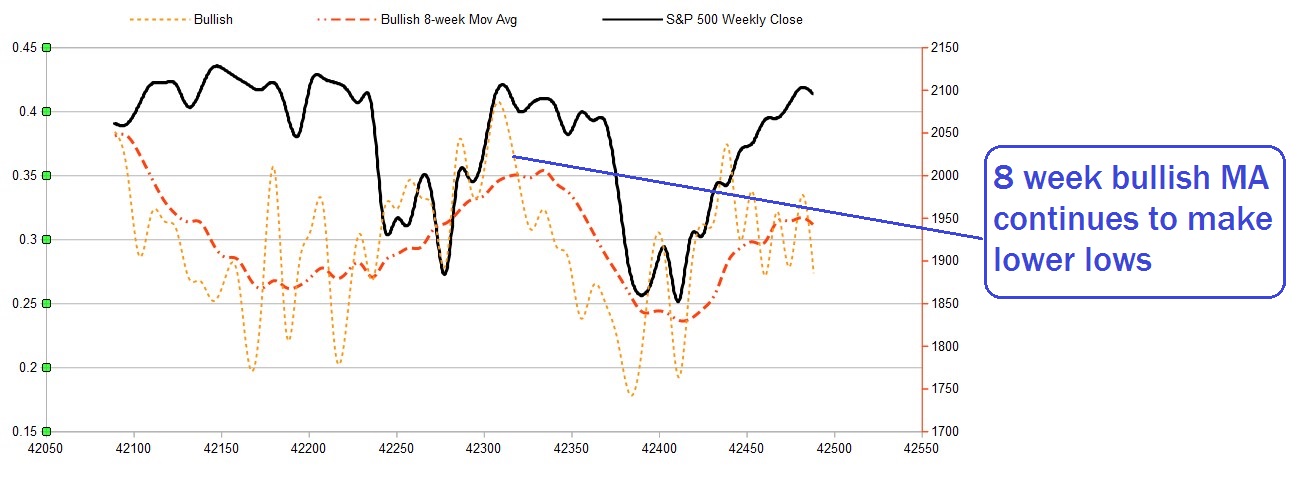
The S&P has remained almost unchanged for over a year at this point, with two sizable dips in the meantime. All the while the 8 week MA of the bullish % has put in a series of lower highs.
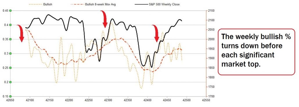
If we were the inquisitive type, we could use this data as a type of moving average crossover signal. Using the MA line ( in yellow ) as the slow average and the weekly bullish % line as the fast average.
You can see from the chart that the mini crash in December/January was preceded by a downwards cross in November. adding at least some predictive quality to the data.
A similar signal may be happening right now, with three downwards crosses in the last month alone.
It may be the case that we are reading too much into this small subset of data, BUT, on the other hand it may be trying to tell us something.
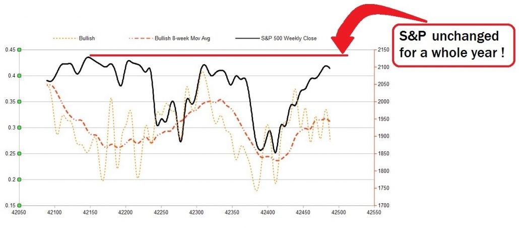
The wider market has been slogging along for the last year bouncing back from major resistance at the 2140 level twice in that period, couple that with declining volume across the board, a generally bearish Elliott wave perspective and long-term investor sentiment that is simply not willing to get excited, and we could be setting up for some fireworks in the months to come.
Keep an eye on our weekly Elliott Wave and technical analysis across the markets to stay on top of the trends.
If you liked this article, give it a share!

