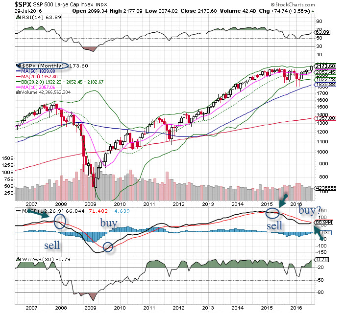
Since Spring of 2015 it has been my assessment the markets had entered into a bearish phase, as evidenced by the turnover on the MACD. As we can see from the chart and the arrow, when this cross occurred (where the black line crossed the red line) the long term cycle changed from bull to bear. We can see this same pattern happened in 2007, and certainly proved to be the case, it paid to follow the indicator into the massacre that occurred to the financial crisis.
Being on the side of caution helped to save quite a bit of capital for many. Further, being defensive and using puts for protection was the operative strategy, and holding large amounts of cash.
Likewise, when the bells rang to get long on the next bull cycle there was plenty of upside to be had. But this last bear phase was rather shallow in duration but with some violent moves to the downside. Interestingly, the prior bear phase started at the old highs (for SPX 500), and this potentially new bull phase starts just a bit higher than that. Bull trends reflect markets that go higher, while bear trends reflect markets that do not go higher (they can go sideways).
As the month of July came to a close, we see the MACD crossing to a bull signal, for the first time since 2011.
But to call a bull market phase at an all-time high seems counter-intuitive, but we’ll just go with the time-tested signals that often do not fail us. While there will be challenges, the stock market is entering a new bull cycle, it’s time to play it that way.