As the month and quarter comes to a close we thought we would attempt to show one of the reasons why the recent markets have been so challenging. Challenging, of course, is another way of writing… perplexing,frustrating,or down right exasperating.
Over the years we have done all kinds of chart-based ‘spins’ on the idea that the cyclical trend lags changes in interest rates by two years. At times we use long-term Treasury yields while on other occasions we focus on the sum or combination of short and long-term yields. We tend to like the ‘sum’ because it averages out the bond market’s acuity withcentral bank myopia. In other words while the bond market is typically correct and leads the Fed by a disturbingly long period of time changes in central bank policy carry a substantial amount of weight with respect to cyclical growth.
In any event… today we are going to focus not only on short-term interest rates but also on the way the European Central Bank (with some help from the Bank of Japan) is messing up our work.
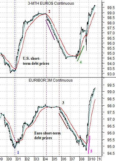
At right we show a comparative view of 3-month eurodollar futures (short-term U.S. dollar denominated debt prices) and 3-month euribor futures (short-term euro denominated debt prices).
Notice first that through 1999 and 2000 the trends were identical. Both U.S. and European short-term interest rates began to tumble at the end of 2000 as debt prices pushed higher. Our argument has been that falling interest rates will turn the cyclical trend positive- with a lag of two years. In other words declines in short-term yields at the end of 2000 indicated a return to positive cyclical growth in late 2002. Right about the time that the 2000- 2002 bear market came to an end.
Things began to get a bit strange, however, in 2004 as short-term U.S. interest rates began to rise even as short-term European rates held at the lows. In other words the Fed began to tighten monetary policy in the spring of 2004 after energy prices pushed to new highs while the ECB kept policy expansive into the autumn of 2005.
Add two years to both dates and we discover that both the spring of 2006 and the autumn of 2007 marked key cyclical trend change points. In the spring of 2006 copper prices peaked while in the autumn of 2007 the Chinese stock market began to collapse.
The next point would be that the emergence of the ECB as a separate and independent monetary policy power seems to creating multiple instead of single cyclical trend change points. Notice, for example, that U.S. interest rates began to decline in the autumn of 2007 while European rates held near the highs deep into 2008. The cyclical trend was supposed to turn positive during the second half of 2009 but we can make an argument that at least some facets of it could remain under pressure until the final quarter of next year.
In the mean time one of the best explanations for the crazed swings forex rates comes from the chart above. To the extent that the Fed raises or lower interest rates while the ECB pursues an independent policy capital is incented to flood into and out of these currencies which, in turn, magnifies the impact of policy differences.
Equity/Bond Markets
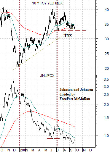
One of our views is that the markets have been waging a very intense battle with respect to the cyclical trend. To explain we show a right a comparison between the yield index for 10-year U.S. Treasuries and the ratio between the share price of Johnson and Johnson (JNJ) and copper producer FreePort McMoRan (FCX).
In theory- and usually in practice- the JNJ/FCX ratio swings inversely to the trend for long-term Treasury yields. In other words falling yields go with slowing cyclical growth which, in turn, leads to an improvement in the relative strength of JNJ compared to FCX. Rising interest rates, on the other hand, indicate positive cyclical growth which pushes the JNJ/FCX ratio lower.
From June through September yields have held below 4.0% and above roughly 3.25%. The JNJ/FCX ratio has continued its downward push as the equity markets focus on the prospect of an economic recovery that the bond market apparently is questioning. Our view has been that a clear break below 3.3% for yields will require (page 3) a push below 1.60 for gasoline futures and if this comes to pass… look for the JNJ/FCX ratio to bounce rather sharply higher.
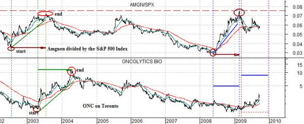
Did you know that we are the midst of a small cap biotech boom? Those holding names such as Human Genome Sciences (HGSI), Oncogenex (OGXI), or Affymetrix (AFFX) probably do but with all of the focus on China, Brazil, base metals, and energy prices this trend has not received wide attention. To explain we show a comparison below between the ratio of Amgen (AMGN) to the S&P 500 Index (SPX) and the share price of a small Canadian biotech company called Oncolytics (ONC on Toronto). We are simply using ONC to represent the ‘small cap biotech’ theme.
Between 2002 and 2003 the AMGN/SPX ratio pushed powerfully higher as large cap biotech outperformed the broad market. Once the ratio peaked in 2003 money began to rotate out from large cap to small cap which pushed the share price of ONC upwards into 2004.
Keeping in mind that we argued in favor of large cap biotech through much of 2007 and 2008- generally focusing on Genentech which was eventually take over the Roche- we can see on the chart that the AMGN/SPX ratio pushed back up to roughly the same peak as 2004 earlier this year.
The chart suggests that similar to 2003 the peak for the AMGN/SPX ratio marked the start of a small cap biotech trend. Our thought is that this trend could run for at least one more quarter with the potential for a peak towards the end of this year.