We thought that we would start off today by checking back in on a couple of arguments that we have made in past issues. We throw quite a bit against the wall on a regular basis so it usually makes sense to look back to see whether anything has actually stuck.
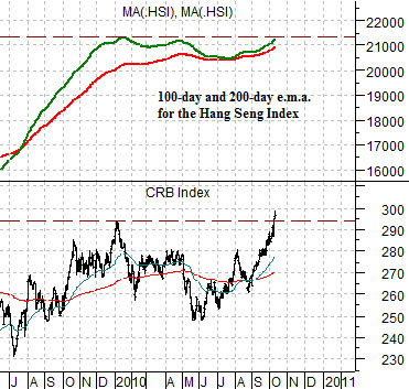
The chart below compares the CRB Index (commodity prices) with two moving average lines for Hong Kong’s Hang Seng Index. In this instance we are using the 200-day e.m.a. (red line) and the 100-day e.m.a. (green line).
The argument was that if the green line crossed down through the red line then the cyclical recovery was turning negative. Note that the ‘crossing’ of the moving average lines last occurred in the autumn of 2007- months ahead of the collapse of commodity prices but right on time with the start of Asian weakness that eventually led to falling asset prices.
The chart shows that the moving average lines converged this past summer but failed to ‘cross’. As the Hang Seng Index began to recover the comparison suggested that commodity prices would once again start to lift. With the CRB Index reaching new recovery highs… even we have to admit that actually got one ‘right’ for a change.
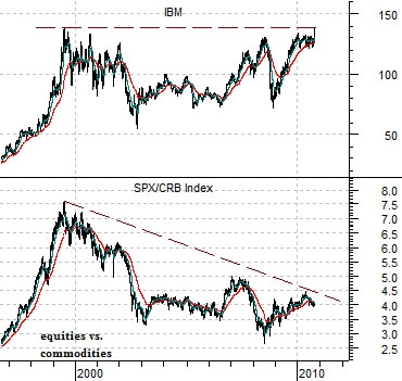
Below is a comparative view of the share price of IBM and the ratio between the S&P 500 Index (SPX) and the CRB Index.
We have been following IBM quite closely over the past few months. The stock has recently reached new all time highs although the break out above 1999’s price peak is still too small to be clearly visible on a long-term chart.
Our argument was that IBM was likely to be one of the first stocks to reach new highs following more than a decade of price consolidation. So far, so good. The next argument was that a rising trend for IBM should lead to a rising trend for the SPX/CRB Index ratio. This remains a work in progress. In terms of the ‘math’, however, this is still somewhat interesting. With the CRB Index rising towards 300 all it would take is a push by the SPX/CRB Index ratio towards 5:1 to carry the SPX all the way up to 1500. In other words while many worry about 1150 or 1220 it is not that big of a stretch to contemplate a return to something closer to 1500 over the next few months.
Equity/Bond Markets
We will start with the chart below given that it is an extension of the equity/commodity ratio discussed briefly on the first page.
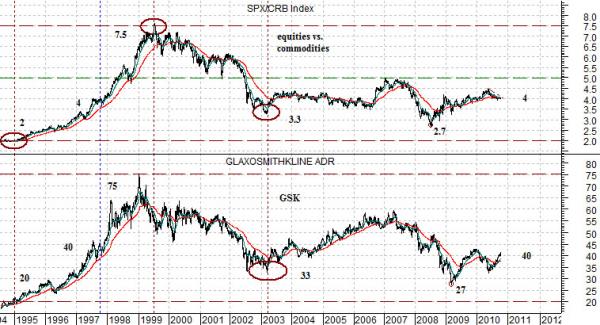
The chart compares the share price of GlaxoSmithKline (GSK) with the ratio between the SPX and CRB Index.
The argument was that the share price of GSK seems to track the ratio quite closely. The peak for GSK back in 1999 was, for example, roughly 75 while the ratio topped out at 7.5.
At present the market appears to be back in balance as GSK’s share price settles in around 40 while the ratio has declined back close to 4:1. The point is that if the ratio is going to rise up to 5:1 to help swing the SPX back up to the top edge of its trading range then the large cap consumer and pharma stocks have to able to rise as well. If one can imagine a stock like GSK- currently trading in the 41’s and yielding around 4.7%- trending up to 50 then the idea would be that the SPX has the potential to move fairly rapidly up towards 1500.
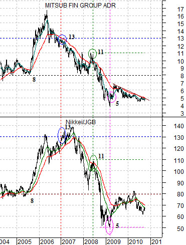
The chart further below compares the share price of Japanese bank Mitsubishi UFJ (MTU) with the ratio between the Nikkei 225 Index and the Japanese 10-year (JGB) bond futures.
Our argument has been that MTU tends to trade close to the Nikkei/JGB ratio. In 2004- 2005 when the ratio was close to 80 times the share price of MTU was roughly 8.
To kick MTU back to the upside in a meaningful manner we still need to see a much stronger Nikkei and… a much weaker Japanese bond market. This is one of the reasons why we have been focusing so hard on the long end of the Japanese bond market as we attempt to discern whether it is possible for yields to start to rise once again in the face of a very strong Asian/Latin/emerging markets growth trend.