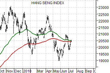
Below are two comparative charts of the CRB Index and… an overlaid and likely needlessly complicated view of natural gas futures (in black) and two moving average lines (200-day e.m.a. in red, 100-day e.m.a. in green) for Hong Kong’s Hang Seng Index. The chart at top right is from 1997 into 2002 while the chart below right runs from 2007 to the present day.
The premise is actually quite simple. Really. There is a basic relationship between ‘Asian growth’ (represented by the Hang Seng Index) and commodity prices (shown through the CRB Index and natural gas futures). However, the relationship is macro enough to require some amount of smoothing. To do this we use the moving average lines for the Hang Seng Index and then argue that when these lines ‘cross’ the basic trend driving commodity prices changes as well.
In 1997 and again around the end of 2001 the moving average lines ‘crossed’ to the down side. This marked the start of two fairly significant commodity price corrections.
The same thing happened in mid-2008. While the Hang Seng turned lower in late 2007 the moving average lines did not ‘cross’ until the end of the second quarter in 2008.
The point? The chart below shows the current situation. The Hang Seng Index has corrected lower over the last nine months. At present the index as well as the two moving average lines are sitting almost exactly on the 20,500 level. Whether the commodity trend fails or finds new life may well depend on what happens next in the Asian equity markets.


Equity/Bond Markets
We are going to pull forward a chart-based argument that we have been using on page 5 over the past while.
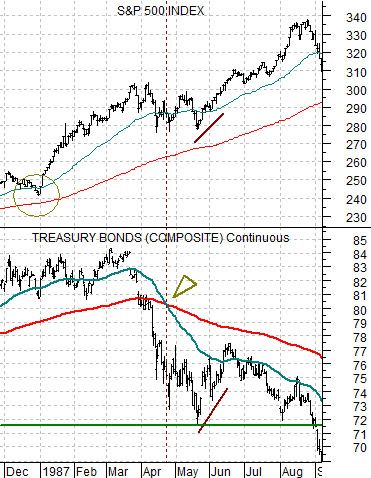
Below is a comparison between the S&P 500 Index (SPX) and the U.S. 30-year T-Bond futures from 1987.
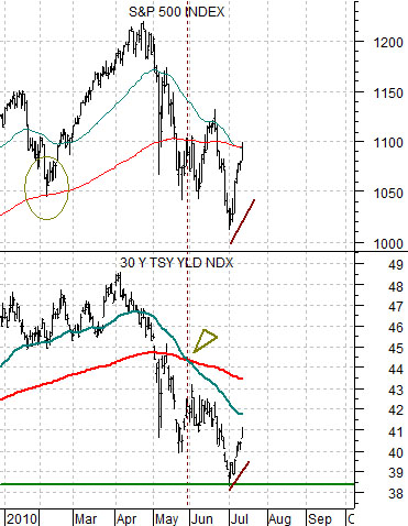
Next we compare the SPX with 30-year Treasury YIELDS from the present time period.
The argument is that the equity markets are trending with yields today in a similar manner to the relationship with bond prices in 1987. While the idea might seem somewhat farfetched the charts to make an interesting case.
As bond PRICES held near the highs through the end of 1986 the SPX lifted upwards. The same thing happened earlier this year as YIELDS remained between 4.5% and 4.8%.
The first correction for the SPX in 1987 occurred as bond prices broke lower. A month or so after the moving average lines ‘crossed’ in April the SPX reached a low at the same time as bond prices.
The recent correction for the SPX took place as yields declined. The moving average lines ‘crossed’ at the end of May with the SPX and yields hitting a low a month later.
The argument was that if the relationship continues the time to get serious about exiting the long side of the equity market would be when 30-year yields break to new lows below 3.85%.
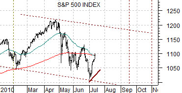
Below we compare the SPX from the current time frame with that of 1987. The basic point here is that in terms of ‘time’ the stock market could push upwards through the end of the third quarter and in terms of ‘price’ a return to the channel top around 1170 might be in order. For now, however, we will do our best to hold a simple positive view as long as yields continue to track upwards.