
Today, in his TraderPlanet column (Chart Presentation: The Yield Spread ), Kevin Klombies offers an interesting perspective on the potential for a bear market based on the yield curve compared to the S&P 500.
His argument is, “… it is far too early to be overly worried about an economic slow down and bearish equity market” because “the yield curve is, at present, far from inverted. In fact, it is still holding between roughly 3% and 4%, which represents the high (economically stimulative) end of the range.”
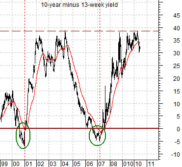
Now, understand that an inverted yield curve (negative) usually points to slower economic growth and a negative trend for equity prices. We saw this negative yield curve back in 2000, just before the dot.com bust and following recession, and we saw it again in 2007, just before we began the downhill slide into full-on recession and financial collapse in 2008.
Klombies’ analysis, and the facts he relies on, are just the type of analysis and commentary that I have been recommending. The yield curve is an indicator one can sink teeth into, bite off, swallow, and digest easily. It is a number that relates directly to long-term and short-term Treasury yields, and those numbers tell us something important about the flow of money (FYI, the yield spread is difference between yields on 10-year and 3-month Treasuries.).
By the way, I agree with Klombies. Despite all the hoopla about market correction, European debt, China’s red-hot economy, and less-then-expectation economic reports, the yield curve is telling us that those fears are over blown. To understand better, look at Klombies’ chart below.
So, checkout his column, as he offers further evidence of his contention that a bear market is not imminent. His take is both enlightening and solidly credible.
Trade in the day; invest in your life …
Trader Ed

