The Decade Theme argues that the trend for asset prices is similar during individual years within a decade. For example, crashes and crisis have tended to occur during the ‘7’ and ‘8’ years while asset price peaks have generally been reached during the ‘0’ year. Another spin on the theme involves the sectors that have risen to bubble peaks.
The idea is that commodity prices made a multi-decade top in 1980 followed by the Japanese (and Taiwanese) equity markets into 1990. A decade later U.S. large caps and the Nasdaq rose to a top followed most recently by a return to the commodities sector. If the sequence is commodities, Japan, U.S. large caps, and then commodities… the argument would be that Japan might represent at least part of the dominant theme through the next ten years.
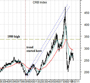
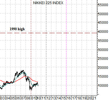
Below is a chart of the CRB Index from 1993 to the present time period while below right is a chart of the Nikkei 225 Index from 2003 forward. We have lined up commodity prices starting in 1993 with Japanese equity prices ten years later.
In a sense the argument would be that the broad trend for the Nikkei 225 Index today should be in some ways similar to the trend for the CRB Index through 2000.
The comparison makes a variety of points. First, the low point for the CRB Index was reached in early 1999 while the Nikkei’s most recent bottom was made in early 2009. So far, so good.
Second, the CRB Index was strong through into the end of 2000 creating an upward sloping channel that it returned to in 2008 to mark the most recent cycle high.
Third, the CRB Index followed the usual pattern of cyclical weakness during the ‘1’ and ‘2’ years as it retested the 1999 lows into early 2002.
Fourth, the CRB Index moved above the 1980 highs in 2006.
If history were to repeat the Nikkei would create an upward sloping trend from 2009 through 2010, weaken into 2012, and then move back through the 1990 highs some time during 2016. From a macro perspective the prospect of the Nikkei quadrupling over the next 5 to 6 years is enough to keep us positive even in the face of likely down side pressure into 2012.
We are going to attempt to explain why we find the current market situation so challenging.
One of our views is that you should always attempt to be long those sectors that are pushing interest rates higher while avoiding those sectors that are pulling interest rates lower. In other words if rising energy prices are pushing yields higher then it makes sense to be long the energy sector but if tumbling financials are moving interest rates lower then it makes sense to not be long the banks.
On the surface we trust that this makes sense. When interest rates are rising stick with those sectors that are so strong that interest rates are forced upwards. When interest rates are falling try to avoid those sectors that are so weak that yields have to decline.
So… here is where it gets a bit more complicated. What do you do- from the long side- when interest rates begin to decline?
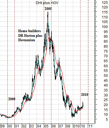
Below is a chart of the combined share prices of two U.S. home builders- DR Horton (DHI) and Hovnanian (HOV) from 1999 to the present day.
There are three time frames of interest on this chart- 2000, 2005, and 2010.
In 2000 interest rates began to decline as the Nasdaq- representing the capital spending theme- peaked and turned lower. This marked the start of an equity bear market that would run through into the final quarter of 2002.
If the argument was that as soon as interest rates began to decline one should abandon all equity markets long positions then on the one hand an investor would have remained nicely on the sidelines during the 2001- 2002 bear market while, on the other hand, missing a major bull market move in sectors ranging from the banks to the pipelines to the home builders. The bull market for DHI and HOV began at the very moment that the bear market started for the broad U.S. stock market.
Given that the sum of DHI and HOV rose from well under 10 to very close to 115 from 2000 into 2005 a case can be made for being long equities during periods of falling interest rates.
The sum peaked in 2005- a time period that we will return to on today’s third page.
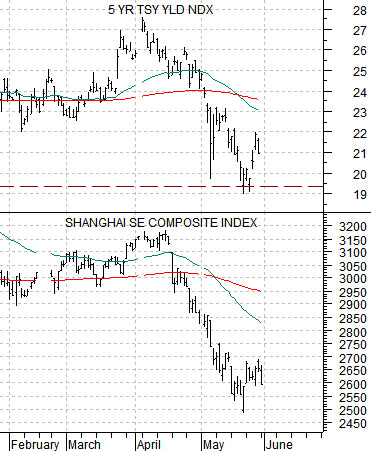
Below we show a chart of 5-year Treasury yields (FVX) and China’s Shanghai Composite Index.
The argument is that yields are moving very closely with the Chinese stock market. A similar case can be made for base metals prices which tend to trend quite tightly with the Asian growth theme. If yields continue to decline then it would make perfect sense to avoid those sectors related specifically to Asian capital spending and construction. At the same time the dominant theme for North America- having shifted from capital spending in 2000 over to consumer spending (aided by falling mortgage rates and rising home prices) should be set to swing back to a capital spending theme for the next five to ten years. In other words we are not writing in favor of the previous cycle’s winners (home builders) but instead are attempting to argue that falling interest rates and easier credit will serve to strengthen the trend for a variety of sectors that we have yet to clearly identify.