With Greece downgraded to junk and Portugal heading in the same direction the equity markets slumped yesterday as bond prices soared. While the markets are capable of doing almost anything- especially when the trend is somewhat stretched- our focus today is on what it might mean if long-term Treasury prices continue to rise.
We are going to use the year 2000 as our template. Below is a comparison between the Nasdaq Composite Index and the U.S. 30-year T-Bond futures from December of 1999 through June of 2000.
What we are looking at is the time period when bond prices bottomed and the Nasdaq reached a peak. There are three somewhat relevant points in time to consider.
First, when the TBond futures turned upwards in January the equity markets sold off for a few days. Second, following the initial bearish reaction the Nasdaq continued to rise with the bond market through February and into March. Third, as the 50-day e.m.a. line crossed up through the 200-day e.m.a. line in March the Nasdaq reached a final peak and began to decline.
If history were to be kind enough to repeat then an equity market correction in response to rising bond prices would make sense given that the TBond futures began to rise at the start of this year’s second quarter.
If the bond market made a price low at the start of April then the comparison argues that the cyclical theme is in a similar position to January of 2000. Fair enough.
The point is that even with the TBond futures shooting up into the 118’s yesterday the rally has only taken the bond market back up to the 200-day e.m.a. line- a line that has recently served as resistance. The chart below compares the TBond futures and the Nasdaq from the current time period and we can see that the stock market’s decline through January this year came to an end once the TBonds approached the moving average line. In a perfect world it would still take as much as another month before the TBonds were far enough above the 200-day e.m.a. to ‘cross’ the 50-day up through the 200-day. If the equity markets follow a similar path to 2000 then this would allow for an extension of the rally through into late May or mid-June.
Equity/Bond Markets
The dollar and the bond market were markedly stronger in trading yesterday.
We have done this on a number of occasions in the past but this is probably a reasonable time to go through it quickly once again. There are four combinations of the dollar and bond market and each favors a different theme.
1) Weak dollar/weak bond market- this is the kind of trend that drives energy and base metals prices higher. A weak dollar supports commodity prices while declining bond prices go with cyclical growth.
2) Weak dollar/strong bond market- this is often the best trend for gold prices. The weak dollar supports commodity prices while rising bond prices go with gold outperforming both crude oil and copper.
3) Strong dollar/weak bond market- while a weak dollar tends to go with strength in the Asian/Latin/emerging markets themes as money moves away from the U.S. a stronger dollar favors large cap over small cap and U.S. over most foreign markets. A weak bond market goes with cyclical strength so this combination tends to go with a strong tech sector. This is typically the most bearish combination for gold prices.
4) Strong dollar/strong bond market- this was yesterday’s theme. The stronger dollar supports large cap U.S. equities while rising bond prices suggest slowing growth. This combination tends to go with outperformance by large cap defensive names. This is the most negative combination for copper and crude oil and usually the best back drop for large cap consumer and health care shares.
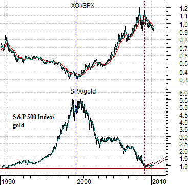
Below is a comparison between the ratio of equities (S&P 500 Index) to commodities (CRB Index) and the sum of the TBond futures and the U.S. Dollar Index (DXY).
When the sum of the TBond futures and DXY is rising it represents the fourth outcome listed above- strong dollar and strong bond market. In general this goes with a rising trend for the equity/commodity ratio.
Further below is a comparison between the SPX/CRB Index ratio and the share price of GlaxoSmithKline (GSK).
The argument is that GSK trends fairly closely with the equity/commodity ratio. In fact… back in 1995 when the ratio was 2:1 the share price of GSK was close to 20. By 1999 when the ratio peaked around 7.5:1 the share price of GSK had topped out at 75.
Into 2003 the ratio tumbled to 3.3:1 as GSK fell to 33 and at the bottom in 2008 the ratio hit 2.7:1 which was fairly close to the cycle lows for GSK a few months later at 27.
The point? The last time the dollar and bond market began to surge higher was during the second half of 2008 and we all recall how that turned out. If European debt is replacing subprime mortgages as the crisis of the moment then a bearish outcome appears likely. However… there is a difference between ‘likely’ and ‘certain’. In mid-2008 when the SPX/CRB Index hit 2.7:1 the argument was that GSK was ‘fair value’ at 27 yet it was trading closer to 48. It took nine months of pain to pull it back to 27. Today the SPX/CRB Index ratio is closer to 4.3:1 while GSK ended in the 37’s yesterday which suggests that there simply isn’t the kind of yawning value chasm under the large cap defensive stocks that we witnessed a couple of years ago.