The thesis that we are working with suggests that the cyclical recovery will wane during the second half of the year as long-term Treasury yields decline. This would lead to general weakness in energy and base metals prices, a stronger U.S. dollar, and down side pressure on the emerging and BRIC equity markets.
What if we are wrong?
Our sense is that it all comes down to the war between fundamentals and liquidity. That, of course, and the markets’ tendency to pivot direction and trend far in advance of supportive news. In other words it is absolutely normal for those who rely on fundamentals and stale economic releases to argue with a rising stock market and if the land scape was not rife will bears calling for a correction or break to new lows we would be even more worried than we are at present.
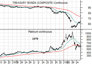
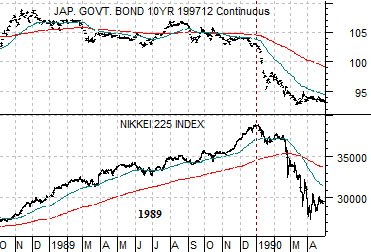
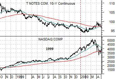
Below we show the last three major ‘bubble market tops’. At top right we compare platinum futures through 1979 with the U.S. 30-year T-Bond futures, at middle right the Japanese Nikkei 225 Index and Japanese 10-year (JGB) bond futures, and below right the Nasdaq Composite Index and U.S. 10-year T-Note futures.
The points are as follows. First, the last three decades concluded with a major asset price rise with commodity prices peaking in 1980, Japanese asset prices in 1990, and the Nasdaq in 2000. Second, in all three instances the trend for bond prices was lower which, we suspect, makes sense. In the midst of a powerful and rising trend for real or financial asset prices one would expect to see rising long-term interest rates.
Our thesis is that cyclical growth will slow during the second half of 2009. If 2009 proves to be yet another ‘end of decade bubble’ created by the tidal flood of liquidity dumped into the markets by nervous central bankers… then we will know that we are wrong when long-term Treasury yields move to new highs. Our thesis argues that cyclical asset prices- including the Asian equity markets- will weaken as we push through into the seasonally weak autumn but the charts at right suggest at least the potential for a different outcome. In all three cases shown the strongest price gains came during the final six months of the rally with particular strength during the final calendar quarter. Our point is that we have a thesis but we also have to draw a line or three in the sand to keep us from standing on the wrong side of the trend through the balance of the year.
Equity/Bond Markets
We are going to show charts today that support the ‘bubble’ outcome mentioned on page 1 as well as the outcome that fits with our thesis.
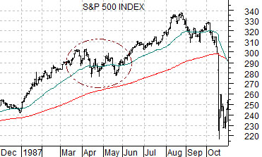
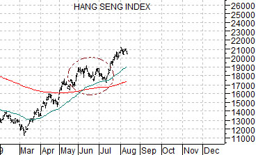
Below we compare the S&P 500 Index from 1987 with Hong Kong’s Hang Seng Index from 2009. The argument is that by breaking to new highs in July the Hang Seng pushed out of a consolidation similar to the April/May time frame in 1987. In other words when a market rises, consolidates, and then pushes to new highs it tends to continue upwards for a number of months. As long as the Hang Seng Index is well above its 50-day e.m.a. line the trend is obviously positive.
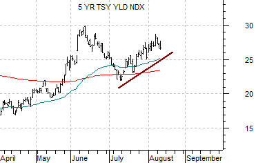
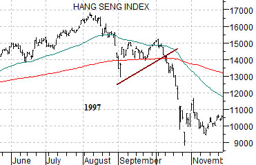
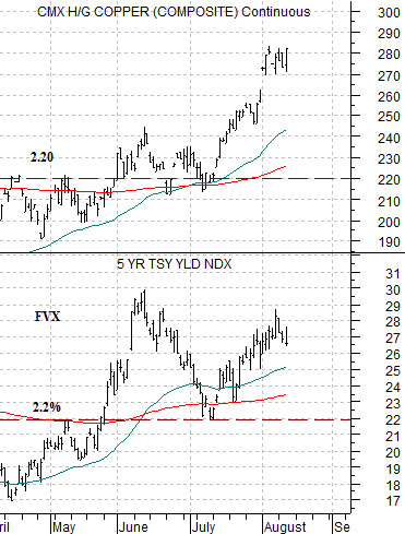
Below we compare the Hang Seng Index from 1997 with the yield index for 5-year U.S. Treasuries (FVX) from 2009.
If yields peaked in June (5-year yields at 3%) then we can still make the case that a major top is being formed that could lead to a sharp reversal to the down side similar to the way the Hang Seng Index collapsed in 1997. A break below 2.5% should lead to at least a retest of the 2.2% level reached in early July.
Below we compare 5-year yields with copper futures. The ongoing argument has been that copper PRICES have tended to be very similar to 5-year Treasury YIELDS over the past year or so. If 5-year yields remain below 3% then copper prices should hold below 3.00 and if yields break back to 2.2% then copper prices will be pressured back down to 2.20.
The point is that our thesis is based on yields remaining below the June highs.