
Well, we sure have come a long way in two weeks!
Here’s a great selection from our Chart School files that gives you a nice visual overview of the S&P from Larry at Ichimoku Charts:
As I mentioned in the weekly wrap-up, having come to the very top of our predicted trading range, we had no choice but to grit our teeth and go short into the weekend, ratcheting up our DIA coverage to balance the overall portfolio bearish over the weekend. There was nothing fundamental in the shift other than the overall fundamentals that WERE NOT being reflected in the (perhaps) overly exuberant rally of the past two weeks.
As I said in the post: “Wehave another heavy week of earnings ahead of usand we also have heavy data next week, including the Q2 GDP on Thursday. We have New Home Sales on Monday, Consumer Confidence and Case-Shiller on Tuesday. Wednesday is Durable Goods and the Beige Book all leading up to the GDP for April, May and June – which will be interesting to say the least. It’s going to be both exciting and informative but I’m sure sleeping better knowing we are well-covered over the weekend!“
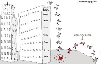 We did, in fact, have a nice, relaxing weekend as we were able to review our positions and discuss the pros and cons of the market. John Mauldin wrote an excellent piece called “The Statistical Recovery” and points out that, as Tim Knight did in “Legends of the Fall,” seemingly spectacular rises off a deep bottom are not necessarily “evidence” of a recovery. In short – beware the dead cat bounce – something we had EXPECTED back on July 11th, when we first predicted this “rally.” Has the cat exceeded our expectations? No, 9,100 was always our Dow target for this bounce – we just didn’t think we’d get there in just10 days of trading!
In that post at the bottom of the sell-off, I asked: “Is the current panic justified? What’s really changed in the last 30 days? Obviously, there were great attempts being made to push us up and over the top during the early part of June -the media pandering, the constant “stick saves,” Cramer’s idiocy, Goldman Sach’s $85 oil call – all attempts to pull investor dollars off the sidelines and break out of our range. Failure to do so seems to have led to a sell-off, perhaps funds are giving up on…


