We are starting out today with the same two charts that we included on the second page of yesterday’s issue. It isn’t that we can’t think of anything new to write about (hopefully) but instead that this is a topic that requires additional explanation.
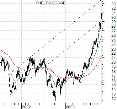
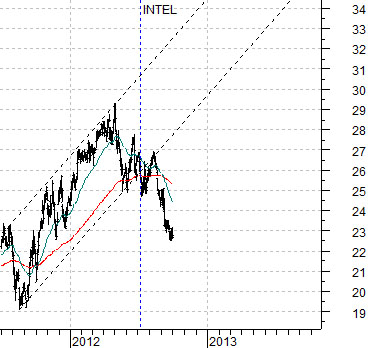
We could probably find all kinds of charts from different sectors, stocks, markets, and time frames that ‘look’ similar. In most cases this is little more than coincidence so to take a chart of a company that no longer exists (Phelps Dodge) and put it against a company in an entirely different business (Intel) ten years later is somewhat of a leap. Yet… that is exactly what we are attempting to do.
In years past we used Phelps Dodge to represent the commodity cyclical theme. In years current we use Intel to represent the cyclical tech theme. The similarity is that ‘cyclical’ trends go with rising interest rates while ‘commodity’ does better with a weaker U.S. dollar and ‘tech’ does better when the dollar is rising.
The argument is that each decade the dominant theme is established some time around the end of the first year (i.e. 2001, 2011) while the cyclical trend doesn’t kick in until late in the ‘2’ year.
Using the chart of Phelps Dodge from 2001- 03 as our road map we can see that the stock began to rise in late 2001 before busting below the upward sloping channel in the summer of 2002. The stock price bottomed in October of that year and then pushed powerfully higher in mid-2003 once bond prices finally began to weaken.
The sequence involves three time frames. First, a positive trend from late 2001. Second, a cyclical bottom in October of 2002. Third, a swing back into the rising channel starting in mid-2003 in response to rising interest rates and, of course, falling bond prices.
Intel’s share price began to trend upwards during the second half of 2001 before breaking down through the rising channel in the summer of 2012. In terms of our comparison the first time frame to pay attention to would be the current month along with some kind of bullish response in due course to bond price weakness.
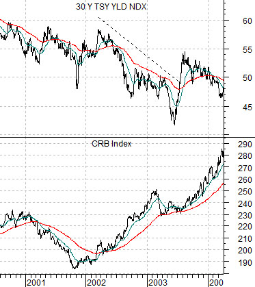
Let’s take another run at our argument. The chart below compares 30-year Treasury yields and the CRB Index from 2000 into 2004.
We are showing this to help explain the trend changes that impacted the share price of Phelps Dodge a decade back.
The CRB Index bottomed out around the end of 2001 before gaining positive momentum on dollar weakness in 2002.
Notice that through 2002 the CRB Index continued to climb. There was almost nothing in the trend for commodity prices that would explain the weakness in the share price of Phelps Dodge during the third quarter of 2002.
Our view is that PD sold off on the weight of the seasonal trend that creates the impression of economic weakness into October and November and strength through into April and May.
In terms of 30-year yields there were two ‘bottoms’. The first was made in the autumn of 2002 while the second was reached in the late spring of 2003.
The CRB Index (commodity prices) represented the dominant theme until at least the middle of 2008. One might argue that the trend began around the first few months of 1999 following the rolling series of crises that ran from Asia to Russia and then to Brazil resulting in cycle lows for both crude oil and copper futures. Another argument would be that the bullish trend gained actual credibility during the final quarter of 2001 supported through 2002 by U.S. dollar weakness.
In any event… the share price of Phelps Dodge began to rise with the CRB Index in late 2001, made a price bottom with new lows for yields in the autumn of 2002, and then exploded back ‘on trend’ in mid-2003 once 30-year yields pivoted back to the upside.
The current situation may be similar but it is also remarkably different.
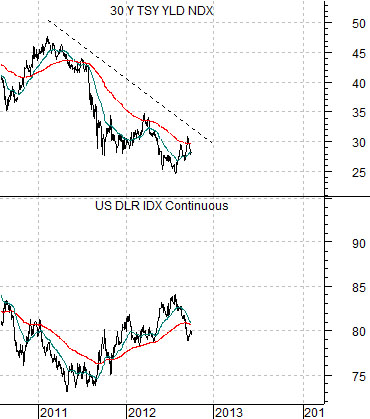
Below is a comparison between 30-year U.S. Treasury yields and the U.S. Dollar Index. Notice that we are once again using yields but instead of showing commodity prices we have substituted the U.S. dollar.
It is difficult and, perhaps, unreasonable to draw short-term conclusions out of a macro perspective but the idea is that the dominant theme from the previous decade was based on dollar weakness while what appears to be a new dominant theme in the current decade is based on dollar strength.
Our thesis is that the dollar is trending higher in a similar manner to the CRB Index coming out of 2001. If this is the case then it makes sense to concentrate on sectors that do better when the dollar is stronger.
The other variable, of course, is the direction of long-term interest rates. The strength in the health care themes (pharma, biotech, etc.) suggests that the dollar is trending higher (see the next page) while the weakness in the cyclical themes (Alcoa, laggard banks, techs, etc.) suggests that we have yet to reach the true ‘cyclical pivot’ that will be associated with rising yields. This puts the markets ‘in between’ the trend-setting action in the dollar and the lagging nitrous oxide blast that will come in due course from rising yields.