We are going to start out today with the same chart comparison that we used in yesterday’s issue. The reason has less to do with a lack of inspiration and somewhat more to do with… relevance.
Here and there small cracks have developed within the recovery trend. That is probably obvious each time the equity and commodity markets drop like a stone. The problem is that small cracks are not trend-changers although it is entirely possible that this will be the case later this week.
From time to time we have argued that trends tend to run quarter to quarter but actual pivots tends to occur during the final week or so of the first month of a new quarter. Quite often the actual shift won’t be made until after the bulk of quarterly earnings reports as investors change focus from what happened in the previous quarter to what is expected to happen in the current quarter.
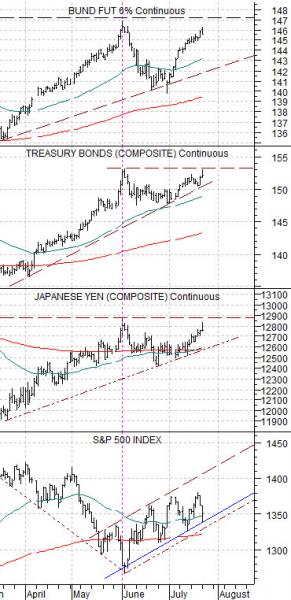
Below- once again- is a chart of the long end of the German bond market (Bund futures), U.S. bond market (TBond futures), Japanese yen futures, and S&P 500 Index.
In a rising dollar trend… the U.S. large cap stocks will tend to outperform virtually all other equity markets. All this means is that the one market that should hold the best when pressure is applied is the S&P 500 Index (and/or Dow Jones Industrial Index). This doesn’t mean that it has to rise but, at minimum, it should decline at a slower pace.
The next chart makes the case that German and U.S. bond markets have not- so far- busted to new highs. The Japanese yen- another destination for money fleeing ‘risk’- remains below the peak set at the end of this past May.
If the bond market and yen remain below the highs from the end of May then the underlying trend for the S&P 500 Index shouldn’t change. Our view is that a ‘flat’ bond market will result in a reasonable equity markets trend with relative strength tending to favor the defensive stocks and those levered to low and falling interest rates (i.e. the housing sector).
Equity/Bond Markets
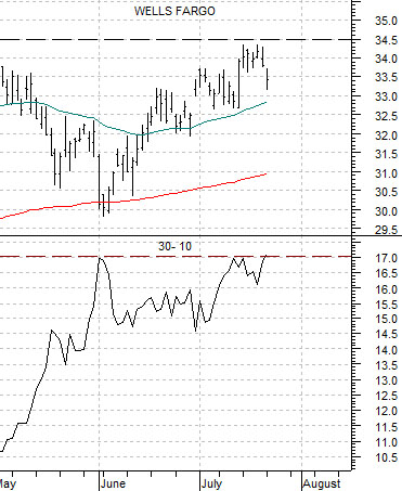
Below is our chart of Wells Fargo (WFC) and the price spread or difference between the 30-year and 10-year Treasury futures.
This is a fascinating comparison because… both sides are struggling with resistance (even though the trends are inverse). WFC is having trouble pushing through the 34- 35 range while the 30-10 spread is into the peak levels set over the last two months around +17.
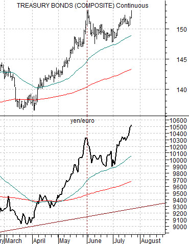
Below is a chart of the TBond futures and the cross rate between the Japanese yen and euro.
This is an example of a ‘small crack’. Notice that the yen/euro is at new highs while the TBond futures… aren’t. Yen strength and euro weakness represents the sense of ‘crisis’. If the TBonds do break to new highs then the cyclical trend is going to be under considerable pressure into the autumn.
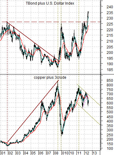
Last we compare the sum of the TBond futures and U.S. Dollar Index (DXY) futures with the sum of copper (in cents) and crude oil (in dollars times 3).
The basic argument is that a rising dollar AND bond market goes with falling energy and base metals prices. We cautioned months ago that the sum of the TBond and DXY had pushed to new all-time highs. Another point that we should make is that the upward thrust in the dollar and bond market from early 2011 to the present day of 40 or so points (195 up to 235) is similar to that trend in the final half of 2008 (187 to 225). The major difference is the way copper and oil prices have held in over the past 5 quarters.