From time to time when we are looking at a chart we see similarities between an earlier period or, perhaps, a completely unrelated market. Such was the case today as we stared at the chart of the Japanese yen futures. To us it looked very much like the S&P 500 Index in months leading up to the 1990 bear market.
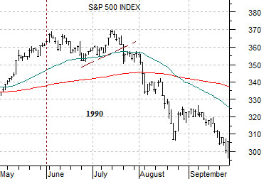
Below is a chart of the S&P 500 Index from June of 1989 through February of 1990.
1990’s bear market did not begin until late July so we are looking at the way the SPX traded a few quarters in advance of that time period. Notice the series of choppy thrusts to new highs- especially into October and early January- that led almost immediately to punishing corrections. The one-day decline in October of 1989 was a rather unnerving mini-crash.
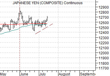
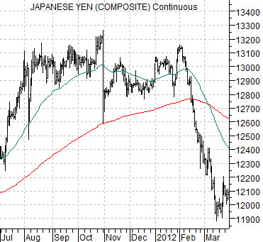
Next is a chart of the Japanese yen futures from July of 2011 through March of this year.
The three details that stood out to us were as follows. First, the way the yen made three pushes to new highs between August and October of last year culminating in a ‘mini-crash’ seemed similar to the action in the SPX through the third quarter of 1989.
Second, the build back toward the highs following the mini-crash with through January of this year had the same feel as the equity markets in the final months of 1989.
Third, the punishing correction for the yen into March appeared similar to the SPX selling off in January and February of 1990 (in response to the bubble peak and decline in Japan’s stock market).
The point, we suppose, is that the chart of the Japanese yen through the second half of 2011 appears to hold a bit of a resemblance to the broad U.S. equity market over the final half of 1989. On the following page we will attempt to explain why this is actually somewhere between relevant and important. Perhaps.
Equity/Bond Markets
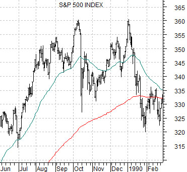
Above we focused on the Japanese yen in 2011 and the S&P 500 Index in 1989. At right we snug up the comparison somewhat by showing the S&P 500 Index from May through September of 1990 along with the Japanese yen futures from this year.
The SPX rose to a peak in early June of 1990. From there it put in a ‘top’ that extended through most of July. The break down in this index went with the start of rising oil prices and a declining bond market.
The Japanese yen futures have made what may end up being a similar ‘top’. The recent peak was made in early June with a push back to the highs through the first two weeks of July.
So… let’s dig for a bit of perspective here. The equity markets were pushing upwards into 1990 in the face of deteriorating growth. The Japanese asset price bubble was in the process of bursting but after the first hard price decline for the Nikkei 225 Index into March of that year Japanese stock prices bounced upwards into July. This ‘lower top’ marked the peak for the S&P 500 Index.
Aside from Japan the ramp up to the Gulf War was a bearish event with long-term interest rates rising along with crude oil prices. The combination of rising yields in the face of slower growth and sharply higher fuel costs helped tip the U.S. economy into the 1991 recession.
The argument is that the choppy action by the S&P 500 Index through 1989 along with the final top in the summer of 1990 represented a market pushing higher even as the news became more dire. Fair enough.
While the chart of the Japanese yen may be somewhat similar the back drop is almost exactly the opposite. The rising trend for the yen represents a bearish cyclical trend. To make the comparison we have to be able to suggest that the yen is still pushing upwards on momentum even as the news becomes progressively more positive.
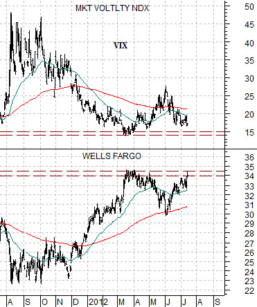
Below is our chart of Wells Fargo (WFC) and the CBOE Volatility Index (VIX).
The argument is and has been that WFC has serious resistance around the 34- 35 level. This is the price point that the stock has risen to repeatedly since the recovery began in 2009.
When WFC rises to 34- 35 the VIX tends to have declined back to around 15.
In terms of perspective… the Japanese yen (and bond market) is pushing back up towards the recent highs set at the start of June. These markets are ‘saying’ that things are either getting worse or, perhaps, are not showing much in the way of improvement.
At the same time the share price of WFC has snugged back up to the resistance line. One could imagine for the sake of argument that if WFC were to break cleanly up to new recovery highs that the message would be that the stalemate for growth that has persisted since 2010 has been resolved in a bullish manner. Is it completely unrealistic for us to argue that the markets are sending off mixed messages when WFC is potentially breaking out even as the Japanese yen and long-term bond futures move up towards the recent price peaks?