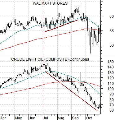
When does an orderly markets rotation turn into a rout? One answer to this question comes from the action in the share price of Wal Mart back in 2008.
We have argued that Wal Mart (WMT) tends to trend inversely to the price of crude oil. In other words when the share price of WMT starts to rise on both an absolute basis as well as relative to the S&P 500 Index it suggests that money is moving away from the kinds of cyclical themes that usually push crude oil prices higher.
Below is a chart comparison between crude oil futures and Wal Mart from 2008. We are focusing on the time frame just after the cycle peak for crude oil in July of that year.
As energy prices began to weaken in the third quarter of 2008 the share price of WMT strengthened. WMT had actually begun to outperform the broad market in the autumn of 2007 but the argument is that the initial reaction in 2008 from July into September was positive.
The difference between a markets rotation that involves money moving from one sector to another in a semi-orderly manner and a ‘crisis’ can be seen on this chart. By the end of the third quarter money fleeing both the equity and commodity markets managed to send the share price of WMT lower.
So… when does an orderly market rotation turn into a rout? When the pressures become so great that even with declining oil prices the share price of WMT sells off.
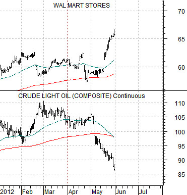
Below is the same comparison for the current time period.
Notice that weaker energy prices were one of the dominant features of the month of May offset by a rising share price for WMT. Our thought is that WMT should continue to trend higher as long as energy prices are under pressure. The detail that we will be watching for- hopefully not until at least the start of the next quarter- is a pivot back to the down side for WMT. If this were to happen it would suggest either that oil prices had found a defensible bottom or… that the Eurozone pressures had escalated into something similar to the final quarter of 2008.
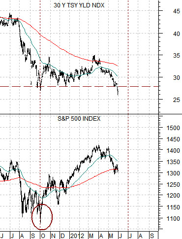
The major difference between May of 2002 and last month is that the stock market declined in the face of falling yields. Aside from that… the comparison is quite compelling.
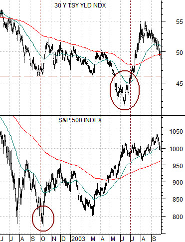
Below is a chart of 30-year U.S. Treasury yields and the S&P 500 Index from June of 2002 through September of 2003.
Below is the same comparison from June of 2011 to the present day.
The cyclical recovery began in earnest around September of 2002. This was, for all intents and purposes, the start of the broad recovery for equities following the post-Nasdaq bubble bear market.
The low point for the SPX was made at the first bottom for 30-year yields. Notice that this is exactly what happened last September.
Yields broke to new lows in May before reaching a bottom in mid- June. The June 2003 lows for 30-year yields were tested in 2005 and then finally broken in the final quarter of 2008. The point, however, is that roughly 9 months AFTER the stock market turned higher yields reached a very significant bottom.
The argument is that the stock market ‘leads’ the economy. We have argued, in fact, that it makes more sense to forecast the economy off of the stock market than the other way around. In other words… fire all of the economists, get rid of the Federal Open Market Committee, and adjust the Fed funds rate according to changes in TBill yields.
The stock market bottomed in the autumn of 2002 which ‘said’ that economic growth was going to resolve higher over the coming quarters. The bond market continued to trade off ‘the news’ with 30-year yields breaking to the down side through May and June of 2003.
The comparison between long-term Treasury yields and the S&P 500 Index becomes quite interesting when we use a similar template for the current situation. As mentioned above the starting point for the sequence is the initial bottom for yields at the end of September last year coinciding with an upward pivot from a bottom for the S&P 500 Index.
The rising trend for the SPX suggests that growth is improving. If one focuses on the bond market as yields break to new lows the impression is that the opposite must be true. After all, weakness for long-term interest rates MUST be telling us that the recovery has just run into a brick wall.
A couple of years from now we will be able to look back at 2012 and know exactly how things turned out but without the benefit of that kind of hind sight the best we can do at present is suggest that the most bullish thing the stock market can do is… rise in price. The longer the SPX maintains a bullish trend the more likely it will be that the stock market is ‘right’. Instead of the bond market pulling equities lower we would expect to see the stock market pull bond prices lower through the second half of this year.