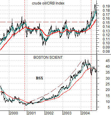
Every time the stock price of Boston Scientific (BSX) rises by a dime or so we wonder whether the time for a trend change has arrived. Months and then years have limped by since we first introduced this particular argument but, then again, until an actual trend change occurs we won’t know whether our thesis is valid or not.
Below is a comparison between the ratio of crude oil to the CRB Index and the share price of BSX from 1999 into 2004.
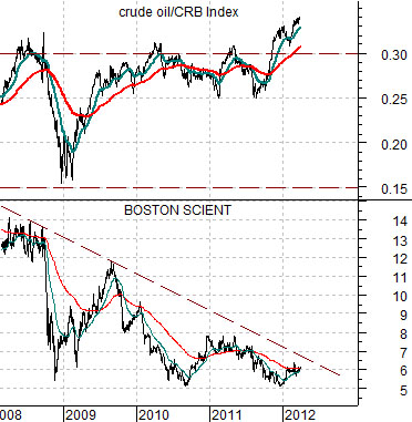
In recent memory the only time the share price of BSX pushed upwards for any length of time was between the end of 2000 and the middle of 2004. This was also the period of time when crude oil relative to the CRB Index was not making new highs.
The crude oil/CRB Index ratio peaked late in 2000. In terms of background we note that President Clinton authorized the release of 30 million barrels of crude oil from the Strategic Petroleum Reserve on September 22nd of that year. As usual most thought that this wouldn’t help lower energy prices…
The crude oil/CRB Index ratio remained basically below .15 into the second half of 2004 and under the cover of a relatively flat oil price trend the share price of BSX rose from around 7 up to roughly 45.
Next is the same comparative chart for the current time frame.
Our thoughts in no particular order are as follows. First, there is lots of chatter about the prospect of an imminent dump of oil from the SPR. In 2000 the problem was the cost of heating oil in front of the winter heating season. In 2012 it is the rising cost of gasoline as the summer driving season approaches. A September decision in 2000 would be roughly the calendar equivalent of a March announcement in 2012.
Second, between 2000 and 2004 the crude oil/CRB Index ratio had resistance at .15. Today that appears to be support given that the ratio declined close to that level in 2008. Recent resistance was at .30 but as the days have gone by the ratio has pushed on to new highs.
Third, if BSX actually starts to push higher in response to energy price weakness then there is still a chance that a trend somewhat similar to 2001- 04 will emerge. We simply hope that we aren’t still waiting for something to begin a year or two from now.
Equity/Bond Markets
We realize that there are many compelling reasons to be bearish on the U.S. equity market. Yet… we are still quite bullish. Why? Because no matter what the text books might tell you it takes a considerable length of time for the markets to fully discount significant news.
To explain… the Fed pulled the overnight interest rate down close to 0% at the end of 2008. It took three years for long-term Treasury bond prices to rise to what we believe will be a cycle peak.
The equity markets are still running behind the bond market. Bit by bit and day by day valuation levels are expanding as earnings and dividend yields are squeezed down towards the reality of the current interest rate structure. We have no idea how long it will take until the equity markets have completed the adjustment but our view is that the process will go on for at least a few more quarters or even years.
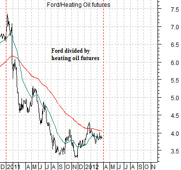
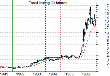
Let’s start this page off by looking at the chart below right. The chart shows the ratio between the share price of Ford (F) and heating oil futures from 1981 into 1986.
This is a ratio that we put together a very long time ago. We used it to help explain the way the markets evolved through the 1980- 81 bear market and into the uber-bull market that began in August of 1982.
The point was that the bull market began around the time when long-term interest rates peaked in late 1981. Close to a year before the S&P 500 Index began to rally the markets were working through relative price adjustments as the share prices of the autos (Ford) began to lift relative to energy prices (heating oil).
The Ford/heating oil ratio bottomed out in 1981 and then ran into a period of weakness or consolidation towards the end of the summer in 1983. The trading range held through into 1985 before the ratio went ballistic to the upside as crude oil prices collapsed.
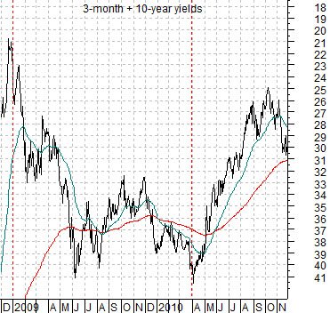
In any event… we digress. At top right is an upside down view of the sum of 3-month and 10-year Treasury yields. We have been using the sum of TBill and 10-year yields this week but for this argument we have scaled the chart upside down so that it goes ‘with’ the Ford/heating oil ratio.
At middle is the Ford/heating oil ratio from the end of 2010 to the present day. Note that the sum of 3-month and 10-year yields shows the time frame from two years previous starting at the end of 2008.
The argument is that the cyclical trend lags yields by two years. If the lag was ‘exactly two years’ then the decline for yields on the upside down chart at the start of 2009 would help us to understand why the Ford/heating oil ratio began to tank at the start of 2011.
The point is that the trend for yields turned rather sharply positive for the cyclical trend in April of 2010 so we are rapidly approaching the point in time when something both significant and surprising to the markets may occur. In terms of this perspective the ‘something’ might include downward pressure on energy prices and an offsetting positive reaction from energy users like the auto, airline, and cruise ship stocks.