What does the share price of Cisco have to do with the price of gold? Nothing and, perhaps, everything.
Let’s take a step back to August of last year. From Bloomberg on August 11, 2001: ‘Cisco Systems Inc. (CSCO) shares rose the most in more than nine years after the company’s profit and sales beat analysts’ estimates, the first time in six quarters that the shares gained the day after results.’
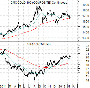
First below is chart comparison between Cisco and gold futures.
The charts are virtually mirror images with Cisco trending lower from February of 2011 into August while gold prices pushed higher. The post-earnings price strength for Cisco in August occurred a couple of weeks before gold prices finally topped out but, when all is said and done, is ‘close enough’ to warrant a closer look.
We have argued that gold prices have been in a down trend since last August and, on occasion, have shown that the share prices of Intel and Cisco have been in a rising trend over the same period of time. So… what does Cisco have to do with gold prices?
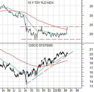
Second below is a comparison between Cisco and 10-year U.S. Treasury yields.
The argument is that Cisco’s price ‘gap’ on the day following earnings- the first time in six quarters that money actually moved towards Cisco- marked some kind of change in the flow of money. Up until that point in time money was inexorably flowing away from the large cap U.S. tech stocks towards both bonds and gold.
In the space of a few seconds in after-market trading the share price of Cisco flew to the upside. The game and the trend had changed even as the momentum traders pushed gold up towards 1900 while driving bond prices upwards through the end of the quarter.
In the weeks to come one should pay very close attention to ‘gaps’ in the share prices of U.S. large cap companies. Down side gaps could reinvigorate the gold price trend while upside gaps could help to accelerate the rising trend for long-term yields while putting additional pressure on gold. Typically ‘gaps’ suggest that something unanticipated has just happened and it often takes weeks, months, or even quarters for prices to adjust accordingly.
Equity/Bond Markets
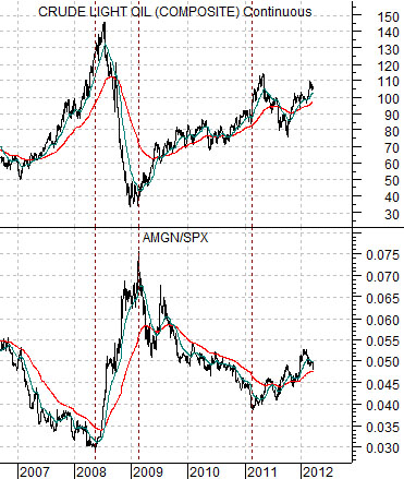
There is a persistent and rather strange relationship between the biotech and energy themes. In a sense they tend to move in opposite directions.
Below is a comparative view of crude oil futures and the ratio between biotech giant Amgen (AMGN) and the S&P 500 Index (SPX).
The argument is that Amgen tends to weaken against the broad large cap U.S. stock market during those periods of time when crude oil futures prices are driving higher. The AMGN/SPX ratio tends to bottom just ahead of crude oil and then rise to a peak when crude prices start to ramp upwards.
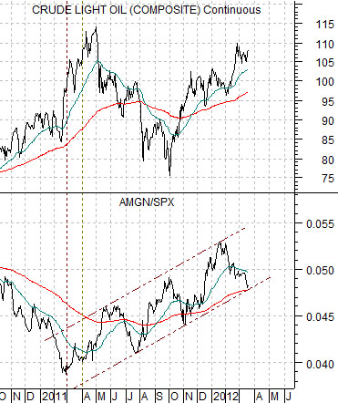
Next is a medium-term view of the same comparison.
The chart makes a rather interesting point. The AMGN/SPX ratio has been moving upwards since the first quarter of 2011. While it has tailed off to a certain extent since the end of January the trend is still positive.
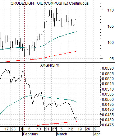
We have shortened up the time frame even further in the chart directly below.
Our view is that while energy prices are still rising quite strongly with Brent crude oil futures driving gasoline prices upwards- to the dismay of the Obama administration- the equity markets have yet to react to this strength in a convincing manner. In other words there is still a chance that the flotilla of VLCC’s carrying Saudi crude, a potential inventory dump from the Strategic Petroleum Reserve, or a stand-down related to Iran and/or Israel will save the day and break the rising trend for crude oil before it starts to create real damage to economic growth and the recovering stock market.