We are going to attempt to do something today that will be a bit different. Within the morass of markets confusion we are going to strive for clarity. Not, perhaps, clarity with respect to the markets but instead clarity from the perspective of our thoughts.
As usual we are stuck with disparate views. On the one hand we are bullish on asset prices. On the other hand the ‘decade theme’ suggests that we could still be six or seven months early. If we had, in fact, a third hand we would argue that both outcomes can coexist in the same reality.
Now… we promised clarity and have already slipped into outright obfuscation so let’s get started with the explanation.
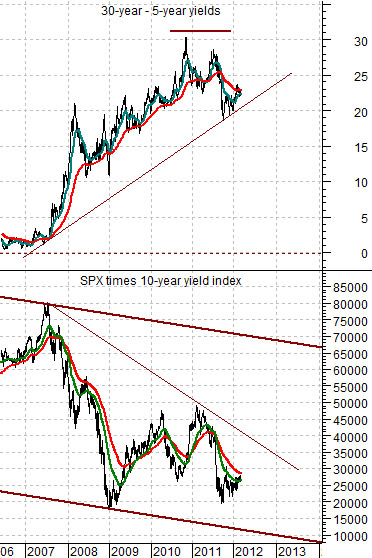
Just below is a chart that we showed earlier in the week. The chart compares the yield spread between 30-year and 5-year Treasuries and the product of the S&P 500 Index times 10-year Treasury yields.
The arguments are as follows. First, for any level of earnings stock prices will be higher in response to lower interest rates. In other words the value of a dividend or earnings stream will trend in the same direction as bond prices. The S&P 500 at, say, 1300 is ‘less expensive’ when 10-year yields are 2% than it would be when yields are 8%.
Second, over time the SPX times 10-year yields moves higher and lower within a fairly well defined channel.
Third, the trend for the SPX times yields is the opposite of the yield curve. The yield curve in this instance is measured by the difference between 30-year and 5-year yields. When the spread is ‘low’ the SPX times yields will be ‘high’ and vice versa.
We have gone through the period (2007- 08) where falling yields reflected plunging earnings. We are currently within the period where the yield spread is holding close to the highs suggesting that the SPX times yields is closer to the channel bottom than the top.
Our expectation is that the further we move away from the subprime crisis and the harder the Fed works to inflate asset prices the greater the traction for the recovery. Our view is that over time the yield spread will work lower while the SPX times yields will rise back to the channel top. Our conviction is that over time it makes sense to be bullish on asset prices. The problem lies not with the view but with the words ‘over time’.
Equity/Bond Markets
Much of what we do is based on macro perspectives so when you are viewing the markets in terms of years or even decades it is possible to be months or quarters early and still be broadly correct.
Our first page point might be summarized as follows. The further we get from the last recession the higher the overall level of corporate earnings. The longer the Fed fights to keep interest rates near current levels the greater the expansion of asset valuations. When you combine rising earnings with expanding valuations… you get a powerful bull market. At least, of course, until the yield curve moves back into inversion a few years down the road. For this reason we are positive on asset prices.
So… how does the ‘decade theme’ fit into all of this? The ‘decade theme’ argues that the markets keep repeating the same basic trends every ten years using different markets sectors.
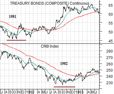
Below is a comparison from 1981- 82 between the U.S. 30-year T-Bond futures and the CRB Index.
The argument is that in the first two years of each decade there are two ‘bottoms’. The first bottom indicates that a recovery is forming while the second bottom is made by the sector that dominated the trend in the previous decade.
In this example bond prices bottomed and turned higher in late 1981 while commodity prices remained under pressure into the final quarter of 1982. The stock market ‘split the difference’ somewhat when it pivoted to the upside in August of 1982.
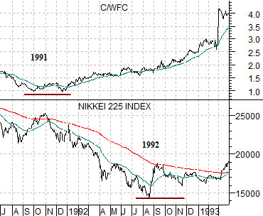
Next we show a comparison from 1991- 92. The C/WFC ratio (Citigroup/Wells Fargo) represents the relative strength of the laggard banks. This ratio bottomed in late 1991. The Nikkei 225 Index represents the asset price theme that dominated in the prior decade.
The U.S. economy began to recover in the final quarter of 1991. The Japanese stock market continued to decline into late 1992.
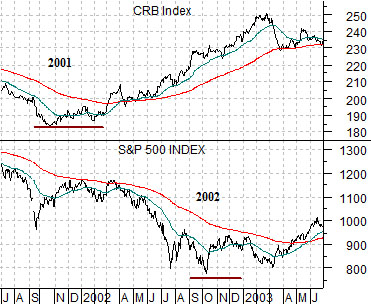
Last is a comparative view between the CRB Index and S&P 500 Index from 2001- 02.
In this instance the CRB Index represents the leading edge of the recovery while the S&P 500 Index represents the asset class that dominated the trend through the previous decade. The CRB Index bottomed in the final quarter of 2001 while the SPX continued to decline into late 2002.
We are doing our best to explain why we can be bullish on asset prices and fearful of being ‘early’ at the same time. Our expectation is that the leading edge of the recovery began in the final quarter of last year. Fair enough. Our concern is that one or more asset classes won’t truly wash out until the final quarter of this year.
The challenge is to try to be and stay positive on those sectors that are trending higher similar to bonds in 1982, the laggard banks in 1992, and commodities in 2002. The daily concern is that we haven’t figured out which sector or sectors are going to wash out at lower levels six or seven months from now. Our assumption was that it would be related to commodity prices in general or energy prices in particular but… as time goes by we are drifting more and more to the notion that it will be ‘yields’.