
Saturday 12 January 2013
We deviate from our coverage of the futures markets to take a look at this popular stock. As we often say: A
chart is a chart, composed of price, volume, and time. While fundamentals may be more prevalent in stocks,
from an analysis perspective, they can be very subjective, depending upon how they are presented. The reason
we view any analysis only from price, volume, and time, is that the charts reflect all the best fundamental views
that are translated into buy/sell activity. Charts also include all the worst possible points of view, for they, too,
are an integral part of the price/volume relationship.
We briefly dwell on this topic because some, [many?] view any analysis that does not incorporate fundamentals
as flawed, somehow. The flaw in that assessment is that it is equally flawed. Who determines which of the
myriad fundamentals presented are legitimate, worthy, on target, based on bias?
After all is said and done, the only thing that matters is the action taken in the marketplace based upon all
available information, from the most expensive and sophisticated, to the least informative presentation. The
collective decisions from every possible source is captured and recorded in the marketplace, either as a buy or
a sell. These transactions reveal the cumulative forces of supply v demand, each seeking dominance over the
other. Once these continuing decisions to buy or sell are recorded in the charts, the collective opinions become
indisputable facts, and they can be measured in a way that no other analysis allows.
With this, we turn to our collection of charts over a period of varying time frames to see what the forces of
supply and demand are saying, regardless of any fundamental spin. We start with an annual chart because
the higher time frames hold greater sway over smaller time frames. Not many look at annual, quarterly, or
sometimes even monthly charts, but they form the context within which the smaller time frames spin
What you want to see most from differing time frames is a synergy amongst them that relates a consistent
story. This does not always happen, but when it does, the “story” revealed becomes more compelling.
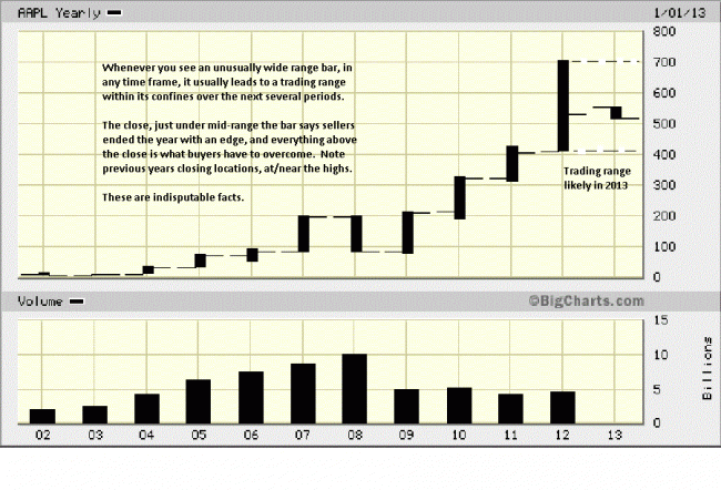
By the end of 2012, the close, it was just under mid-range the bar. The location of the close tells us who won
the battle between buyers and sellers. There are two things to note on this annual chart. Firstly, the unusually
larger size of the 2012 range, relative to previous years. Whenever you see a large range, it tends to capture
subsequent ranges within it. We could see several years of trading within this 2012 range. It is not a guarantee,
but it does have a proven history for respecting price to be contained, moving forward.
Secondly, note the close location of prior years, relative to 2012. Eight of the last nine years had annual closings
at or near the high for the year. 2012 is a change in behavior, a potential warning for what follows. We do not
know in advance what will follow, but we have been alerted, by the most reliable source, the market itself, to be
on guard. Smaller time frames will have already given similar warnings.
The quarterly breaks the annual into four separate parts. In Qtr 1, there was a wide range rally bar, typical in a
bull market. Not marked, but in Qtr 2, the range narrowed, and the close was lower than the opening and lower
than the previous close. Here is an excellent example of what a “warning” can be like. The move higher did not
end, but its character had changed, and we see this in the Qtr 3, marked #1 on the chart.
To view the remaining complete analysis and charts, visit our article at http://bit.ly/XYvacz

