It makes a lot of sense that the aggregate value of a country’s stock market should be correlated with its Gross National Product (GNP). Assuming the stock market contains most of the country’s largest companies, the value of what those companies produce should constitute a large part of GNP and should also play a large role in determining what those companies are worth, hence the suggested correlation.
In this 2001 article, Buffett argues that while “the [stock market value to GNP] ratio has certain limitations in telling you what you need to know…it is probably the best single measure of where valuations stand at any given moment.”
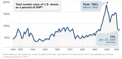
Here’s a look at this ratio for the last several decades, as compiled by Carol Loomis and Doris Burke of Fortune:
 What we see from the above chart is that stocks now have come down to a more normal historical value, after years of outperforming GNP! Indeed, even after the tech bubble burst, stocks were still expensive, and only after another bull market to 2007 did they come ‘crashing’ down to today’s seemingly normal levels.
Of course, relying completely on this chart could lead one astray. As the market has become more sophisticated over the decades, there may now be a greater percentage of companies that are public, which would lead to an upward trend to this chart rather than a horizontal line. Public sentiment during certain periods may have also resulted in a skewed public to private comany ratio. For example, if we look back at the years during the Great Depression, it is likely that many companies, even many successful ones, remained private for lack of cheap public capital.
Nevertheless, this chart is immediately useful for demonstrating that over the last several years, stocks are clearly trading at a discount to what they were after even after accounting for a drop in the value of goods produced.


