We are fond of comparing one time frame to another. While it is impossible (for obvious reasons) to argue that today is exactly like some previous point in time… we have to admit that we do find today’s comparison fairly compelling.
The argument is that March of 2010 is, in some respects, quite similar to the autumn of 1991.
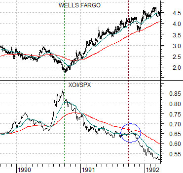
Immediately below is a comparison between Wells Fargo (WFC) and the ratio between the Amex Oil Index (XOI) and the S&P 500 Index (SPX) from the fourth quarter of 1989 through into 1992.
The stock market (as well as the share price of WFC) bottomed in October of 1990. This was also the peak for the oil stocks relative to the broad U.S. equity market.
From the autumn of 1990 through into 1992 the basic trend involved rising equity prices along with a steady decline in the relative strength of the major oils. The oils did not collapse in price but simply underperformed the broad market as money moved away from this sector and into stocks such as Wells Fargo.
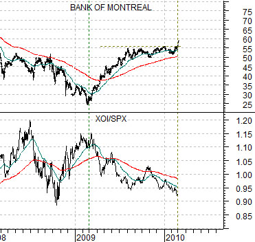
Further below we show Canada’s Bank of Montreal (BMO) and the XOI/SPX ratio. The chart begins in early 2008 and covers the same amount of time as the chart at top right. We have lined up the charts so that the low point for the share price of BMO is directly under the bear market for WFC in 1990.
If the share price of BMO reached a low along with the broad market in March of 2009 and this marked the start of a downward trend for the XOI/SPX ratio then we can make the argument that what has transpired between March of 2009 and March of 2010 is in some ways similar to the twelve month time period following the October 1990 stock market bottom.
We are using the Bank of Montreal for the current comparison simply because the Canadian banks are widely viewed as ‘best of breed’; perhaps the least damaged, the most stable, and the quickest to recover. The reason we are making this argument today is because a number of the large Canadian banks broke to new recovery highs in trading yesterday. Notice on the chart that after six months of trading essentially flat the share price of BMO popped through resistance yesterday.
Equity/Bond Markets
There are probably still a few people in the markets that recall the post-1990 time period. While most would argue that today is completely different and undoubtedly much worse… 1991 and 1992 were fairly ugly years for the financials (especially the saving and loans).
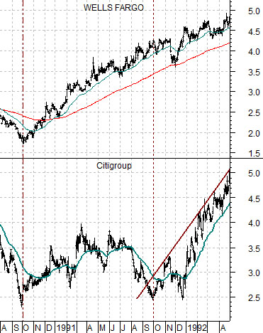
Wells Fargo was one of the early leaders coming out of 1990 aided, perhaps, by purchases from Warren Buffett. The chart at right, however, shows that while the strongest financials (i.e. WFC) began to push upwards in the fourth quarter of 1990 many of the more damaged names struggled near the lows for the next year.
We’ve suggested that we are now one year past the start of the recovery for the stock market that began in March of 2009. The chart at right makes the case that Wells Fargo had a clear twelve month running head start on the share price of Citigroup (which was called Citicorp at the time) which did not begin to trend higher until the fourth quarter of 1991.
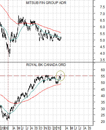
Below we compare the share price of Canada’s Royal Bank (RY) with that of Japan’s Mitsubishi UFJ (MTU). We are using RY today as a substitute for Wells Fargo back in 1991 and MTU as a surrogate for Citigroup (C).
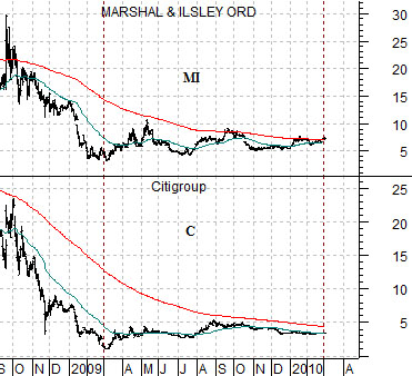
We should note that there is no particular reason why we are using MTU for this analysis. We could just have easily used Citigroup once again or even something like regional bank Marshal & Ilsley (MI). We show both below to make the case that there are quite a few financials still lurking close to last year’s lows.
If the Canadian banks are the relative strength leaders while C, MI, and MTU represent industry dead weight then the idea would be that it makes no sense to buy the laggards as long as the leaders are not making new highs. In other words with the share price of the Royal Bank range bound between 50 and 55 from the end of last August through into the start of March the trend for the weaker financials was somewhere between neutral and negative. What we needed to see were upside break outs by the leaders and that was exactly what we noticed in trading yesterday. If the break outs hold for a few more days then the momentum generated by the leaders may be enough to carry the laggards along for the ride.
