Our working premise is that we will continue to see cyclical growth through the balance of the year leading to stronger equity and commodity prices.
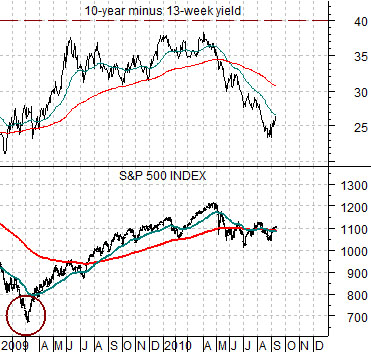
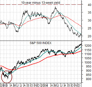
Below are two charts of the S&P 500 Index (SPX) and the spread between 10-year and 3-month U.S. Treasury yields. The top chart runs from 2003 through 2004 while the lower chart begins at the start of 2009.
The SPX bottomed in March of 2003 and again in March of 2009. The equity markets consolidated and corrected lower into August of 2004 and, apparently, into August of 2010.
If we view this through the yield spread we can see that at least some of the pressure on the equity markets may have come from a declining spread in mid-2004 as well as the falling trend in 2010. In other words for as much as this cycle appears to be different… in at least a few ways it is very similar to the early stages of the bull market into 2004.
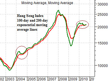
Our view, however, is that what happens next has much to do with the trend for Hong Kong’s Hang Seng Index. Below is a chart of the Hang Seng Index using 2 moving average lines (100-day in green and 200-day in red). The ongoing argument is that the cyclical trend turns negative when these two moving average lines ‘cross’ to the down side. Notice that the positive trend was tested- and held- in 2004 and has so far remained bullish into the autumn of this year.
Equity/Bond Markets
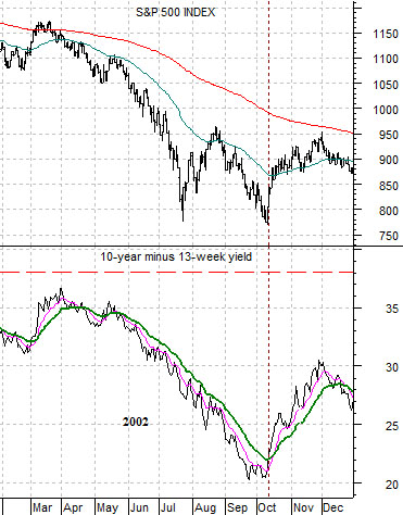
Below are two charts of the S&P 500 Index and the spread between 10-year and 3-month Treasury yields. On page 1 we focused on the time period into 2004 while on this page we will look once again at the comparison between today and 2002.
The final decline for the 2000- 2002 bear market drove prices to a bottom into October of 2002. This went with a sharp decline in the spread between 10-year and 3-month yields. The chart at top right from 2002 shows that the spread remained below the 25-day e.m.a. line (green moving average line on chart) through the entire correction. In October as the SPX reached a low the yield spread finally punched up above this moving average line as equities began to rebound.
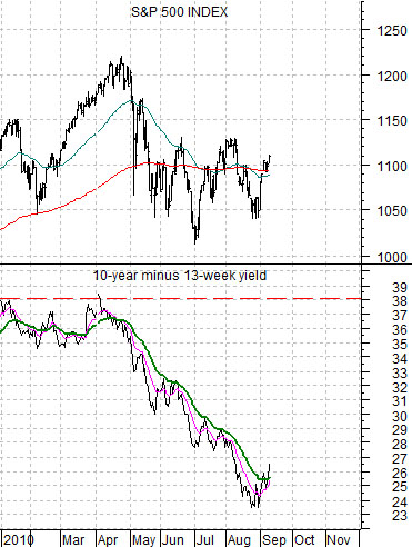
The current situation is shown below right. Once again the 10-year minus 3-month yield spread had fallen as the equity markets have remained under pressure. Once again the yield spread has rallied repeatedly and then failed at the moving average line… until this past week.
The argument is that the correction that began in April has now run its course. Obviously in 2002 this simply meant that stocks were able to rally for a couple of months before the lows were retested into early 2003 but for now it probably is enough to simply observe that conditions look more encouraging than they did as recently as a week ago.
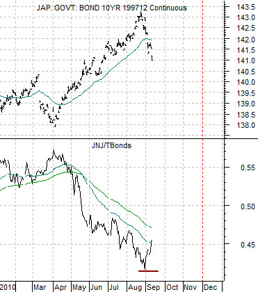
Below is a chart of Japanese 10-year (JGB) bond futures and the ratio between the share price of Johnson and Johnson (JNJ) and the U.S. 30-year T-Bond futures.
Quickly… the point we made last week was that once the JNJ/TBond ratio makes a significant bottom the Japanese bond market tends to make an equally significant bottom three months later. In other words if the JNJ/TBond ratio continues to rise we would look for some kind of price low for long-term bonds around the end of November.