U.S. weekly jobless claims moved somewhat higher with the 4-week moving average lifting from 402.5K to 407.5K. This was likely enough to cool off the recovering trend for the markets. One might argue that the trend is swinging off of European news and Greek long-term yields but we tend to like the relationship to the weekly claims numbers.
The point is that- at least for the day- the trend towards lower bond and gold prices ran into a fairly significant head wind. Since we are not inclined to change our views on a daily basis we are going to go on a bit of an intermarket ramble today. We would be both surprised and impressed if anyone could actually look at the two charts on this page and surmise where we are headed with this.
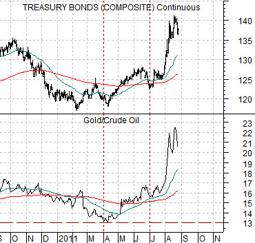
First is a chart comparison between the U.S. 30-year T-Bond futures and the ratio between gold and crude oil futures.
The foundation for the argument is that the ratio between gold and crude oil prices tends to swing up and down with the long end of the Treasury market. This means that when bond prices are screaming higher the price of gold will do better than crude oil which, of course, has been the case in recent months.
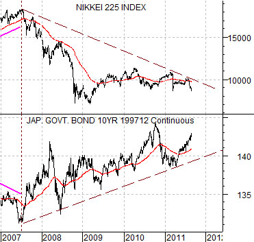
Next is a chart of Japan’s Nikkei 225 Index and Japan’s 10-year (JGB ) bond futures.
The basic argument is that the trend for Japanese bond prices has been relentlessly higher since 2007 and this has gone with a rather extended period of negative pressure on the Japanese equity market.
So… the long-term trend for bond prices is higher with something of an acceleration of this trend from 2007 to the present day.
When bond prices are rising there is downward pressure on those equity markets that tend to trend inversely to bonds (i.e. Japan and the U.S.)
When bond prices are rising the price of gold will tend to rise faster than the price of crude oil.
Equity/Bond Markets
Now we will move on to the broad point that we wanted to make today.
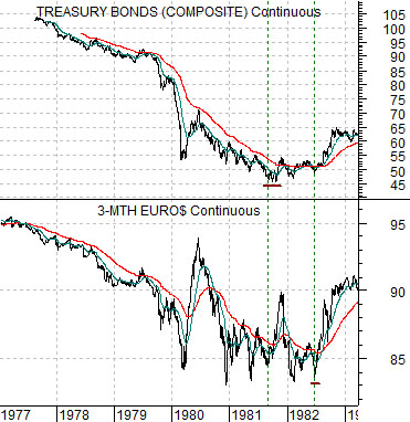
Just below is a chart comparison between U.S. 30-year T-Bond futures and U.S. 3-month eurodollar futures from 1977 into 1983.
In a sense the last ten years has been similar to the 1970’s while from a different perspective the trends have been almost completely the opposite. Which… is intriguing.
The 1970’s and the 2000’s were both dominated by rising commodity prices so from this point of view they were really quite similar.
The difference is in the way the bond market has trended. Rising commodity prices in the 1970’s went with rising interest rates as consumer and producer prices moved higher. Strong energy and gold prices are usually associated with rising inflation and sky-rocketing interest rates but that has most certainly not been the case this time around.
The detail that fascinates us is the severity of the central bank response. Chairman Volcker ostensibly broke the back of inflation and inflationary expectations by pushing short-term interest rates higher in the early 1980’s. The chart shows that as U.S. 30-year T-Bond futures prices declined from 1977 into 1981 the price of 3-month eurodollar futures also fell.
A price of, say, 90 for eurodollar futures is fairly close to a 3-month interest rate of 10% while a price of 85 would go with a yield of 15%.
So… above we showed a chart of Japanese bonds and equities to slide into the point that bond prices have been rising steadily from 2007 into 2011.
Here we are attempting to make the argument that the opposite happened in the 1970’s with bond prices moving rapidly lower from 1977 into 1981.
Now… there were two trend change points associated with the bond market in 1981 and 1982. In September of 1981 long-term bond prices bottomed. In July of 1982 short-term eurodollar prices bottomed. These two time periods created the start of the recovery in 1981 even though the weight of the equity markets did not begin to rise until the summer of 1982.
And yet… that still isn’t our point.
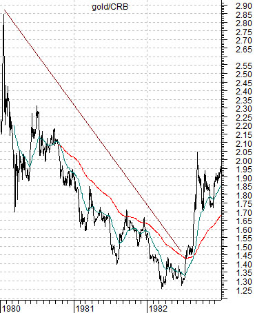
At bottom is a chart of gold divided by the CRB Index from 1980 through 1982.
Gold prices peaked in early 1980 while energy prices remained fairly strong until later that year. The end result was a downward sloping trend for the gold/CRB Index ratio as gold was one of the first commodities to break to the down side.
In the 1970’s commodity prices rose with bond prices collapsing from 1977 into 1981. In the 2000’s commodity prices rose with bond prices pushing rapidly higher from 2007 into 2011. In the 1970’s gold was perhaps the first commodity to peak and turn lower. We will push on with our mystery point on the following page.