We are going to head off in a new direction today. We actually didn’t intend to follow this line of thought when we started setting things out but sometimes these things just happen.
The argument is that there is a certain similarity between the current time period and that of early 1999. In other words the post-Eurozone crisis bears a certain resemblance to the post-Asian/Russian/Brazilian situation that marked the end of 1998.
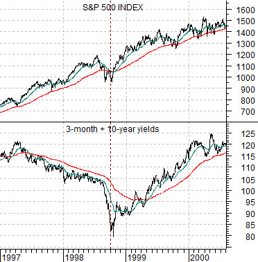
First is a comparison between the S&P 500 Index and the sum of 3-month and 10-year Treasury yields from 1997 into 2000.
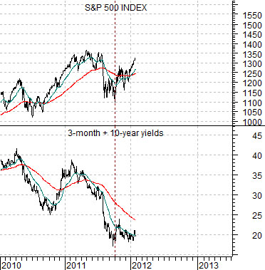
Next is the same comparison running from the start of 2010 to the present day.
The charts show that yields declined from 1997 into the autumn of 1998 and then fell again from 2010 into the final quarter of 2011. The run up to both crises went with a couple of years of falling interest rates.
The detail that we found interesting had to do with the way the S&P 500 Index held essentially a rising trend through 1997 and 19998 with the sell off during the Asian crisis pulling the 50-day e.m.a. .line briefly down through the 200-day.
Once yields reached bottom and started to rise the SPX swung back into its original bullish trend with minor corrections during much of 1999 holding close to the 50-day moving average line.
In essence the current picture is actually somewhat similar in that yields fell through 2010 and 2011 until a bottom was reached in the final quarter of last year. The SPX is still in a bullish trend with periodic breaks below the 200-day e.m.a. line occurring whenever yields are under considerable pressure.
The thought was that the SPX still has the potential to not only rise from current levels but rise aggressively if there is any indication that upward pressure is starting to form under long-term Treasury yields. The 2-year lag argues that this would lead to a bullish stretch that would carry things through into early 2014.
Equity/Bond Markets
We are going to come back to our page 1 point on both pages 3 and 5 today but for now we are going to take a bit of a side trip so that we can take a look at the chart of biotech giant Amgen (AMGN).
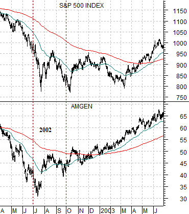
Below is a comparison between AMGN and the SPX from 2002- 03.
AMGN intrigues us because it tends to turn higher at odd times. In general when AMGN starts to push upwards it seems to suggest that something important is going to happen within the markets over the next three or four months.
In this instance AMGN pivoted upwards a number of months before the broad U.S. large cap market reached bottom. In fact the SPX was still testing its lows into the spring of 2003 as AMGN pushed steadily higher.
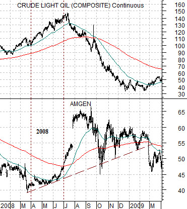
Below is a comparison between AMGN and crude oil futures prices from 2008- 09. Notice that AMGN started to rally through the final few months of the rising trend for crude oil and remained generally stronger until oil prices bottomed in early 2009.
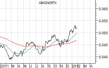
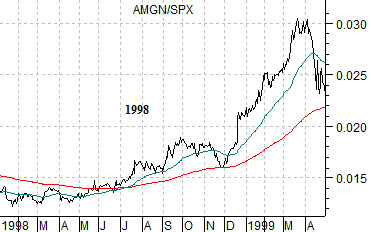
Below are two charts of the ratio between AMGN and the SPX. The bottom chart is from 1998- 99 while the top chart is from the current time period.
The Asian crisis roiled the markets from the late summer of 1998 into early 1999. The argument is that similar to today the share price of AMGN started to outperform the broad market in advance of the stock market sell off and then continue to act as a relative strength leader once the markets shifted into a period of recovery.