If a trend runs long enough it becomes accepted as a given. For years everyone knew that stock prices always go higher although we used to argue that the same was true for commodity prices as long as one didn’t mind the odd 20 or 30 year consolidation.
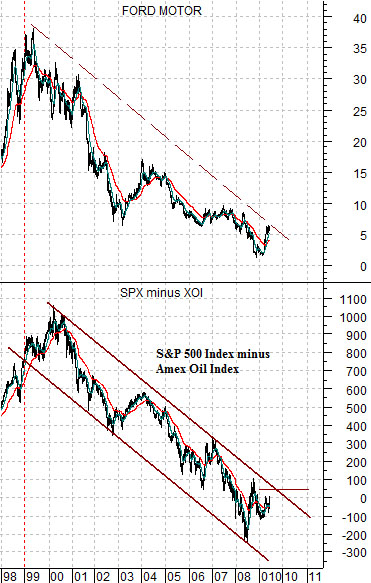
Immediately below we compare the share price of Ford (F) with the spread or difference between the S&P 500 Index (SPX) and the Amex Oil Index (XOI).
The oils have been outperforming the broad U.S. stock market for close to a decade so perhaps it is not much of a surprise that most people now believe that no matter what happens- rain or shine, boom or bust- the energy sector is the place to be. The trend has held for so long that it has literally become accepted as reality.
We have two problems with this. First, the XOI has outperformed the SPX through a time period when the SPX has been unable to make new highs. As long as the spread is weak and falling we accept that there is little chance that the SPX will push on to new highs.
Second, the ‘strong energy’ trend is offset by a ‘weak autos’ trend. One can argue, we suppose, that it is far too early for the autos to rise phoenix-like out of the ashes but our counter is that things can hardly get much worse for this sector. Maybe a little worse, of course, but considering how much damage has been sustained since the late 1990’s we feel fairly confident in stating that Ford’s share price is closer to a bottom than a top.
Our sense is that within the next few quarters the automakers will actually start to produce something that people are interested in buying and when this happens it will mark the birth of a major trend that has the potential to be Apple-like in dimension. Our sense is that while investors clutch their energy-related shares waiting for the inevitable return to new highs a new era and a new trend will begin. When? Probably a year ago but more likely the end of last year when Ford’s share price reached bottom. What we lack is confirmation because, quite clearly, the SPX minus XOI ratio is still firmly ensconced in a negatively-sloped channel pointed firmly towards the economic abyss. We would like to see the SPX shake clear of the XOI and rise at least 50 points and preferably 100 points above the oil index to break the trend, change reality, and give us a bit of hope with regard to the future.
Equity/Bond Markets
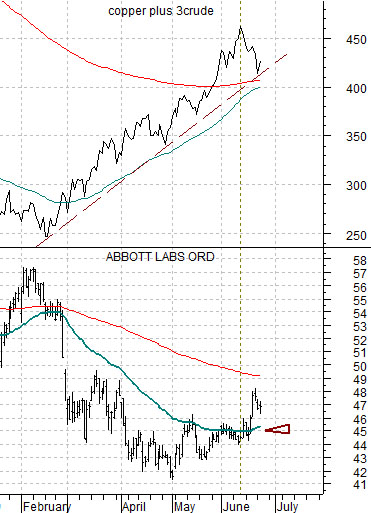
Below we show the sum of copper and crude oil as well as the share price of Abbott Labs (ABT).
Over the past month or two we have argued (quite often, actually) that when the share price of ABT pushes up through its 50-day e.m.a. line (blue line on chart) the sum of copper and crude oil should be at a peak. Strangely enough… the markets have yet to prove us wrong on this one. Of course we can’t count ourselves as being right as long as the sum of copper and crude oil is holding above the rising support line but at least this particular view remains intact and in play. Which, we suppose, is a good thing.
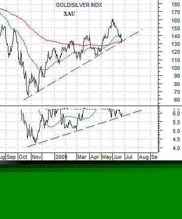
Below we compare the Philadelphia Gold and Silver Index (XAU) with the ratio between copper futures prices and 10-year Treasury yields. At present copper is close to 2.20 while yields are 3.64% (36.4) which creates a ratio of close to 6:1.
The argument is that as long as copper prices are stronger than yields so that the ratio continues to climb… the trend for the gold miners will be positive. Notice that both the ratio and the XAU hit support on Monday before rallying somewhat on Tuesday.
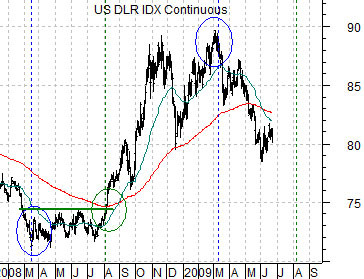
Below is a chart of the U.S. Dollar Index (DXY) futures. We are going to ‘stretch’ just a bit with this one.
We have argued for much of this year that the equity markets should bottom in March, rally for two months into May, and then resolve back to a second low in early August. The question that we have struggled with is… why? Why did they bottom in March and why might they turn positive in August?
On page 7 we have included a chart comparison between the share price of Coca Cola (KO) and an annual percentage change for the dollar. The argument is that Coke tends to do better when the percentage change line is falling and worse when it is rising. The point is that the worst (i.e. greatest and therefore the most negative) year-over-year change for the dollar was made in early March because the dollar was at a low in March of 2008 and a high in March of 2009. Annual percentage changes start to improve in July (because the dollar was stronger in the summer of 2008) and by early August the comparisons will become even easier because the dollar broke to the upside in August of 2008. For what it is worth, of course.