Once again it is Thursday and Thursday means the weekly U.S. jobless claims report. We continue to believe that the markets are trending off of this number so lower claims would tend to be cyclically positive while higher claims would help push bond and gold prices upwards.
Perhaps the most bullish (page 5) perspective that we can show still has a short-term window of risk attached to it. Best case is that the markets muddle through the next few days without major damage but a surprising rise in jobless claims would undoubtedly make the next few days… interesting.
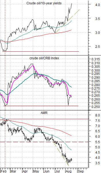
We are going to start out today with a chart that has vexed us in recent weeks. Below is a comparison between, from top to bottom, the ratio between crude oil futures prices and 10-year Treasury yields, the ratio between crude oil and the CRB Index, and the share price of airline AMR.
In general (over a very long period of time) the crude oil/yields ratio tracks directly with the crude oil/CRB Index ratio. In general the trend for AMR is the inverse of the crude oil/CRB Index ratio.
The problem at present is the divergence between crude oil relative to yields and crude oil relative to the CRB Index. This is showing up in the downward pressure on AMR as it trends inversely to crude oil/yields instead of crude oil relative to general commodity prices.
The argument is that the major problem at present is the direction of interest rates. Money continues to move away from ‘risk’ towards the perceived safety of the Treasury market. The divergence on the charts from July into August represents the bearish pressure that the markets are currently dealing with.
To truly get to the other side of the recent state of crisis the bond market has to stop rising. The best way to reverse the trend for the bond market may well come from U.S. weekly jobless claims. We have argued (and will do so again on page 3) that falling gasoline and Brent crude oil prices would help but the bottom line is that a trend change back towards risk and growth will not begin until the long end of the Treasury market begins to decline in price.
Equity/Bond Markets
The bond market revolves around the cyclical trend in two different ways. This is one of those concepts that tends to make your eyes glaze over but, even so, it is an important idea.
In the here and now bonds tend to rise when cyclical growth is slowing so there is usually an inverse relationship between bond prices and cyclical asset prices. This has become even more pronounced in recent years. The Japanese stock and bond markets began to trade inversely as far back as 1994 while the U.S. trend has been inverse since the Asian crisis of 1998.
The point is that we can argue that the cyclical trend will not turn positive until bond prices turn negative… and mean it. However, there is another relationship that also impacts what is going on.
We have argued that there is a 2-year lag between the direction of interest rates and the direction of the cyclical trend. Falling interest rates today mean a negative cyclical trend today but… a positive cyclical trend 2 years into the future. Conversely rising interest rates today go with a stronger cyclical trend today but a weaker cyclical trend 2 years later.
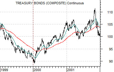
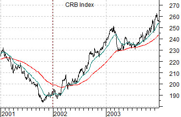
Below is a chart of the U.S. 30-year T-Bond futures from 1999 through 2001.
Directly below this is a chart of the CRB Index from 2001 through 2003. The two charts have been offset or shifted by 2 years so that the trend for long-term bond prices in 1999 is set directly above the trend for commodity prices in 2001.
The argument is a bit tricky in that the ‘cyclical trend’ shows up in different ways during different cycles. Typically all cyclical sectors trend together so the basic trend for tech, Japan, copper, etc. will usually be similar. From cycle to cycle, however, different themes tend to dominate and through the previous decade ‘commodities’ were clearly the strongest and most relentless theme.
The point is that 2 years after the bottom for bond prices at the end of 1999 the trend for commodity prices turned higher. This is an example of the 2-year lag.
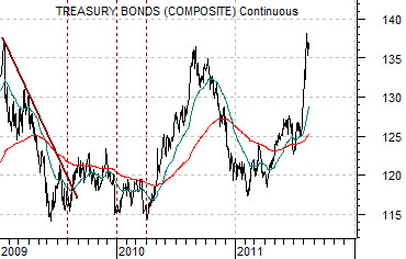
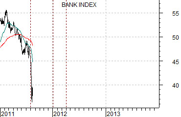
The current situation is far more difficult in that the bond market did not make a clear price bottom. At bottom right is a chart of the U.S. 30-year T-Bond futures from 2009 to the present day along with a chart of the Bank Index (BKX) from 2011 forward.
If we were to distill the TBonds down to an annual %age Rate of Change then the clear bottom would have been made at the end of 2009 suggesting a more positive cyclical trend closer to the culmination of the current year.
If we stick with a ‘glass is half full’ perspective then the first of series of bottoms for bond prices was made in August of 2009 leading into a choppy period that extended into the first quarter of 2010. This suggests at least the potential for a near-term cyclical low leading into a period of cyclical recovery through the end of next summer. If the Bank Index was weak this year in response to falling bond prices in 2009 then better days lie ahead. Eventually.