We threw an awful lot at the wall in yesterday’s issue and it was our intention as we started to set up this issue that we would go back over a number of the points in an effort to support and solidify the overall argument. However, as is too often the case, we seem to have become side tracked. The down side, we suppose, of having a woefully short attention span. Our hope is that we will return to yesterday’s thesis over the next day or so.
Today’s question is… and now what? We are not referring to what happens this week, month, or perhaps even in the current quarter but are instead looking out over time in search of a truly macro understanding of what the markets are up to. There is some short-term relevance but we won’t get to that point until the 3rd page.
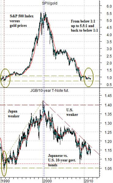
In essence the chart at right describes how we got from here to there and back again. The chart compares the ratio between the Japanese 10-year and U.S. 10-year bond futures with the ratio between the S&P 500 Index (SPX) and gold futures.
The trend has been roughly divided into two parts. In the first section Japanese asset prices collapse pulling its economy into downward spiralling deflation. The ratio between Japanese and U.S. bond prices soars and Japanese interest rates decline.
From around 1990 into 2000 there were (at least) two distinct trends. Japanese bond prices were rising relative to U.S. bond prices as Japan’s economy weakened and U.S. equity prices moved higher relative to the price of gold. We will argue that the downward pressure on interest rates from Japan collided with a U.S. economy that really did not require lower interest rates. The end result was both a decade-long period of U.S. economic growth fuelled by artificially low borrowing rates, a constant flow of money away from Japan in search of higher returns, and, aided at least in part by the ‘gold carry trade’, persistent selling of gold into the market with the proceeds invested in stocks and bonds.
The chart makes the case that the trend ran hard in one direction from around 1990 into 2000 and has since corrected most of its excesses. The SPX/gold ratio rose from under 1:1 up to 5.5:1 and is now back under 1:1 which suggests that the adjustment in relative prices favoring gold and pressuring the SPX has largely been completed. So… now what?
Equity/Bond Markets
It may seem farfetched to compare Japan post-1990 with the U.S. following the Nasdaq’s price bubble into 2000 but… we can show at least one perspective that supports the view.
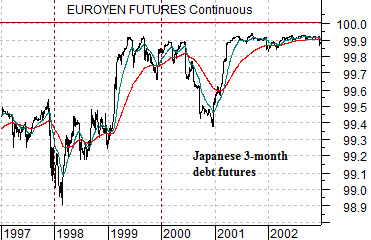
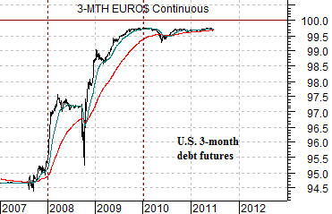
Below are charts of 3-month euroyen futures from 1997 through 2002 and 3-month eurodollar futures from 2007 to the present time frame.
Eurodollar yields represent the interest rate paid on U.S. dollars in non-U.S. banks while euroyen rates represent yen-based yields from non-Japanese banks. We could go into the history of the eurodollar market but this is probably not the time to do so.
Similar to TBills the price of both eurodollars and euroyen represent a discount from 100. For the sake of simplicity we will assume that a price of, say, 99 represents a 1% interest rate while a price close to 100 represents a near-0% yield. The numbers aren’t exact, of course, but they are close enough for our purposes.
So… Japanese asset prices peaked in 1990 and now short-term Japanese interest rates are close to 0%. U.S. asset prices peaked in 2000 and now short-term U.S. interest rates are also effectively 0%. Fair enough.
The intriguing point is how yields got to the 0% level.
Euroyen futures prices finally moved just under 100 in 1999. The final ‘shove’ down to 0% followed 1998’s Asian crisis that morphed into Russia’s debt repudiation and early 1999’s Brazilian crisis. In other words asset prices peaked in 1990 and interest rates fell to 0% into 1999 following what seemed to be an ‘end of the financial markets’ period of crisis in 1998.
U.S. asset prices peaked in 2000 but short-term yields did not fall down to 0% until 2009. The process required a similar ‘end of the financial markets’ crisis in 2008.
One way to look at this would be to examine the length of time the Bank of Japan held yields at 0% post-1999 and then apply this to U.S. short-term yields post-2009. In other words Japanese interest rates held close to 0% until late 2005 suggesting that the Fed could be on hold at current levels for… a long time.
Our thought, however, is that as long as U.S. 10-year yields are trading well above 2.0% the situations are not strictly comparable. 10-year yields below 2.0% argue for deflation and deflation supports short-term yields at 0%. 10-year yields above 2.0% argue in favor of rising prices suggesting that short-term yields close to 0% will lead to yet another asset price bubble.
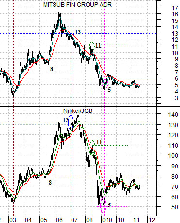
In any event… Japanese asset prices started the cycle back in 1990 and our sense is that Japanese asset prices may change the cycle as early as this year. The chart below compares the share price of Mitsubishi UFJ (MTU) with the ratio between the Nikkei 225 Index and Japanese 10-year (JGB) bond futures.
If Japan leads the recovery then the Nikkei/JGB ratio has to rise. The share price of MTU trends in the same direction as this ratio which is one of the reasons why we tend to focus so much of our attention on it.