We probably wouldn’t do this kind of work if we weren’t comfortable with processing information visually. Each of us uses all of our senses to accumulate and process data but the dominant sense often shows up through statements like, ‘I like the way that feels’, ‘I don’t like the sound of that’, or ‘I like the way that looks’.
The point is that charts and other visual representations of concepts and themes are more suitable for those who process information visually. To some a picture is worth a thousand words while to others it is just a mass of confusing lines. More often than not our work probably falls into the latter category.
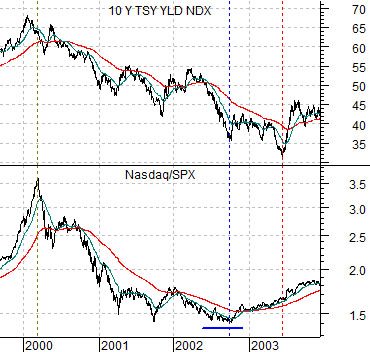
In any event we are going to show another chart comparison to help explain the ‘picture’ that we are working with. At top right is a chart of the ratio between the Nasdaq Comp. and the S&P 500 Index along with 10-year U.S. Treasury yields from 1999- 2003.
Weakness in capital spending associated with the tech and telecom sectors helped push interest rates lower from 2000 into mid-2003. This trend went with a falling Nasdaq/SPX ratio.
The argument is that yields bottomed out AFTER the Nasdaq began to recover in the autumn of 2002. In other words the entire cycle began with weakness in the Nasdaq and ended a few quarters after the Nasdaq/SPX ratio turned upwards.
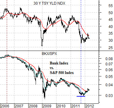
Below right is a comparison between the ratio of the Bank Index (BKX) and SPX along with 30-year Treasury yields from 2006 to the present day.
While much of the drama within the markets did not show up until the second half of 2008 the negative cyclical trend began some time around the second quarter of 2006 as copper prices peaked and the Japanese stock market and BKX/SPX ratio began to move lower.
If we view the bear market through the BKX/SPX ratio and the trend for yields then the argument would be that if the ratio turned higher during the final half of 2011 then the current situation is somewhat similar to the first half of 2003. The sectors that created the downward trend are showing strength but we have yet to reach the point in time when the recovery has progressed far enough to swing long-term yields back to the upside.
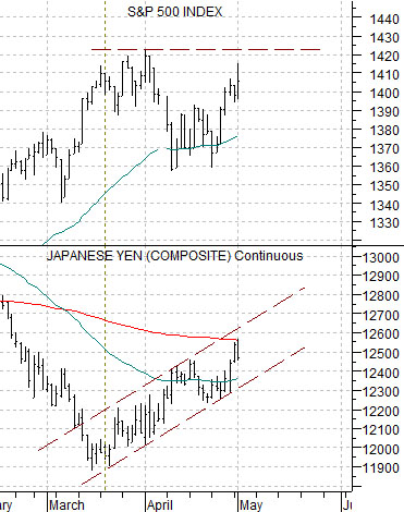
At right is our chart comparison between the S&P 500 Index and the Japanese yen futures.
The yen trends with the long end of the U.S. Treasury market. Both rise together when money is moving away from ‘risk’. This means that when the Japanese yen is pushing upwards we would expect to see a certain amount of pressure on the SPX.
The argument has been that as long as the yen is trending higher the SPX should remain flat to lower. Once it becomes clear that the recovery trend has begun then we would expect to find the next top around three months after the upward push commenced. In other words… if the SPX moves right through 1420 without stopping then there is a reasonable chance that the next peak will be made sometime around the middle of June.
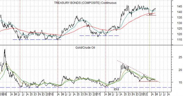
Below is a comparative view of the U.S. 30-year T-Bond futures and the ratio between gold and crude oil futures.
The gold/crude oil ratio has been working lower since last autumn. This creates a downward trend for bond prices.
If the gold/crude oil ratio continues to decline then bond prices should resolve lower.
If bonds trend with the yen and we can make a case for weaker bond prices… then we can also make a case for a lower yen. If the stock market is trending inversely to both then the path of least resistance for stocks remains higher.
In recent years bond price bottoms have been made when the gold/crude oil ratio declines to 13:1. In theory any combination of rising oil prices and falling gold prices should apply rather significant pressure on the long end of the Treasury market.