We are going to take another swing at the argument that we led off with in yesterday’s issue. No particular reason to do so aside from the fact that we already had the charts set up.
Below is a comparison between the CRB Index and the sum of the U.S. 30-year T-Bond futures and U.S. Dollar Index (DXY).
The argument is that the trends are inverse so a positive trend for commodity prices will go with negative trends for the dollar and bond prices. And vice versa.
With the European situation calming somewhat the most likely outcome would include some kind of rebound for the euro (i.e. dollar weakness) and a decline in long-term Treasury prices as fear-based capital drifts away from the various safe havens. While this may be the most likely outcome… it isn’t the only outcome so we thought that we would quickly sketch out another alternative.
Let’s say the dollar and bond market keep rising to the point where the sum moves above the peak set back in 2001.
The chart suggests that this would initiate some kind of price waterfall for the CRB Index with a potential target down in the 200 range. Keep in mind that crude oil was around 20 back in 2001 and fell to 35 at the end of 2008 so we aren’t writing about minor price declines here.
The markets seem somewhat balanced between a glass-is-half-full and glass-is-half-empty outcome. A bearish resolution would be based on some combination of dollar and bond price strength that would serve to push the CRB Index back to the levels from 2001 and 2007. The strange thing is that this is almost exactly what the laggard banks have already done.
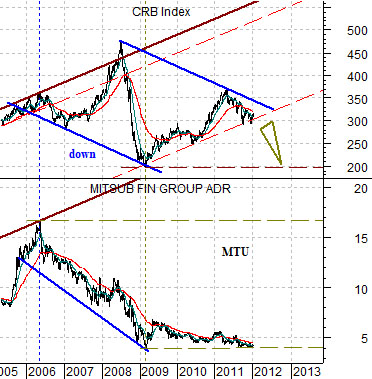
The next chart compares the CRB Index with Japanese bank Mitsubishi UFJ (MTU). The argument would be that if the recovery does not progress to the point where MTU starts to swing higher to follow the rising path for the CRB Index then the CRB Index may be forced lower to follow the ‘flat’ path that MTU has traced out since the lows were reached in early 2009.

Equity/Bond Markets
If pressed the reason that we worked through the charts on page 1 (again) has something to do with the chart at right .
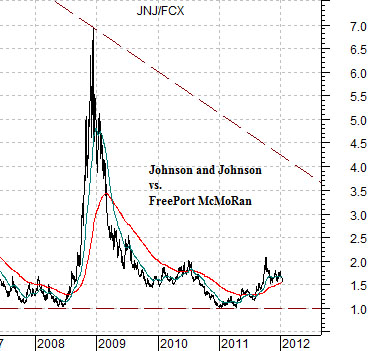
The chart compares the share price of Johnson and Johnson (JNJ) with that of FreePort McMoRan (FCX).
Going back to the 1995- 96 time frame the ratio generally traded between 1:1 and 2:1. By 2000 the ratio had risen to 14:1 (i.e. the share price of JNJ was 14 times the price of FCX). Our argument in the early 2000’s was that the commodity cyclical had been ‘left behind’ by the large cap U.S. growth stock trend and were set to play catch up. Which, of course, is what happened.
By 2008 the ratio had fallen all the way back to 1:1 only to spike up to 7:1 during the subprime meltdown later that year. Gradually the cyclical trend swung back to the commodities sector until by 2011 the ratio had once again declined to 1:1.
So, in a sense, we are back to where the entire process began in the mid-1990’s. Which isn’t a bad thing.
The ratio will tend to rise with the bond market and dollar so if we made the case that the ratio was going higher from current levels then we are, by extension, arguing that the sum of the TBond and Dollar (from page 1) is going to continue to move upwards. Our sense is that the ratio is somewhat ‘fair’ around current levels so perhaps we have simply returned to a point of reasonable relative prices.
To this juncture there is absolutely no way that one could guess what our point is. Our point is… that we are quite curious about how the markets react to quarterly earnings through the balance of the month. If the S&P 500 Index continues to rise AND the JNJ/FCX ratio stays more or less flat THEN our thought is that this might be the first quarter in quite some time when the markets actually found some reason to get excited about the earnings prospects from some of the large cap consumer and health care names.
How can we be bullish and bearish at the same time? Quite easily actually.
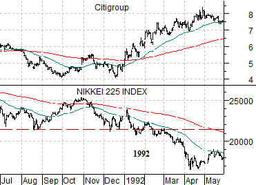
Next is a chart of Citigroup (C) and Japan’s Nikkei 225 Index from 1991- 92.
Below we compare the CRB Index and S&P 500 Index (SPX) from 2001- 2002.
The idea is that trends repeat from decade to decade using different sectors.
The Nikkei and the banks are both somewhat cyclical. The commodity market and equity market are also both an extension of the cyclical trend.
Around the start of 1992 as well as the beginning of 2002 the markets ‘split’. In 1992 the Japanese stock market weakened as the U.S. laggard banks turned higher. In 2002 the commodity markets turned higher even as the equity markets turned lower. Our argument is that this is the point in time (i.e. 2012) when we should expect to see weakness in one direction and offsetting strength in another. The challenge is to identify what is weak and what is strong as quickly as possible.