The simple point is that the equity markets went down with weakness in the cyclical sectors- including the major financials- and is recovering as these sectors start to rebound. As long as the market has a taste for ‘cyclical’ the equity markets should continue to do better.
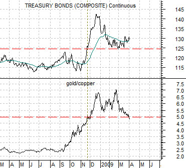
Below right is a comparison between the U.S. 30-year T-Bond futures and the ratio between gold and copper futures prices.
We have argued that the TBonds above 124- 125 was inspired by a sense of crisis which was confirmed by the push above 5:1 for the gold/copper ratio. As conditions normalize we should see a downward drift for bond prices and a decline back below 5:1 for gold (in dollars) relative to copper (in cents).
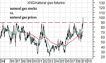
Below is a chart of the ratio between the Natural Gas Index (XNG) and natural gas futures prices.
It is hard to imagine any equity markets sector showing even a modicum of speculative excess these days but… one can argue that if there is one it would be the stock prices of the natural gas producers. The markets still seem convinced that energy prices are going to soar higher at any moment which has pushed the ratio of the natural gas stocks to natural gas futures prices to the highest levels witnessed in over 15 years. At close to 100 times gas prices instead of a more ‘normal’ level of 50 to 60 times the XNG seems a bit rich at present.
Equity/Bond Markets
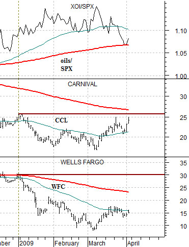
The equity markets were fairly robust yesterday with the oils leading the charge higher. The Amex Oil Index rose close to 4.2% while the S&P 500 Index gained just under 2.9%. The net result was an uptick in the ratio between the XOI and SPX.
Below we show the XOI/SPX ratio along with the stock prices of Carnival Cruise Lines (CCL) and Wells Fargo (WFC).
The ongoing argument has been that WFC and CCL should turn higher as the XOI/SPX ratio declines and that these stocks should be ready to move back above their 200-day e.m.a. line when the ratio is ready to move below its moving average line. For as strong as the equity markets were yesterday the one detail that we didn’t like was the return to relative strength by the oils.
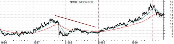
We have long been enamored with the idea that the markets are repeating- in a broad sense- trends from decade to decade. Back in early 2005 we put together a short list of stocks that we expected to do well based on what we called the ‘decade trend’.
The ‘decade trend’ is based on the observation that we keep getting cyclical markets peaks in the ‘0′ year (1980, 1990, 2000), bottoms in the ‘2′ year, crashes and crises in the ‘7′ and ‘8′ years and a return to cyclical strength in the ‘9′ year.
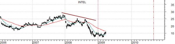
Below we compare oil service company Schlumberger (SLB) from 1986 through 1990 with Intel (INTC) from 2006 to the present day. The argument is that the commodity sector peaked in 1980 while the techs topped out in 2000 which suggests that SLB through the 1980’s could be somewhat similar to Intel in the 2000’s. We have shown this comparison in these pages on a couple of occasions in the past as we attempt to make the case that the tech and telecom sectors should be generally stronger through 2009 into the summer of 2010.