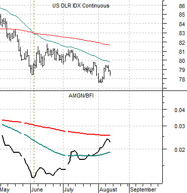
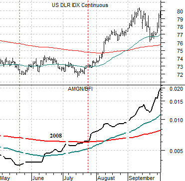
The markets continue to teeter rather precariously on a knife’s edge as two opposing trends fight for dominance. Asian/BRIC/commodity price strength is on one side with bond prices, the dollar, and the Japanese yen on the other. We have argued almost daily in these pages that a break up through the 200-day moving average line by the ratio between biotech giant Amgen (AMGN) and the Baltic Dry Index (BFI) should mark the start of a rising trend for the dollar. We used this exact argument last year (chart at top right) and it worked quite nicely.
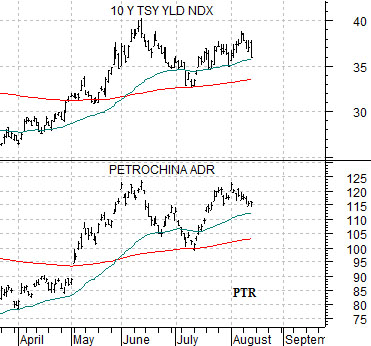
In trading yesterday Amgen’s share price ended lower which helped to curl the ratio back away from the moving average line delaying a positive signal for the dollar. At the same time the markets found new reasons to push commodity prices higher even as long-term Treasury yields declined. Below we compare the yield index for 10-year U.S. Treasuries (TNX) with the share price of PetroChina (PTR).
The point is that while copper prices make daily new highs the trend that has helped drive copper prices upwards appears to be struggling. Only time will tell whether PTR and yields push on to new highs but if they don’t… then the base trend away from cyclical growth actually began to shift way back in June.
Equity/Bond Markets
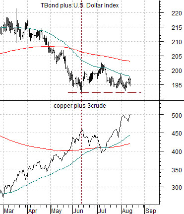
Second chart below shows a comparison between the sectors that represent the two opposing themes. On the one side are the U.S. 30-year T-Bond futures and the U.S. Dollar Index (DXY) while on the other we have copper and crude oil futures.
Clearly copper and crude oil have broken to new highs. This tips the balance- theme-wise- towards cyclical strength through the rest of the year. However… in the past when the combination of the TBonds and Dollar Index start to rise copper and crude oil tend to decline so this remains an unresolved intermarket issue.
Below we show the share price of Nippon Tel (NTT) and the product of the U.S. 30-year T-Bonds times the Japanese yen futures. As mentioned on page 1 the ‘other side’ of the trend includes the dollar, yen, and TBonds so we are showing a variety of combinations of these three markets in today’s issue. The point, by the way, is that the TBonds and yen peaked last December but has yet to make new lows since June even as NTT swings back to the upside.
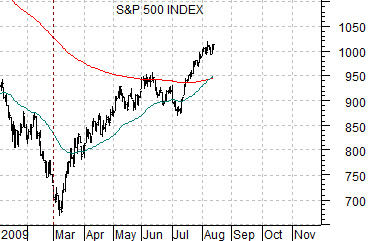
In the last chart we present what may well be a ‘weak argument’. The idea is that long-term Treasury yields bottomed in December of 2008 leading us to argue that cyclical growth was starting to improve. The S&P 500 Index, however, did not begin to rise until early March which suggests that the equity markets are lagging the bond market by a couple of months. The charts have been offset or shifted by two months so that the lows for yields lines up with the bottom for the stock market. The point? If yields are higher equities should be higher as well but as long as the peak for 10-year yields in June holds an argument can be made that an August top for the SPX would simply represent a lagged response to the start of lower yields that began back in June.