With the U.S. markets closed yesterday we are going to start off today with the same chart that we used on Monday. We are going to present a somewhat different spin on the argument however.
The markets are working through a rather complicated series of interconnected trends. On the one hand the reaction to every crisis is the creation of liquidity which, in turn, puts upwards pressure on asset prices. On the other hand we remain mired in the downward pull of a deflationary tractor beam. On the one hand the markets are cycling from one asset class to another as relative prices come back into line while on the other hand the population bulge represented by the baby boomers has reached a point where the tolerance for risk has declined substantially. On the one hand the manufacturing base of the U.S. economy has been gutted as production has shifted off shore in search of lower cost structures while on the other hand wealth, growth, and demand has increased almost exponentially in Asian and emerging markets.
The point is that this is a challenging markets environment as an expanding pool of available capital deals with fewer growth opportunities, faster cycles, and a reduction in the tolerance for risk.
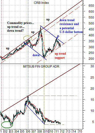
Just below is our comparison between the CRB Index (commodity prices) and the sum of the price of the U.S. 30-year T-Bond futures and U.S. Dollar Index (DXY). The argument is and has been that as long a the sum of the TBond and DXY remains below the peak levels of 2001 (very close to where the sum is at today) the trend for the CRB Index should remain higher.
We are going to do our best to fold a number of perspectives into a larger argument today.
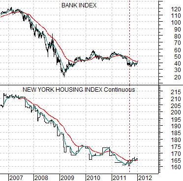
Next is a chart of the Bank Index (BKX) and the New York Housing Index futures. The housing futures have a base of ‘100’ representing the cost of residential real estate in the particular city back in the year 2000.
The argument here is that there is a basic relationship between the trend for the banks and the trend for U.S. home prices. Given the horrors associated with the subprime crisis this probably makes some sense. The better the trend for U.S. residential real estate the greater the upside for the financial sector.

Equity/Bond Markets
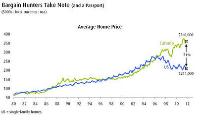
Just below is a chart that we ‘borrowed’ from an internet site called www.hardcorevalue.com. We are unsure of where the chart originated from so we are not able to provide proper attribution.
This is, we believe, a very important perspective.
The chart shows that average home prices in the U.S. and Canada rose in tandem from 1980 to about 2006 or 2007. From there U.S. home prices declined even as Canadian home prices moved higher. While the actual date of the chart is unclear the notation shows that Cdn prices were or are, on average, 71% higher than U.S. prices.
Most believe that the U.S. real estate price melt down was the end result of a ‘bubble’ and the consensus was that the U.S. was travelling down a road similar to Japan post-1990. We tend to disagree.
Money is constantly moving. Trends tend to run to extremes to be followed by periods of relative price adjustment. One of our views is that the markets have spent the last two or so decades trying to bring Japanese asset prices back into line.
There are two ways for this to happen. Either Japanese asset prices have to decline or non-Japanese asset prices have to rise. In fact the best way to raise the floor under the Japanese stock and real estate markets is to elevate prices in other regions. Which brings us to the U.S. housing market.
We have argued that from 2000 to the present day the U.S. bond market has been stronger than the Japanese bond market. In other words Japanese interest rates declined through the 1990’s until the overnight rate hit 0% and from there the trend shifted to pulling U.S. rates down towards Japanese rates.
The end result of falling interest rates was a stronger housing market. The problem was that the U.S. economy lacked the kind of growth in incomes and wealth that would support a fundamentally sound and stable increase in home prices. Without a strong base the rising price trend became increasingly speculative.
So… we end up with two issues. First, there actually was a positive and rising trend for global home prices. This conclusion is derived from the fact that average Canadian home prices continued to rise post-2007. Second, a commodity-oriented trend supports commodity producers while penalizing commodity users. Canada is a producer while the U.S. and Japan are users.
The next point is that there really are only two basic outcomes from the current situation. Either U.S. home prices rise- to the benefit of the banking sector- or Canadian home prices decline to the detriment of the Canadian banks and Canadian dollar.
Either U.S. home prices are arbitraged higher to bring balance to the Japanese market and move back into line with Canada or Canadian home prices are pulled lower to the detriment of the Cdn stock market, banks, and Cdn dollar.
The chart below compares the CRB Index with the share price of Japanese bank Mitsubishi UFJ (MTU). We are using the CRB Index to represent the global growth trend and MTU to represent the weaker aspects of this trend.
The argument is that MTU and the CRB Index began to trend lower back in 2006. This was also the point in time when U.S. home prices began to diverge from Cdn home prices.
From here either the cyclical growth trend kicks back into gear or… an ever expanding list of sectors previously assumed to be bullet proof are at risk of heading down the rabbit hole as the series of crises moves from region to region and sector to sector.