We are going to start things off today with the same two chart comparisons that we used in yesterday’s issue. This will serve as the foundation for the arguments that we hope to make on the following page.
The premise is that the bond market leads. In fact the bond market leads many trends by very close to one year. If you can grasp this point then there will be times when a thoroughly confusing trend will make substantially more sense.
One of the most glaring examples of the bond market leading both reality and the cyclical trend took place back in January of 2000. Bond yields peaked and began to decline that month even as the Nasdaq raced to higher and higher levels. U.S. 1999 4th quarter GDP was gangbusters yet long-term yields continued to work lower.
In January of 2001… the Fed started to cut the Fed funds rate. One year after long-term yields began to decline the markets were coming to grips with the fact that growth was slowing rapidly.
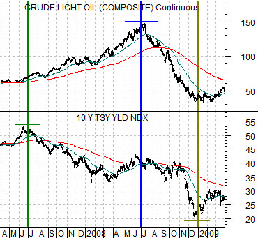
The chart below compares crude oil futures and 10-year Treasury yields from the spring of 2007 into the end of the first quarter of 2009.
The argument here is that yields peaked over the end of the second quarter in 2007 while crude oil prices peaked a year later in mid-2008.
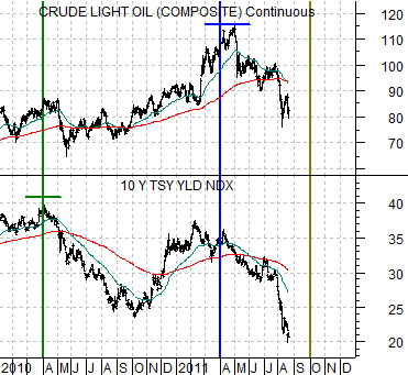
Next is the same chart comparison from the start of 2010 forward.
The peak for 10-year yields following the start of the recovery in early 2009 was made around the end of the first quarter in 2010. If the markets were following a similar sequence to 2007- 08 then the idea would be that crude oil futures prices would reach a top close to the end of the first quarter in 2011.
Our sense is that the 2nd and 3rd quarters of this year are, in some respects, a replay of the back half of 2008. We have yields racing towards a bottom with downward pressure on energy prices. The bad news is that the cycle suggests that a bottom will be reached closer to the end of next month. The good news is that we are close to 5 months into what may well be a 6-month period of correction.
In the next section we are going to reverse-engineer the trend as we attempt to figure out when and how the next recovery phase will begin.
Equity/Bond Markets
We made an attempt to stress the idea that there is a one year lag between changes in long-term yields and the cyclical trend. Now we are going to work at it from the other side.
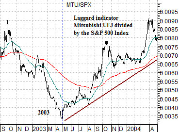
The chart at top right features the ratio between Japanese bank Mitsubishi UFJ (MTU) and the S&P 500 Index (SPX) from 2003.
The idea here is that the MTU/SPX ratio represents the ‘laggard cyclical trend’.
Cyclical strength peaked in 2000. The commodity markets turned higher around the end of 2001. The broad stock market made its first bottom in September of 2002. The laggard cyclicals, on the other hand, did not find traction until April of 2003.
The point is that there were actually at least three ‘bottoms’. One turned higher at the end of 2001, another in the fourth quarter of 2002, and the third in the spring of 2003.
The MTU/SPX ratio dragged lower through the up turn in commodity prices and then fell to new lows as the broad market turned higher in late 2002. The pivot from ‘down’ to ‘up’ took place in April of 2003.
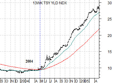
The chart below features 3-month U.S. TBill yields from the time frame one year AFTER the MTU/SPX ratio. Notice that the first signs of strength in the laggard cyclical trend showed up in April of 2003 while TBill yields began to rise in April of 2004. Almost exactly one year later.
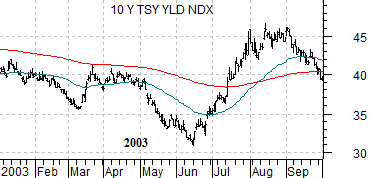
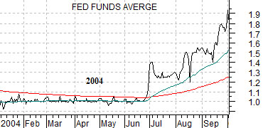
Below is a chart of U.S. 10-year Treasury yields and a chart of the Fed funds target rate. These charts are also offset or shifted by one year.
10-year Treasury yields bottomed in June of 2003. The Fed funds rate began to rise in June of 2004. There was a one year time difference between the low point for 10-year yields and the start of Fed rate hikes.
Recently the Fed stated that the funds rate would remain extraordinarily low into 2013. Our argument is that there is absolutely no way that the Fed can make this statement with any kind of conviction. In fact the Fed funds rate will start to rise a few months after TBill yields start to rise and roughly a year after the low point for 10-year yields.
Next point. Perhaps lost in all of this is the difference in terms of time with respect to the upward pivot for the MTU/SPX ratio in April of 2003 and the upward pivot for 10-year yields in June of 2003. This gap defines the lag between rising TBill yields in April of 2004 and a rising funds rate in June of 2004.
So… in a recovery… what leads? History has shown that the Fed is late to the party. The bond market tends to be early but in this example it was not the first to arrive. The leading edge of the sequence that pushed 10-year yields higher in 2003, TBill yields higher in 2004, and the funds rate upwards a couple of months later was… the ratio between the laggards (MTU in this example) and the broad stock market.